


![]() Sierra Entertainment Logo PNG
Sierra Entertainment Logo PNG
The video game developer uses a modern emblem to convey its innovative approach. The Sierra Entertainment logo embodies everything that makes the company unique: its traditional symbols, historical heritage, and creative concept.
Sierra began in 1979 as On-Line Systems in Simi Valley, California. It was founded by Ken and Roberta Williams, a married couple who first planned to make business software. After Ken discovered Colossal Cave Adventure, Roberta wrote Mystery House in three weeks, inspired by Agatha Christie and Clue. Released for Apple II in 1980, it became the first graphic adventure game, selling about 15,000 copies and earning $167,000.
The company moved to Oakhurst near the Sierra Nevada and became Sierra On-Line in 1982. After the 1983 video game crash, Sierra cut its staff to 30. IBM then funded a $700,000 PCjr game, leading to King’s Quest in 1984. By 1986, it had sold over 100,000 copies, while its AGI engine became the base for many later titles.
Sierra built a strong adventure catalog through Space Quest (1986), Police Quest (1987), and Gabriel Knight: Sins of the Fathers (1993), the latter created by Jane Jensen. Its main rival in the genre was LucasArts, known for Monkey Island and Grim Fandango.
In 1996, CUC International bought Sierra for about $1.5 billion. Ken Williams left in 1997, and Roberta stayed until King’s Quest: Mask of Eternity in 1998. After CUC’s accounting scandal, Sierra passed through Cendant Software, Havas, and Vivendi Universal. The Oakhurst office closed in 1999, and Sierra Entertainment ended in 2008. Activision revived the name in 2014 for digital indie releases, including a King’s Quest reboot and Geometry Wars 3: Dimensions.
Meaning and History
![]()
This video game developer was originally known as On-Line Systems. The Williams spouses called him when they opened an office in the California town of Simi Valley in the backyard of a local printing house. Moreover, they did not plan to use their company for gaming: Ken (a programmer at IBM) intended to make it a platform for developing software for the Apple II and TRS-80 computer OS.
But fate decreed otherwise. One day, they accidentally found a teletype terminal with host-system applications, including Colossal Cave Adventure, and started playing it. This genre carried them away so much that they decided to create something similar, but in a more advanced format, using the Apple II’s graphics capabilities. The result of their efforts was the video game Mystery House.
Then the company underwent several relocations, name changes, and changes in ownership until it was liquidated. Its 2014 revival continued to produce and distribute Western-genre computer games. The developer got its current name in 1982 after moving the office to Oakhurst, California. The word “Sierra” was chosen because the city is located near the Sierra Nevada mountain range, a detail reflected in the new logo. And there are eight of them in total.
What is Sierra Entertainment?
Sierra Entertainment is a video game company owned by Activision. It is known for works such as Gabriel Knight, King’s Quest, Space Quest, and many more. The year of its appearance is 1979. In 2008, it ceased operations, and in 2014, it resumed operations. The founders of this game developer are the Williams spouses (Ken and Roberta). The headquarters is located in Los Angeles, California.
1980 – 1982
![]()
The debut logo of On-Line Systems (later Sierra Entertainment) appeared after the company’s opening. It is made in text format and fully conveys its name. The designers drew a long line on which they placed the inscription. The horizontal stripe starts at the letter “Os and extends across the entire phrase. The word “On-Line” is large and bold, and “Systems” is small and right-aligned. The emblem is black and white.
1980 – 1983
![]()
After moving and renaming in 1982, the video game creator received a new logo. It is based on toponymy, on geographical location, as it moved to the foothills of the Sierra Nevada and to the California city of Oakhurst. As a result, the main component of the logo was the mountain, with nearby coniferous trees depicted. They are taken in a thin ring, from which a solid line extends to the right. Earlier, the stripe came from the first letter of the company name; now, there is no such thing. The word “On-Line” is printed in bold, large, capital letters. Whereas “Sierra,” on the contrary, is small, bold, and handwritten in cursive. The background is a horizontal light green rectangle.
1983 – 1993
![]()
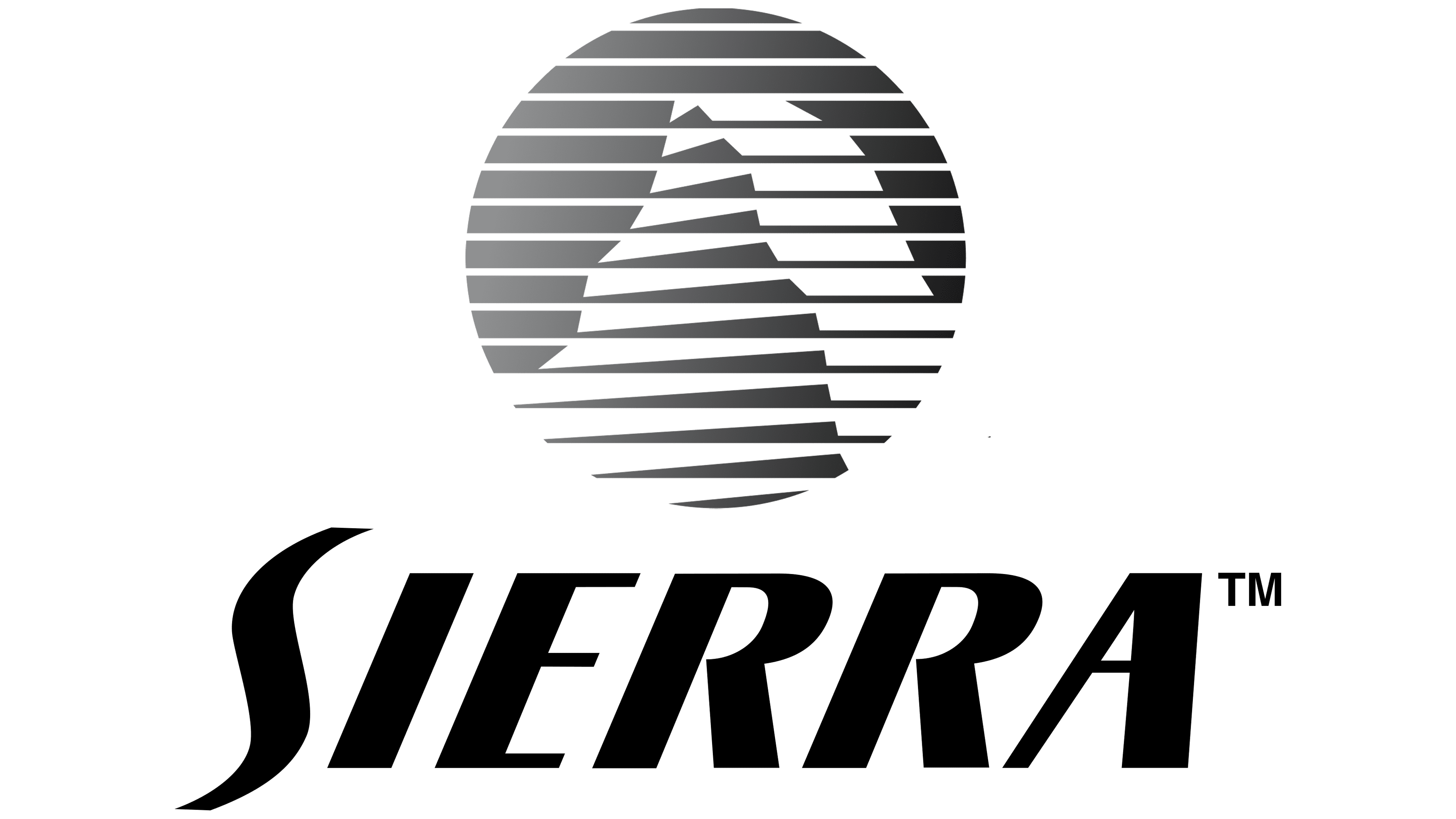
The following emblem is presented in a modernist style. It contains a lined circle that marks the mountain’s location. This element is depicted in monochrome, with black-and-white tones. Due to such a game, a round badge with the Sierra Nevada ridge is formed. To its right is the name of an American company in a completely different font. The letters are large but bold. Both “R” s have rounded legs. The designers removed the colored background and used a neutral space.
1993 – 1998
![]()
In this case, the designers finalized an already existing version of the Sierra Entertainment logo. To do this, they repainted it in black and yellow, intensified the shadows on the mountain, changed the font in the title, removed the grotesque, and chose an antiqua. In addition, a dark background appears, against which the emblem’s light details stand out clearly.
1998 – 2000
![]()
In 1998, the video game maker rebranded into five distinct groups. These include Sierra FX, Sierra Sports, Sierra Home, Sierra Attractions, and Sierra Studios. Naturally, the logo has also undergone some changes. It took on a completely different look because the developers removed the circle with the mountain image and kept only the text, so the main focus now falls on it. The company’s name is in italics, with the first letter handwritten and the rest printed. The “S” is elongated in the form of a vertical ribbon, to the left of which there are four golden “spikes” of different lengths.
2001 – 2002
![]()
During this period, almost all sub-brands were merged again, which required a revision of the visual identity. But the authors did not use the new emblem for long and in a limited number of video games. The designers enhanced the letters by adding subtle highlights and shadows to make them look three-dimensional (the two “R”s and the “A”). They also made the inscription gold and placed it on a black rectangular background.
2002 – 2008
![]()
2002 brought another rebranding: the adventure video game company was renamed Sierra Entertainment. The management returned to the lined circle with the Sierra Nevada mountain range again. The artists made it gold, so the mountain now has a yellow gradient. The inscription adopted the style of 1998-2000: it remained black, oblique, elongated, and printed, with a ribbon-like “S.” At the end of this period (in 2008), the computer game developer became a subsidiary of Activision Corporation and ceased to exist as an independent brand.
2014 – today
![]()
After a six-year hiatus, the Sierra Entertainment brand has been resurrected to create the much-loved adventure video games. Although it has retained some recognizability, the logo has become much more modern. For example, a lined circle with a mountain (the designers moved it to the center) and a winding letter “S” (the other characters received different spellings). The colors have also changed: blue replaces yellow, and silver replaces black.
Font and Colors
The evolution of this company’s logo was smooth, not abrupt, with the gradual replacement of some elements by others. In each new version, there was necessarily something from the previous one. This emphasized the continuity of the visual identity and preserved the video game manufacturer’s recognition. Even after a long pause in its activity, the designers left some old elements in the emblem.
Since the main focus of the Sierra Entertainment logos is the name, several typefaces have been used. These include variations of Skilt Gothic Ultra Italic (the earliest emblem) and Yoxall Bold (also one of the initial logos). Over time, they were replaced by the grotesque Stowe Titling Regular by Roger White. But the most significant typeface in the company’s identity history is an analog of Ponsonby Italic, with some changes to the cursive. It was used not in one but several logos.
The corporate palette is modest, mainly black and white. It also has yellow, silver, green, gold, and aquamarine blue.