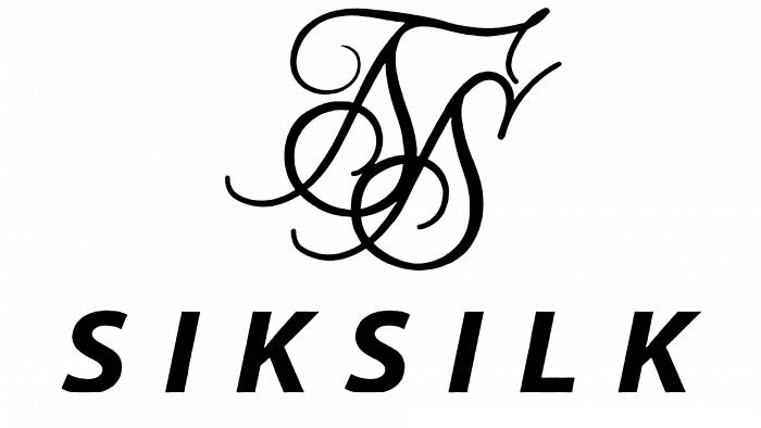
The SikSilk logo is sleek and graceful. The emblem encodes the ease of movement, the cut to the figure, and the unique style. Clothing brings gigabytes of beauty to the streets and makes streetwear more presentable.
SikSilk: Brand overview
| Founded: | 2012 |
| Headquarters: | United Kingdom |
| Website: | siksilk.com |
Meaning and History
The brand is inspired by the best athletes in the world, as well as casual street style. This combination can be seen in everything related to the British clothing manufacturer. He is also guided by refined elegance, combining sports with city streets with surprising ease.
This principle also applies to corporate identity, in which individual dynamics transforms into a modern rhythm of life. The young company chose an extraordinary logo: an old-style monogram with handwritten letters and thin curved lines.
What is Sik Silk?
Sik Silk is a British fashion brand that produces urban and sportswear clothing, which has significantly influenced modern urban fashion culture. It was founded in 2012 and officially registered in 2013. The brand is located in the city of Scarborough. The company was established by three friends: Sam Kay, David Thomson, and Barry Gill.
As a new brand focused on a sports environment, it looks unusual, evoking a sense of retro elegance. At the same time, the label attracts attention and effectively stands out from the rest.
SikSilk: Interesting Facts
SikSilk, a British fashion brand, stands out for mixing streetwear, sportswear, and trendy fashion.
- Start: Founded in 2012 by three friends from Scarborough, England, SikSilk began with baseball jerseys and has grown into a broad fashion line.
- Rise to Fame: From a bedroom operation, SikSilk gained global fame quickly, using social media and influencer marketing to reach a wide audience.
- Working with Influencers: Collaborations with athletes, musicians, and influencers have boosted SikSilk’s visibility and helped it resonate with its audience.
- Inspirations: SikSilk draws from sports, street culture, and high fashion, creating a unique style that appeals to those looking for a new spin on urban and athletic wear.
- Global Presence: From its UK roots, SikSilk has expanded worldwide, reaching Europe, North America, Australia, and Asia, showcasing the broad appeal of its designs.
- Expanded Product Line: Initially focusing on men’s apparel, SikSilk now offers women’s and children’s clothing, including t-shirts, hoodies, jackets, and footwear.
- Diversity and Inclusivity: SikSilk is committed to diversity, aiming to reflect and celebrate various cultures and styles in its fashion and marketing.
- Sustainability: SikSilk is working to use more sustainable materials and practices to address the importance of environmental sustainability in fashion.
- Charitable Work: SikSilk engages in charity, supporting community causes and demonstrating its commitment to positive social impact.
- Cultural Influence: Beyond fashion, SikSilk influences broader cultural trends, playing a part in merging sportswear with streetwear and showing the appeal of combining athletic functionality with street style.
SikSilk continues to evolve, leaving a significant mark on international fashion with its creative designs, commitment to inclusivity, and understanding modern consumer desires.
Font and Colors
The SikSilk graphic symbol is composed of the symbols that go into its name. The letters are written in italics, as closely as possible, resembling sweeping handwriting. They are decorated in a figured monogram, where two “S” are visible. It also has an impromptu “I,” the outlines of the “L” are guessed. This combination of an outdated emblem with an ultra-modern concept creates a unique image with a characteristic entourage.
The color palette of the logo is monochrome. Moreover, black and white sometimes change places, acting either as a background or as a graphic sign. Another option is in use – white and gold. In this case, the letters are placed on a dark substrate and outlined with a thin red line. This emblem is used in contrast to casual youth clothing.
SikSilk color codes
| Black | Hex color: | #000000 |
|---|---|---|
| RGB: | 0 0 0 | |
| CMYK: | 0 0 0 100 | |
| Pantone: | PMS Process Black C |


