The SilkAir logo spreads its wings and paints the sky in bright colors. The places the company has visited have been made safe and comfortable for passengers. The emblem represents a carrier that connects countries and continents.
SilkAir: Brand overview
In 1975, Tradewinds Charters started as a regional charter company under the wing of Singapore Airlines, leasing aircraft for leisure activities.
Influenced by Singapore Airlines’ visionary development strategies, a subsidiary, SilkAir, emerged ready to capitalize on the growing airline market.
In 1992, Tradewinds Charters was rebranded as SilkAir, which pays homage to the famous Silk Road, a historic trade route known for its cultural exchange between Asia and Europe.
The rebranding ushered in a new era of growth for SilkAir as the company expanded its network and launched scheduled passenger flights to exciting destinations in Southeast Asia, the Indian subcontinent, East Asia, and Northern Australia.
As the aviation industry evolved, Singapore Airlines realized the need to adapt and consolidate its operations. Consequently, the decision was made to integrate SilkAir services into Singapore Airlines and its subsidiary low-cost airline, Scoot, by the end of 2021. This strategic move ensured a seamless transition for passengers. It enabled the Singapore Airlines Group to improve operational efficiency while maintaining the quality and service levels for which SilkAir was known.
Meaning and History
What is SilkAir?
It was a regional airline based in Singapore and a subsidiary of Singapore Airlines. It operated short- and medium-haul flights connecting Singapore to various Asian destinations, including Southeast Asia, South Asia, and China. Known for its high service standards, the company offers a full range of services such as in-flight meals, entertainment, and baggage allowance. The airline’s operations and routes have been integrated into Singapore Airlines to optimize services and enhance connectivity.
1989 – 1992
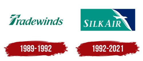
SilkAir began its history in 1989 as Tradewinds Charters and chose its first logo closely linked to this name and its symbolism. The name was inspired by the warm, reliable trade winds associated with sea voyages and the discovery of new horizons. This choice appealed to customers eager to experience something new and extraordinary in their travels. Known for their consistency and predictability, the trade winds highlighted the company’s reliability as a carrier providing safe and comfortable flights.
The company’s logo was designed in a pleasing green shade that caught the eye with its brightness and emphasized the beauty of nature. It is reminiscent of ocean waves and the tranquility they bring. Green is traditionally associated with harmony, growth, and freshness, perfectly matching the company’s image of offering relaxing and enjoyable travels.
The visual symbol of the logo is a white seagull with outstretched wings inside the capital letter “T.” This seagull represents the company’s airplanes, which glide smoothly and gracefully through the air, like birds, carrying passengers across oceans and continents. The image of the seagull adds lightness and loftiness to the company’s image, highlighting its aspiration to reach new heights in the aviation industry.
1992 – 2021
Tradewinds Charters was renamed SilkAir in 1992 and given a new logo featuring a white bird. It symbolizes flight, freedom, and the ability to travel great distances. The bird spreads its wings wide, dividing the rectangular base into two parts: dark turquoise and blue. The name of the airline is written behind the bird. The designers used all capital letters but enlarged the “S” and “A” to emphasize the two words. Despite the serifs, which usually add weight, the italicized font feels light. This emblem was used until 2021, when SilkAir was absorbed by Singapore Airlines.
The emblem’s dark turquoise and blue color symbolizes the reliability and peace of mind valued in the aviation industry. The enlarged “S” and “A” draw attention to the individual words and give the design a sense of balance and symmetry. Singapore Airlines’ takeover of SilkAir in 2021 marks the end of an era, as the distinctive branding and logo are no longer used.


