


 Simplilearn Logo PNG
The Simplilearn logo represents vast opportunities for everyone who uses the learning portal’s services. It is positive and harmonious, drawing attention with its unique structure. The emblem reflects a commitment to growth, development, and the positive impact of education on individuals.
Simplilearn began in Bangalore in 2009 as Krishna Kumar’s blog for professionals preparing for the Project Management Professional exam. In 2010, it became an online learning platform with structured PMP courses. From 2011 to 2012, the catalog expanded into risk and quality management, while Helion Venture Partners invested $3 million to improve its technical infrastructure.
Expansion into the United States followed in 2013, alongside courses in cybersecurity and digital marketing and partnerships with major technology companies. In 2014 and 2015, Simplilearn acquired Market Motive for $10 million and entered cloud computing and data analytics. In 2016, the platform added interactive features, student support, and corporate training programs.
During 2017 and 2018, machine learning and artificial intelligence became major areas of study, and the number of learners passed one million. A 2019 partnership with IBM introduced a career program in AI and machine learning, while cloud and cybersecurity offerings continued to expand. In 2020 and 2021, Blackstone invested $250 million to develop technology, course content, and international operations.
New blockchain and advanced analytics programs arrived in 2022. By 2023, Simplilearn had trained more than three million professionals in over 150 countries and worked with more than 2,000 companies through professional education and corporate training. Its catalog continued to change with technical skills and labor market demand.
Meaning and History
What is Simplilearn?
This learning platform helps individuals develop in-demand digital skills in data science, artificial intelligence, cloud computing, cybersecurity, and digital marketing. It offers courses that combine theory and practice, including live sessions, self-paced learning, and hands-on projects. The platform partners with leading companies and universities to ensure the training meets current market demands. As a result, professionals worldwide gain new knowledge and skills to advance their careers in the digital economy.
2010 – today
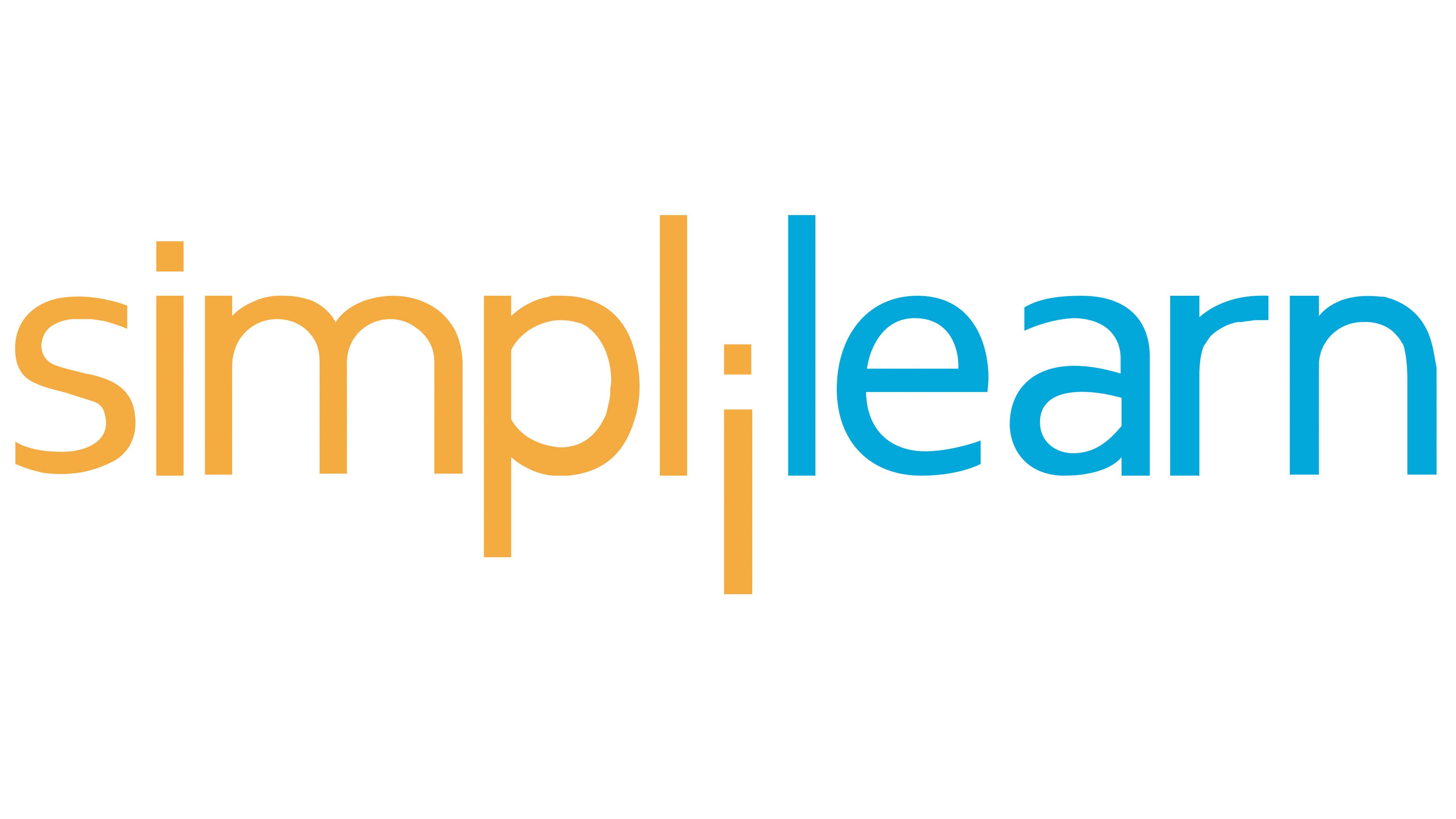
This brand has a striking logo that perfectly conveys the concept of growth. The Simplilearn emblem is text-based yet creatively designed, with some glyphs serving as graphic elements. Specifically, the following details stand out:
- One “i” (located in the middle, being the sixth letter from both the beginning and the end);
- Two “l” s (positioned on the right and left sides of the central letter).
To illustrate the success that can be achieved by learning on this platform, the designers lowered the “i,” making it, along with the side “l” s, resemble a person raising their arms in celebration of the opportunity to enhance their knowledge. It seems to greet everyone ready to join the learning process.
The name is visually divided into two parts: the word “simpli” is rendered in orange, while “learn” is in blue. Despite its vibrant look, the text remains restrained due to muted, pastel-like colors.
The font in the Simplilearn emblem is lowercase, with no capital letters, to maintain the harmony of the “lil” combination, which is essential for conveying the concept. Otherwise, the emphasis would shift to the first letter of the text. All glyphs are sans-serif and semi-bold. Some are rectangular, while others are rounded. The designers balanced these styles so the differences do not stand out visually.