


![]() Sisley Logo PNG
Sisley Logo PNG
The Sisley logo shows premium cosmetics rich in beneficial herbal ingredients. The brand offers a full range of skincare products. The emblem elements convey the company’s confident market position and the breadth of its buyer base.
In 1972, French perfumer Jean-François Laporte and Roland de Saint-Vincent launched a small fragrance company in Paris. The early years were unstable, and by the mid-1970s, the business required new leadership.
In 1976, Hubert d’Ornano acquired the company. His background came from a family deeply embedded in the cosmetics sector. In 1946, he and his brother Michel founded Jean d’Albret. In 1953, together with their parents, Guillaume and Elisabeth, they created Orlane, which later became a recognized European brand. Guillaume d’Ornano had earlier been involved in founding Lancôme and served on the board of Coty.
After selling Orlane, Hubert pursued a different direction, focused on plant-based cosmetics. He renamed the company Sisley, in honor of the painter Alfred Sisley. Alongside his wife Isabelle and chemist Egmont Desperrois, he developed principles of phytocosmetology, centered on plant extracts and essential oils, at a time when L’Oréal and Estée Lauder emphasized synthetic formulations.
The first notable release was Eau de Campagne, initially created for Isabelle and worn privately for years before commercialization. In 1980, Sisley introduced Ecological Compound, positioned around maintaining skin balance.
Growth remained controlled through the 1980s. Production stayed in France, with laboratories in Saint-Ouen-l’Aumône and a factory later acquired in Blois. Distribution focused on department stores, pharmacies, and spas.
Family involvement expanded over time. Philippe d’Ornano joined in 1986, Christine in 1993, and Elisabeth appeared in campaigns during the 1990s. In 2013, Philippe became president. Hubert died in 2015 after nearly four decades as sole owner. In 2011, the company opened a large research and plant cultivation center near Paris. It expanded to over ninety markets, with most revenue coming from exports.
Meaning and History
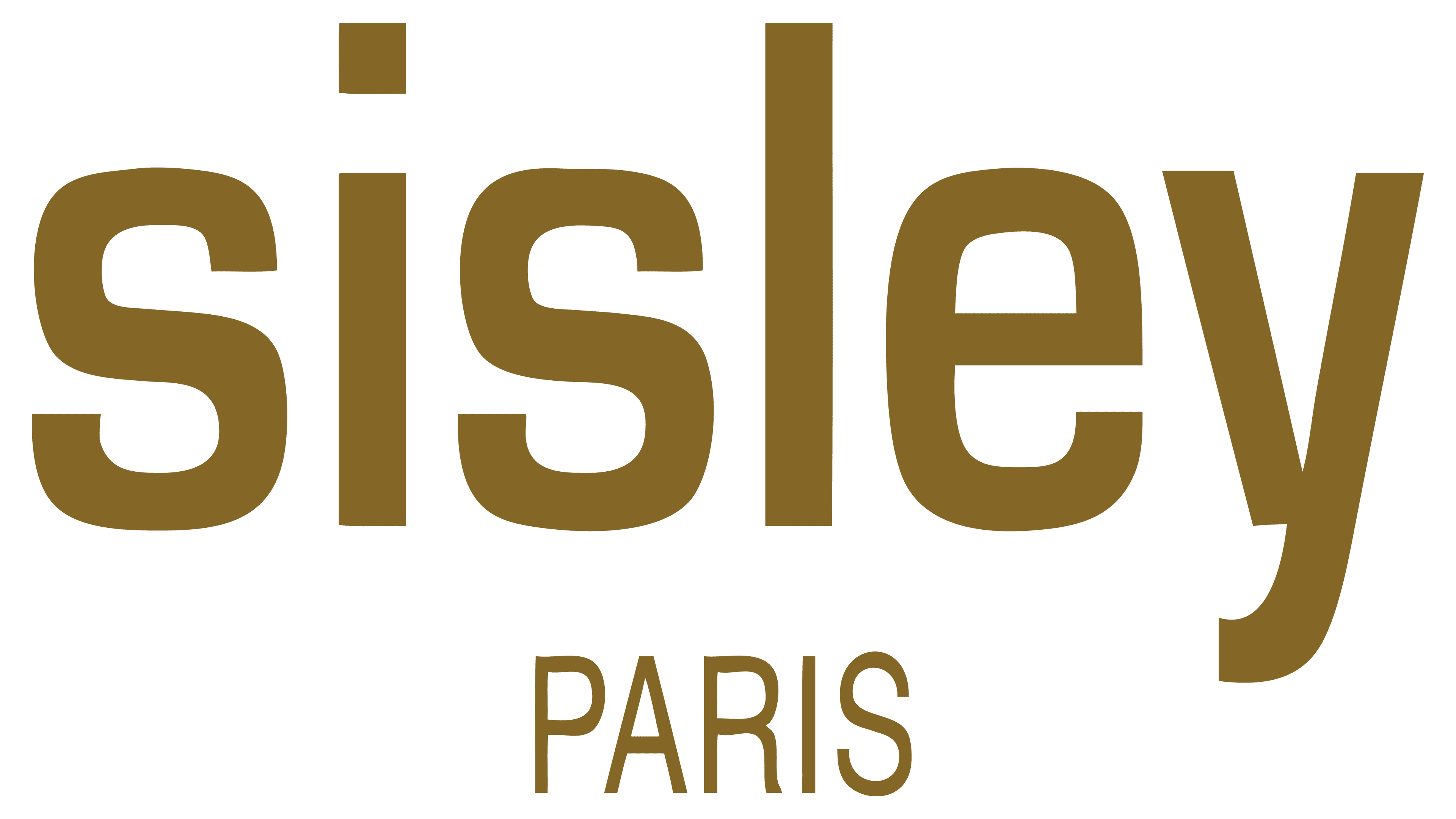
The cosmetic brand immediately acquired a personal mark because each bottle and tube required original labeling. The Sisley trademark has only one logo, and it has not changed over the years.
The key symbolism of the French company is its name combined with an indication of its location. That is, this is a classic version: “Sisley Paris.” The words are arranged in two tiers: the first part of the logo is large, with a wide inter-letter space; the second is small, with thin characters. The background is the usual white color without borders.
What is Sisley?
This company embodies French luxury in skincare and beauty, creating exceptional products that combine botanical knowledge with advanced cosmetic research. Specializing in phytocosmetology, this family-owned business uses powerful plant extracts and essential oils in its skincare, cosmetics, and fragrances. The range includes the famous “Black Rose” cream mask, modern anti-aging products, and color cosmetics. The brand’s uniqueness lies in its meticulous approach to development, with each formula carefully studied and tested to ensure high effectiveness and deliver a luxurious experience that aligns with the French standard of beauty.
Font and Colors
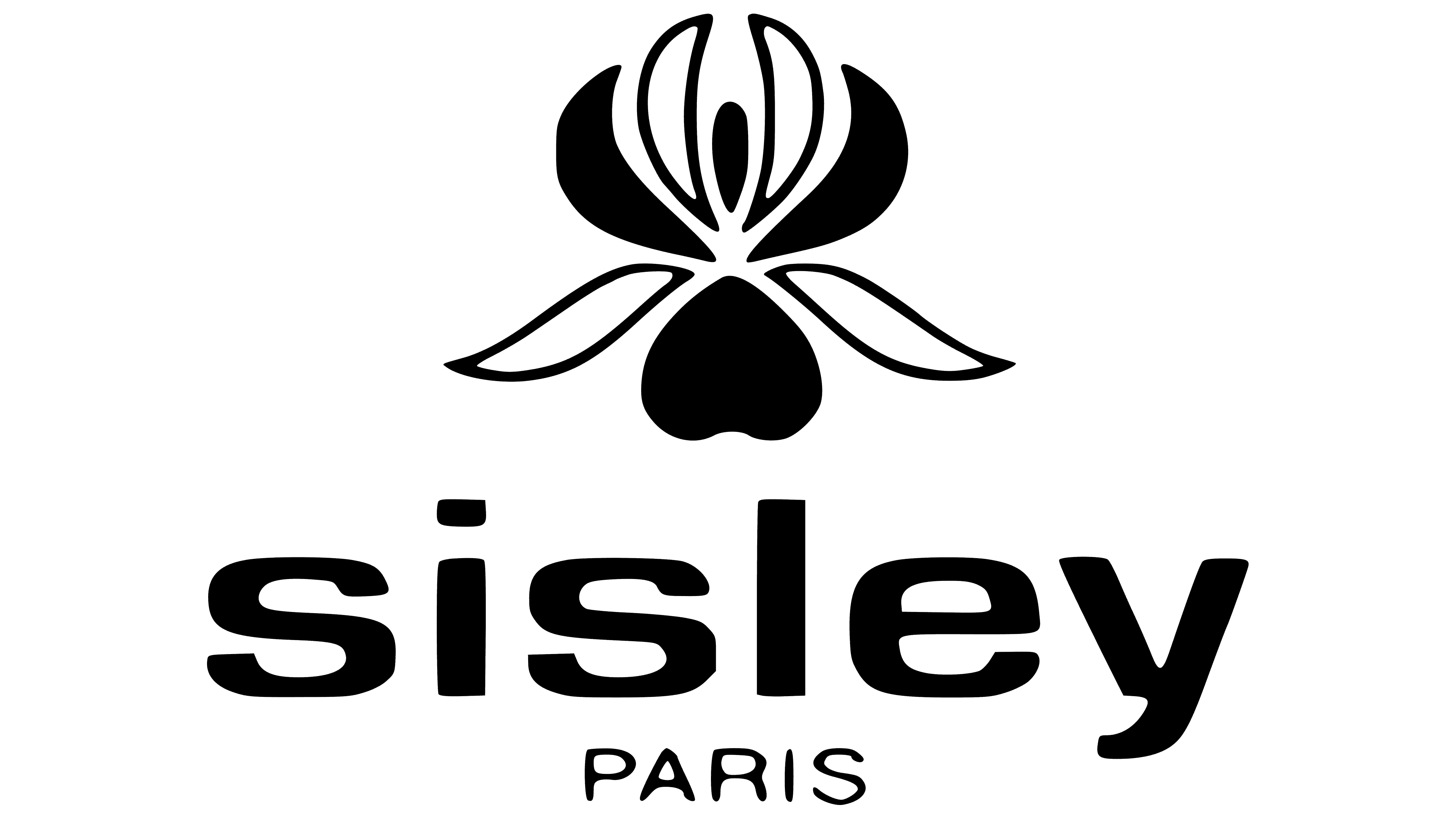
The lettering is set in a sans-serif typeface, so the characters are smooth and sans-serif. There is a rectangular gap at the bottom of the “y.” The dot above the “i” is also a rectangle. The emblem is black and white.