


![]() Sitka Logo PNG
Sitka Logo PNG
Although the Sitka logo doesn’t contain obvious images, it is still associated with hunting gear produced by the American company. The geometric abstraction creates a sense of lightness and movement. These qualities are linked to the comfort necessary for those who spend much time outdoors in the wild.
Sitka Gear began after a 2004 elk hunt in Idaho’s White Cloud Mountains. Jonathan Hart, who had ordered cotton hunting clothes from Cabela’s, faced rain, snow, heat, and a two-hour climb to 11,000 feet. The trip exposed a gap between hunting apparel and modern mountaineering gear. Large retailers such as Cabela’s, Sportsman’s Warehouse, and Bass Pro Shops dominated the market. Yet, technical fabrics were still rare in hunting clothing.
Hart turned to Jason Hairston, his former classmate at the University of California, Davis. Hairston had been a starting linebacker for UC Davis before a neck injury damaged his fifth and sixth cervical vertebrae. In 1995, he signed with the San Francisco 49ers as an NFL free agent, later trained with the Denver Broncos, and ended his sports career in 1996 before entering commercial real estate.
In 2005, Hart and Hairston mortgaged their homes. They founded Sitka in Bozeman, Montana, naming it after the Alaskan town on Baranof Island. Hairston sold his stake in the real estate to finance the launch. The first products used a licensed camouflage pattern and were shipped through Schnee’s. Revenue reached $300,000 in year one, $1.2 million in 2007, and $4.3 million in 2008 as Sitka reached major hunting chains.
The brand hired designers from Mountain Hardwear and Arc’teryx and worked with 16 sponsored “hunter-athletes” who filmed expeditions. Its main technical advance came through W.L. Gore & Associates, with Gore-Tex layered clothing systems and the Optifade camouflage pattern. In 2009, Hart sold Sitka to W.L. Gore during the financial crisis. Hairston left and founded Kuiu in 2010, while Sitka expanded into mountain, wetland, forest, women’s, wader, and fishing lines.
Meaning and History
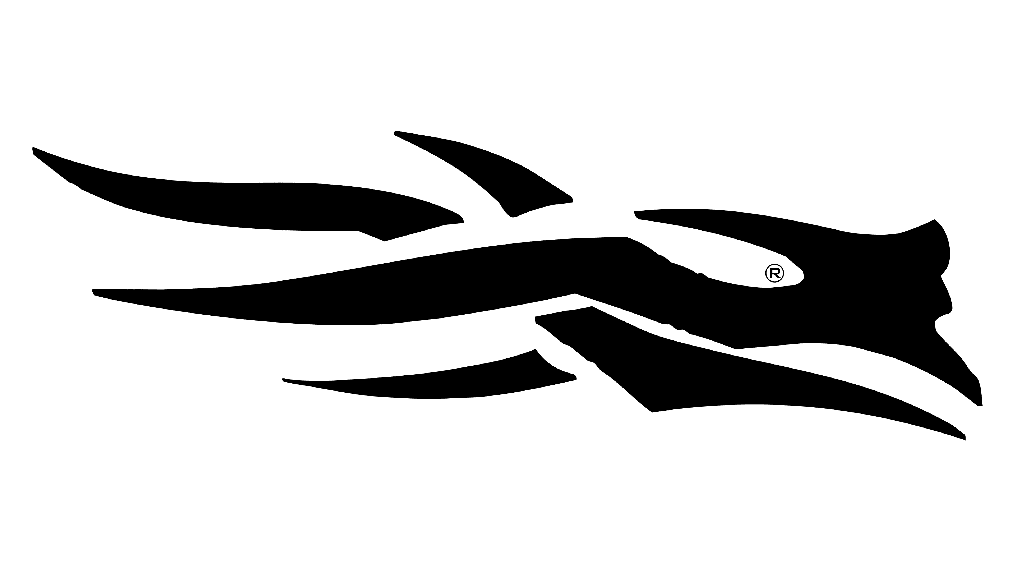
The company was named after the eponymous city on Baranof Island in Alaska. “Sitka” literally means “People on the Outside of Baranof Island.” Perhaps the hunting gear manufacturer chose this name because many locals hunt. The logo featuring stylized antlers was chosen for the same reason: deer are a common prey species for the people of Sitka. However, brand fans continue to debate what its graphic sign means. Some see it as a design by Native Americans, others as a mane of the Denver Broncos’ horse, or a running person. Nonetheless, representatives of the Sitka brand have always claimed that it represents two antlers. Collecting skulls and antlers is an important part of the hunting culture.
What is Sitka?
Sitka is an American hunting gear brand. It was founded in 2005 by Jason Hairston and Jonathan Hart to draw on the best of the mountaineering industry and adapt it for hunting enthusiasts. The first batch of products was sold through mail catalogs. Then, the business rapidly grew, and the products appeared on the shelves of major stores. In 2009, amid the economic crisis, financial director Justin Faggioli suggested selling Sitka to W. L. Gore & Associates Inc., the developer of Gore-Tex fabrics.
Today
![]()
The SITKA logo features an abstract pattern that resembles stylized antlers. The white spaces between the elements give the design a light feel while maintaining clarity. The inner space within the symbol forms a geometric pattern that echoes natural motifs.
The SITKA logo consists of an abstract pattern reminiscent of stylized antlers and the company name, reflecting SITKA’s connection to nature and focus on hunting gear. The upper part of the logo features a dynamic design composed of elongated, intersecting lines with sharp edges. This reinterpreted depiction of deer antlers symbolizes hunting and the rugged conditions for which the gear is designed.
Beyond the obvious hunting theme, the antlers in the logo also resemble gusts of wind, highlighting the company’s focus on wind-resistant technologies in its clothing. The lines of the antlers are broken, creating a sense of lightness and motion, while the gaps between the elements make the image feel airy.
Beneath the graphic element, the company name is displayed in uppercase letters with increased letter spacing. The font is serif and strict, with its simplicity balancing the complexity of the upper symbol.
The color scheme is minimalistic: black and white. The contrast gives the emblem a rugged, natural feel. The logo conveys the spirit of hunting, survival, and performance in challenging environments. It is designed for those accustomed to nature who understand that high-quality gear is not just about comfort but a necessity.
Font and Colors
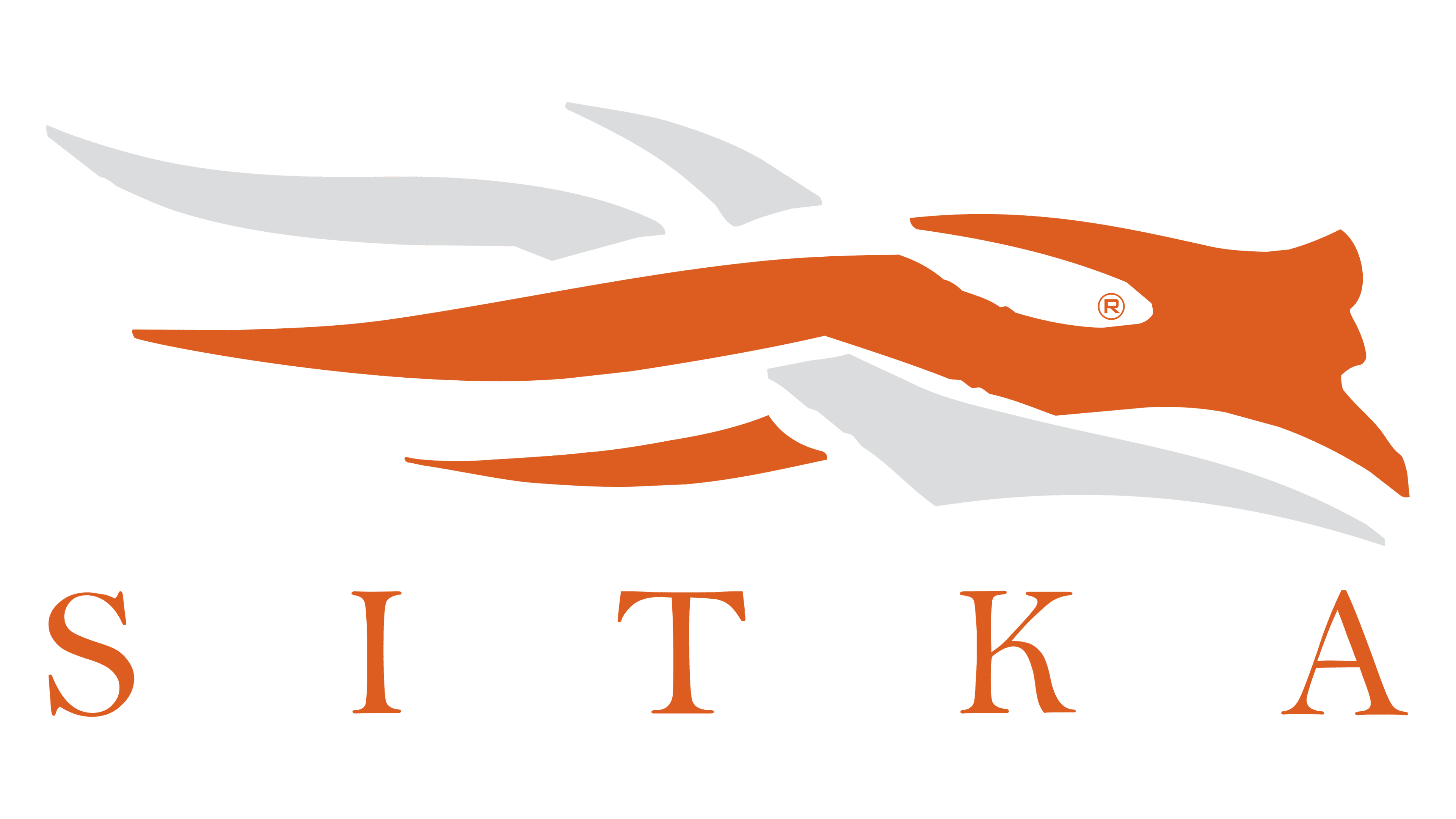
The brand name is executed in a font with long, pointed serifs. The thickness of the main and additional strokes varies, so the wordmark appears mobile, resonating with the graphic emblem’s shape. The lower diagonal of the “K” has a characteristic smooth curve.
The inscription and the drawing are colored in black, while white is used as the background and for negative space. The monochrome palette emphasizes the company’s business style and its serious approach to producing hunting gear.