![]() Six Eleven Logo PNG
Six Eleven Logo PNG
The Six Eleven logo reflects the company’s multitasking nature, spanning many business processes. Its clear structure symbolizes the organization of work, and the symmetrical geometric form conveys balance in communication with clients.
Six Eleven began in Davao City in 2005, when the BPO industry on Mindanao was still developing. The company opened with only 20 seats and focused on sales, marketing, customer support, telemarketing, and contact-center services. From its early years, it presented itself as a Filipino-run operator, unlike many Philippine call centers that were created as local branches of large foreign corporations.
The company officially started operations in May 2006. In January 2007, Six Eleven opened its second call center in Manila, already with 200 seats. That move took the business beyond Davao and gave it access to the capital’s larger labor market, helping the company shift from a regional player into a broader Philippine outsourcing provider.
Six Eleven later returned to strengthening its base in the south by opening an office in General Santos City. The expansion helped the company recruit across Mindanao and reduce its dependence on a single local market. Its growth was gradual and internal, rather than based on mergers or acquisitions. From 20 seats in 2005, the company grew to about 3,000 seats over the following years and reached 5,000 employees by 2025.
Michael Bian has served as CEO since Six Eleven’s founding, after studying at the University of Asia and the Pacific from 2000 to 2005. In the Philippine BPO market, the company has worked alongside much larger competitors such as Teleperformance Philippines and Concentrix, while maintaining its independent Filipino management and its roots in Davao, General Santos City, and the wider Mindanao region.
Meaning and History
![]()
Six Eleven Global Teleservices got its name because its main service is telemarketing, i.e., consultations and direct sales over the phone. The term “Global” implies an aspiration to expand and reach a global level. Similar ideas are conveyed in the logo, which used to look different. Designers modernized it to show a new era in the brand’s development and progress, and the number of employees increased from 20 people (in 2005) to 3000 (in 2021).
What is Six Eleven?
Six Eleven is a Philippine company that provides business process services. It handles various tasks, from communicating with clients to filling out documents. Its agents handle calls, manage accounting, oversee financial transactions, provide IT support, code personal information, and promote products and brands. All this simplifies the work for other firms, allowing them to focus on core activities and reduce costs.
Old
![]()
When the company was less well-known, it used a logo that included its full name. The largest was the blue word “six,” where a large dot above the “i” represented the planet, and the second-largest was the green “eleven.” These were in the top line and consisted of lowercase letters in bold italics. Designers added sparkle by using a gradient with shades of varying brightness. The bottom line was occupied by the red-and-blue phrase “GLOBAL TELESERVICES.” Despite its small size, it was typed in uppercase glyphs.
To the left was an uneven semicircle with sharp projections. It combined two colors: red and yellow. At its base, it hovered three small blue spheres. All geometric shapes cast a gray shadow on the surface, creating a sense of three-dimensionality. The emblem was complemented by an orange motto: “Quality the first time, every time.”
New
![]()
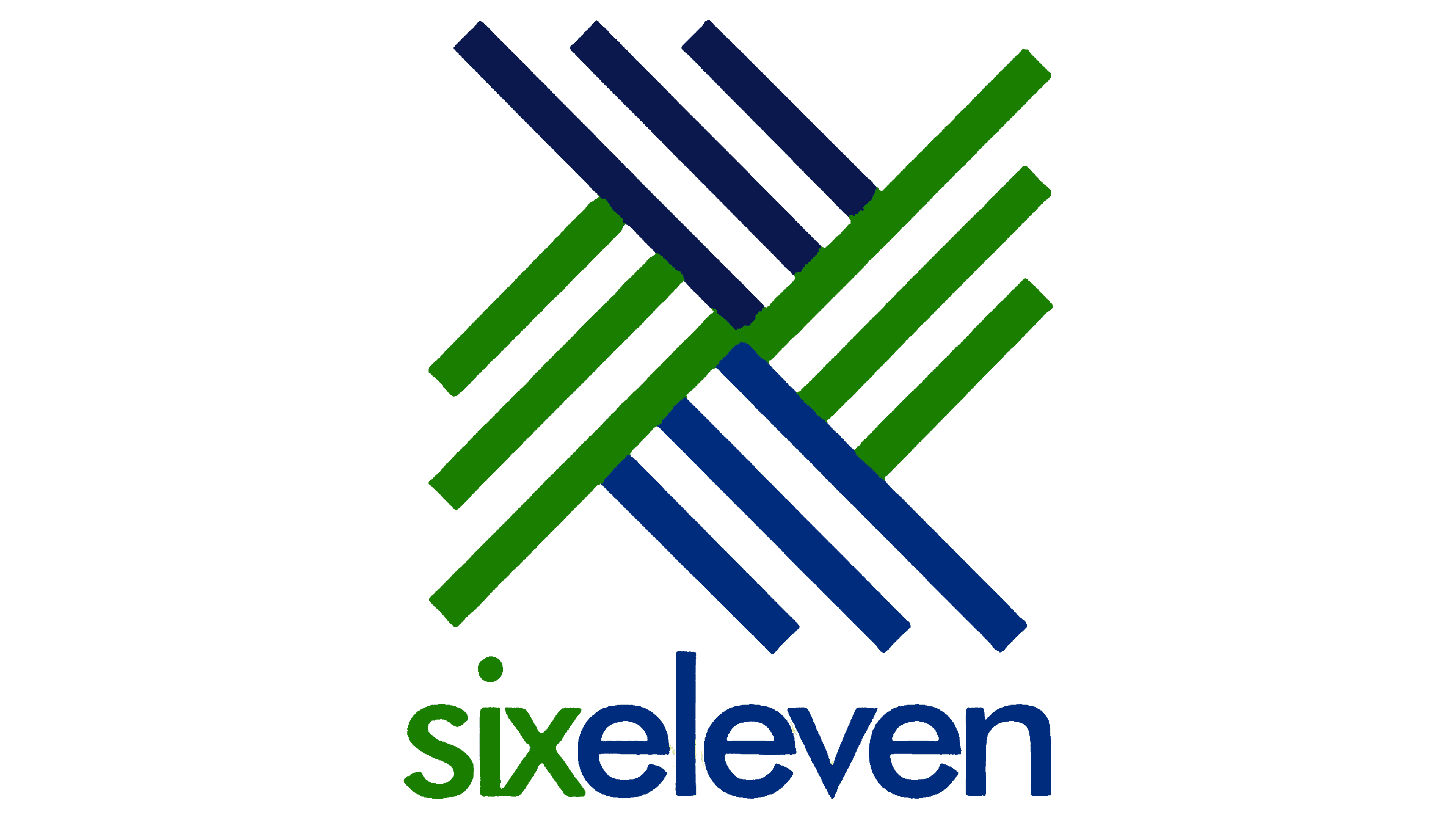
Having become better known, the company began using a logo featuring its abbreviated name, no longer mentioning its field of activity. Now, it contains the single inscription “six eleven.” These two words, as before, consist of lowercase letters without serifs. There is no wide space between them, and to prevent them from blending, designers separated them using color. Light green “six” and blue “eleven” form a stylish combination.
The same shades are used for an abstract pattern of thin stripes. The pattern on the left side of the emblem is shaped like four blades of a windmill. Straight lines radiating in different directions symbolize the connection between the company’s employees and their clients.
Font and Colors
The name of the Philippine firm is written in bold lowercase sans-serif font. It is a modern, minimalist design whose main advantage is easy readability and recognizability, even at small sizes.
The colors of the logo are also thoughtfully chosen: the combination of green and blue creates an atmosphere of harmony and tranquility. Blue is often associated with professionalism, while green signifies energy and freshness. Together, they create a sense of novelty and positive change.