


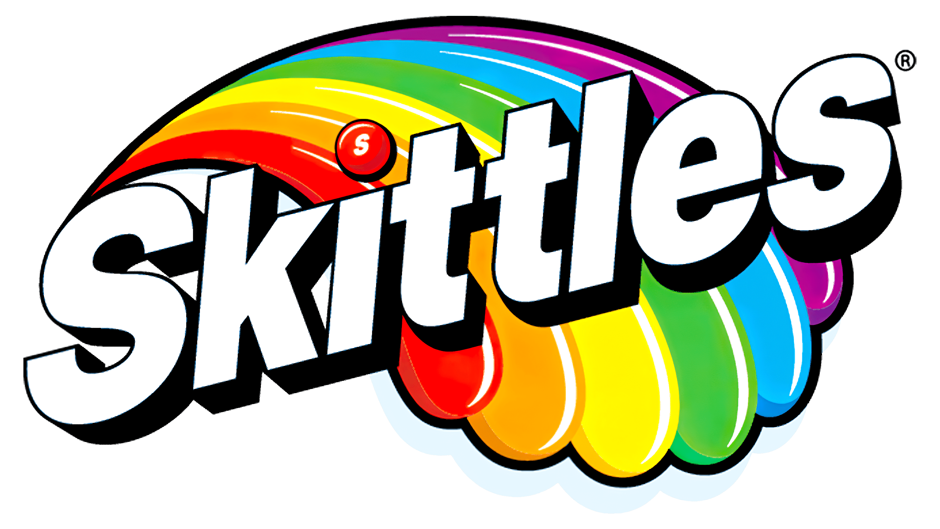
![]() Skittles Logo PNG
Skittles Logo PNG
Vibrant imagery complements vibrant tastes perfectly, which is why the Skittles logo is incredibly colorful. An inscription with standard letters balances the color spots and harmonizes the image of small, sweet dragees. Of course, the emphasis is on the candy: it is depicted above the “i,” replacing the traditional dot.
The Skittles brand adopted the logo immediately upon its introduction in 1974. It is one of the most famous brands, and its identity is well-known worldwide. This is not surprising, as the American company manufactures multicolored round candies. They have a sugar-glazed coating that resembles a shell, on which the letter “S” is applied. The sweet is available in several flavors: Sour, Smoothie, Sweet Heat, Dessert, Wild Berry, and Tropical. The current brand owner is Wrigley (a subsidiary of Mars, Inc.).
Skittles launched in the UK in 1974, capturing the hearts of candy lovers with flavors like orange, lemon, lime, blackcurrant, and strawberry. The company behind Skittles later became part of Mars, Incorporated. By 1979, Skittles made its way to the US, becoming popular for its vivid colors and fruity flavors. The slogan “Taste the Rainbow” was quickly associated with the brand, highlighting its colorful appeal.
Throughout the years, Skittles introduced various products, including Skittles Sour, enriching its flavor selection. The 1980s marked the introduction of resealable packaging, enhancing convenience for consumers. The 1990s saw Skittles affirming its global presence, reaching over 65 countries through effective marketing and sponsorships.
The 2000s were a period of innovation for Skittles, as the brand launched new flavors and limited editions and engaged in interactive campaigns like “Skittles Touch.” In 2009, the brand introduced Crazy Cores, candies with two flavors in one, and explored collaborations, such as Skittles Oreos.
In 2016, Skittles responded to consumer demand for natural ingredients by removing artificial colors from its candies. The brand’s evolution continued with the introduction of Skittles Gummies in 2021, offering a new way to enjoy Skittles flavors.
Meaning and History
![]()
This confectionery enterprise was originally British. It was in the UK that colored round sweets in hard shells first appeared, which is where it got its name. The word “Skittles” is taken from the sports game of the same name. The reason is the similarity of round sweets with the chips used in them.
After 1974, these candies began to spread worldwide, and in 1979, they first reached the American market. Their production in North America started in 1982. At the same time, strong marketing support was launched, and the slogan “Try the Rainbow” was coined. Its author is the New York advertising studio D’Arcy Masius Benton & Bowles.
This brand’s visual identity exactly matches its name and product. Therefore, the Skittles logo was bright and included a rainbow fragment. However, there are discreet options with text design. In total, this product has four emblems.
What is Skittles?
Skittles is an American brand of brightly colored candies in the form of flat dragees. They are distinguished by various flavors and a multi-colored glazed shell with the miniature letter “s.” There are several types of such sweets: Sour, Smoothie, Sweet Heat, Dessert, Wild Berry, and Tropical. The trademark first appeared in 1974. Its current owner is Mars Corporation, which owns the manufacturer of these sweets (Wrigley Company).
1974 – 1982
![]()
The earliest logo consisted of the company name. It was in light gray type on a white background. The letters were printed, chopped, even. The “i” was of design interest: instead of the classic dot, it used a round yellow dragee. The candy was large and bright, standing out from the other signs. Typographic emphasis was also placed on the double “tt.” They had one common crossbar in the form of a wide horizontal line, so lowercase glyphs looked like a capital “H.”
1982 – 2003
![]()
After Skittles became an American company, it changed its logo. It became catchy and joyful, with a rainbow fragment to match the advertising concept: “Try the Rainbow.” A multicolored arch served as the background; next to it were depicted chaotic red dots, suggesting an explosion of taste.
The brand name took center stage. It was in white letters with a red border. Thanks to her, the glyphs did not look like empty spaces but took the desired shape of smooth, grotesque symbols. The dot above the “i” was replaced by a miniature cloud from behind which the narrow end of the rainbow emerged. The inscription was diagonal. Below was another, but smaller. It said: “Taste the Rainbow.” The crossbar at the double “tt” designers has disconnected.
2003 – 2009
![]()
Since the redesign of the Skittles logo, the visual identity has taken on a more restrained look. The brilliance, of course, remained, but it was less dynamic than in the previous emblem. The artists placed the rainbow sideways, adding a blur and gradient to it, bending it into a wide arch that ended at the edge of an imaginary rectangle. An even cut in the lower part of the arc evidenced this. The opposite end was made narrower. It started at the top of the “i.”
The developers rotated the first inscription and replaced the second; the phrase “Bite Size Candies” now appears under the brand name. Although the grotesque font in the word “Skittles” was retained, dark purple shadows were added to each sign. The edges of the glyphs were outlined in the same color. The bottom inscription became small and red.
2009 – today
![]()
The modern Skittles logo is less colorful than the previous one, but it is not boring like the debut one. It harmoniously combines several shades of a bright palette, but in such a meager volume that the emblem does not seem catchy. Each letter is outlined in dark red, enhanced by a black shadow: close to the characters, it is saturated, and at a distance, it is blurry, with a gray tint. Moreover, the shadows follow the contours of the glyphs.
The inside of the signs is not uniformly white; it has a bluish backlight on the left and bottom. This combination creates a feeling of cold, frosty freshness. The dot above the “i” was brought back and made to look like a round candy labeled “s.” Below the red disc is a feathered shadow.
Font and Colors
Although the Skittles trademark has changed its logo several times, it has remained a word-graphic. In some cases, it was an explicit drawing, multi-colored and bright, and hidden; in others, it was a single one. However, it was still present in candy form. The first emblem was painted yellow, and the current one is red.
Skittles chose one of the modified versions of the classic Helvetica Black typeface for its visual identity. The letters are geometric, chopped, and smooth, with smooth edges, arranged diagonally, and decorated with shadows.
Rainbow colors were not always used in the logo; there is also a discreet palette of gray and black. Despite the color, red and white are predominant and present in most emblems except the first.
FAQ
What do Skittles symbolize?
Skittles are more than a well-loved candy; they’ve become a symbol that people everywhere feel connected to. Their bright colors and sweet flavors remind many of us of our childhoods, bringing back happy memories and feelings.
Looking at Skittles, with their various colors, reminds us of childhood joys. They remind us of a simpler time when finding happiness in the little things was easy. Sharing Skittles with friends or family is a way to bring joy and bring us closer together, evoking fun times and laughter. Skittles remind us to enjoy life’s small, happy moments and find joy daily. Opening a pack of Skittles feels like discovering a range of possibilities, where each piece gives a burst of flavor and a break from life’s busyness. Skittles are not just candy. They represent joy, innocence, and the variety of life.
What slogan goes with Skittles?
The slogan “Taste the Rainbow” has become synonymous with Skittles, serving as an integral part of the brand’s identity since its introduction in 1994. This catchphrase encapsulates the essence of Skittles: a variety of flavors and colors that offer consumers a unique, diverse sensory experience, much like witnessing a rainbow’s splendor. The slogan cleverly invites people to explore the multitude of flavors in each pack of Skittles, suggesting that enjoying them is akin to experiencing the rainbow’s expansive beauty and joy.
In a creative twist for the 2018 Super Bowl campaign, the slogan was momentarily altered to “Exclusive the Rainbow, Taste the Rainbow.” This variation underscored the uniqueness of the Skittles Super Bowl advertisement, famously shown to just one viewer, a fan named Menendez. This marketing stunt played on exclusivity while aligning with the brand’s overarching message of inclusivity and joy, tapping into the universal appeal of tasting the rainbow.
What is the name of the Skittles font?
The Skittles logo uses a font that looks much like Helvetica Black but is different. It’s a special version made just for Skittles. They changed some of the letters to make them unique for their brand. One of the biggest differences is the letter “S,” which sets it apart from other fonts.
Helvetica is a common font created in 1957 by Max Miedinger and Eduard Hoffmann in Switzerland. It’s known for being easy to read and clean, which is why many brands and designers prefer it. However, some companies have changed it to better fit their style. These changes help Skittles stand out and showcase its playful, lively brand personality. It’s a smart move that makes Skittles look memorable in the candy world.
Is Skittles changing their logo?
For Pride Month, Skittles is doing something special by changing its usual rainbow packaging. Instead of the colorful design we all know, Skittles is celebrating by featuring artwork from LGBTQ+ artists on its packages. This isn’t just about changing how the packets look; it’s Skittles showing its support for the LGBTQ+ community in a big way.
By turning its packaging into a showcase for LGBTQ+ artists, Skittles wants to highlight this community’s diverse talents and contributions. This Pride Month change shows Skittles’ strong commitment to diversity and to supporting LGBTQ+ rights. It’s a major move showing Skittles cares more than just selling candy. By standing with the LGBTQ+ community, Skittles is making a statement about the value of representation and allyship. This effort goes way beyond typical marketing; it’s about recognizing and honoring the wide range of diversity in society and the arts.