The company’s cars are like an arrow flying at a target. Their wheels are fast and quiet, and their engines are built with the environment in mind. The Skoda logo conveys the message of energy efficiency, speed, and movement.
Skoda: Brand overview
Skoda (full name Skoda Auto) is a Czech passenger car manufacturer and the world’s fifth oldest automotive industry representative. He is engaged in their design and assembly, covering over a hundred countries. The company was founded by two entrepreneurs – Vaclav Laurin and Vaclav Klement. Currently, it is a subsidiary of the German concern Volkswagen Group. The year of its appearance is 1895th. The headquarters are located in Mlada Boleslav (Czech Republic).
The beginning of Skoda goes a little further than it is commonly believed: the enterprise was created in 1859 and is associated with the production of weapons. Only at the end of the 90s of the 19th century did the company change its specialization. This was started by Vaclav Klement, who worked as a bookseller in a Mlada Boleslav shop (Kingdom of Bohemia). He founded a repair shop with Vaclav Laurin that grew into a bicycle factory called Slavia from Laurin & Klement.
In 1924, the company experienced a devastating fire, so a few months later, it became part of the Škoda Works concern, founded by Emil Škoda in 1859 in Pilsen. In 1948, this enterprise became state-owned. In 1991, it was privatized by the Volkswagen Group, and in 2000, it became its subsidiary. A change of identity accompanied each stage in the history of the automobile company.
Meaning and History
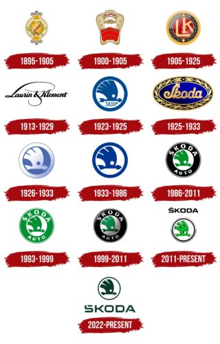
The history of the Czech automobile company Skoda began in 1895; only at that time, it was called Laurin & Klement and produced bicycles. Then she took up the production of motorcycles, and only at the turn of the century – in 1905 – began manufacturing four-wheeled vehicles. The L&K logo adorned cars until the first half of the 1920s, and then the famous “Winged Arrow” of Škoda Auto appeared, which is still used today.
What is Skoda?
The Czech company Škoda Auto produces different types of cars, including hatchbacks, sedans, station wagons, and SUVs. The company was founded in 1859 and originally focused on arms production, and entered the automotive industry in 1925 after acquiring the company, Laurin & Klement.
1895 – 1905
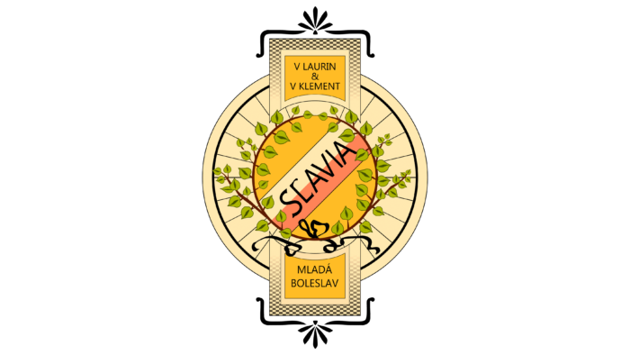
The very first emblem has an unusual shape. In the center is a spoked bicycle wheel entwined with linden branches – a tree symbolizing the Slavs. In the middle, against the white and red stripes (the colors of the Czech Republic flag), is the brand name – “Slavia.” It is written in capital letters, in a thin sans serif typeface. The “L” is shaped like a bicycle handlebar, for which a top stroke has been added. Above and below the wheel are cards with the names of the company owners (V Laurin & V Klement) and an indication of their location (Mlada Boleslav).
1900 – 1905
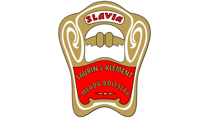
In 1900, the company began exporting Slavia motorcycles. Then 150 copies were sent to London (UK) for the first time for Hewtson. They featured a new logo shaped like a motorcycle tank. By the way, it was there that he was located – on the side of the fuel tank. The brand name is made curly. It contains an ornament of thin white lines with inscriptions on red and white backgrounds: at the top – “Slavia,” and at the bottom – “Laurin & Klement” and “Mlada Boleslav.”
1905 – 1925
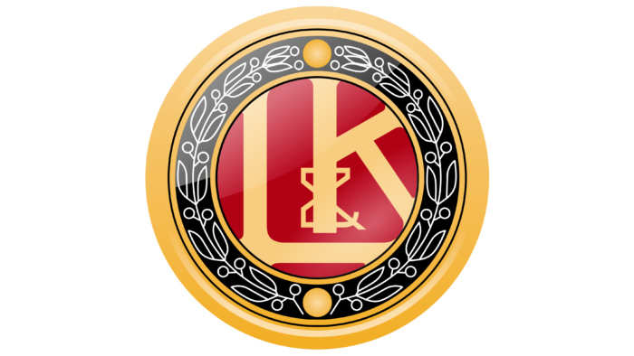
This is the launch period for passenger car production, so the management decided to rebrand the emblem to look spectacular on the parts and the hood. After renaming it Laurin & Klement, the firm commissioned Blecha to create a new logo. The authors gave it the shape of a round seal using a laurel wreath, as it was very symbolic. The name of one of the founders of the company was translated as “Laurin.” In the center on a red background are two large letters – “L” and “K,” connected by an ampersand (&). A wide gold stripe runs along the edge of the logo.
1913 – 1929
In the early 1910s, a logo was created with the black inscription “Laurin & Klement” in a handwritten font. The company’s founders’ names occupied one line on an empty white background without additional decorative elements. The first “L” and the ampersand had elongated lines that curved and swirled elegantly. The rest of the glyphs also looked unusual, especially the lowercase “m,” which had its central stroke separated from the rest of the letter.
1923 – 1925
The company has a logo with a winged arrow, under which the word “ŠKODA” was written. The diacritic was not directly above the “S” but next to it – offset to the left. All the letters were slightly warped, especially the last “D” and “A”: they were compressed into the shape of a white circle where the word was located along with the arrow. The elements and edging ring delineated the emblem’s borders, which were dark blue.
1925 – 1933
After a devastating fire, the car manufacturer Laurin & Klement merged with Škoda Plzeň and changed its name to get a different label. The emblem features an oval with laurel leaves and a new name in coherent italic type.
1926 – 1933
In the late 1920s and early 1930s, a version of the logo without inscriptions was used. The designers have converted the colors so that the center circle is dark blue, while the winged arrow and broad ring are white. At the same time, the frame along the outer edge was circled with an additional blue stripe. It is worth noting that this emblem did not have a pure white color: it had a light blue tint due to a gradient that diverged diagonally from bottom to top, starting from the right side.
1933 – 1986
In 1933, the company adopted its legendary winged arrow emblem. Indian motives inspire it, and it looks like an arrow pointing to the right. Above the arrowhead are feathers, which the Indians usually add to the tails of their arrows so that they can more easily cut through the air and quickly fly forward. The white slot has a keen eye and high production precision; the circle and the globe are perfect.
1986 – 2011
After moving to the Volkswagen Group, the Czech car manufacturer again redesigned the emblem, merging its identity with its new owner. This is how a round badge with a wide black edging appeared, in which “Škoda Auto” is written in white letters. The central element remains the same – the winged arrow. Only its color has changed: green has taken the place of blue.
1993 – 1999
In 1993, the color of the Škoda Auto logo changed: two rings (wide and narrow) in the frame became light green. The main element, the winged arrow, acquired the same shade. Moreover, the central circle, a small circle in the wing, the inscriptions, and one thin ring remained white. The letters’ font and the elements’ shape have retained their former appearance.
1999 – 2011
In parallel, the 3D version of the new logo was approved. The flat logo was used for paper, advertising, and product labeling; the three-dimensional logo was used for placement on the hood.
2011 – today
The current logo contains the same elements as the older version. The developers have removed the word “Auto” and the wide dark edging, replacing it with two thin stripes – silver and black. The Škoda inscription was taken out of the circle.
The Czech company’s identity has gone through a very difficult path from a classic information and text logo to a graphically accurate symbol with a clear semantic load—no wonder this brand name is recognized as one of the most successful in the automotive industry.
2022 – today
Skoda has decided to update its logo for the first time in many years. The changes affected all elements—even the winged arrow, which ceased to be three-dimensional and was repainted in a uniform dark emerald color, like the frame ring. So, the designers have adapted the emblem to digital formats because two-dimensional graphics are better displayed on mobile devices and in print.
The redesign was aimed at highlighting the name of the Czech car manufacturer. Therefore, it is now written in oversized capital letters, and a custom block font is used. All glyphs look unusual. “S” and “A” have cut-out pieces, “O” and “D” are squares with partially rounded corners, and “K” has two diagonals connected with a vertical stroke by a long horizontal strip, which makes the letter look like Arrowhead. The inscription is painted in the same color as the main Skoda symbol.
Interestingly, there is no longer a separate diacritic above the Czech “Š”: it is now integrated into the upper curve of the letter, which makes it look like the English “S.” This was done for two reasons. Firstly, the logo has become symmetrical in this form because there are no protruding elements in the word. Secondly, the disappearance of the “hook” has increased the visibility and recognition of the brand in the global market. It is assumed that the modernized Skoda logo will appear on new car models from 2024.
Skoda: Interesting Facts
Škoda Auto, often just called Škoda, is one of the oldest car makers with a history stretching over a hundred years. Originating from the Czech Republic, Škoda has become a global brand known for making reliable, well-designed cars with good value.
- Cycling Beginnings: It all started in 1895 with Laurin & Klement, founded by Václav Laurin and Václav Klement, making bicycles before moving on to motorcycles and then cars.
- First Car: Their first car, the Voiturette A, came out in 1905. It was praised for its quality and reliability, laying the groundwork for Škoda’s future in the automotive world.
- Joining Forces: In 1925, Laurin & Klement merged with Škoda Works, an engineering giant, transforming into the Škoda Auto we know now. This gave Škoda more resources and tech know-how.
- World War II and After World War II saw Škoda making equipment for Germany. Post-war, the company was nationalized, affecting its operations within Czechoslovakia’s planned economy.
- Famous Cars: Škoda has created iconic cars like the 1960s Felicia and the Octavia, which started in the late 1950s and was brought back in the late ’90s, becoming a global bestseller.
- Joining Volkswagen Group: In 1991, Škoda joined it, starting a new chapter with access to advanced technology and making its cars better and more competitive.
- Rally Racing: Škoda has excelled in rally racing, especially with the Škoda Fabia R5, which has won many titles in the World Rally Championship-2 (WRC-2).
- Going Green: Škoda is serious about being eco-friendly. It’s taking steps to lessen its environmental impact, like using renewable energy in its factories.
- Worldwide Presence: Škoda cars are now sold in over 100 countries, and the brand is growing globally. Its mix of affordability, reliability, and design wins many fans.
- Smart Features: Škoda cars have smart and practical features, such as umbrella compartments in doors and ice scrapers in fuel caps, showing Škoda’s “Simply Clever” philosophy.
Škoda’s evolution from a small bicycle company to a renowned global car brand highlights its adaptability, innovative spirit, and dedication to quality. The brand keeps up with the latest automotive trends and technologies, aiming to meet modern drivers’ needs.
Font and Colors
Skoda’s older visual identity designs used various typefaces with one thing in common – they didn’t have serifs. The only exception was the period with two letters, “L” and “K,” which had a serif’s likeness. In the current emblem, the inscription is in a typeface reminiscent of the Eurostile Extended Black font, created by Aldo Novarese and first published in URW ++.
The color palette has also radically changed. Early logo versions consisted of red, beige, white, brown, and blue, and modern versions of silver, black, and green.
In terms of color scheme, the new Škoda logo continues a long tradition: it is also green but uses a different shade – dark emerald.
FAQ
What does the eye symbolize in the Škoda logo?
The eye in the Škoda logo has important symbolic meaning. It represents vigilance and foresight. The eye is part of the wing and arrow design, giving a sense of movement and direction.
The arrow in the eye symbolizes speed, precision, and rapid forward movement, highlighting the brand’s commitment to progress and dynamic results. The wing symbolizes technological advancement, reflecting the brand’s focus on modernity and continuous improvement in vehicle design. The company specializes in precision manufacturing, ensuring each vehicle meets strict quality standards. The large circle around these elements symbolizes the brand’s global reach and first-class manufacturing standards.
What animal is in the Škoda logo?
The Škoda logo does not feature an animal. Instead, it includes a stylized Indian headdress with feathers and an arrow. The winged arrow symbolizes speed and progress, while the feathers from the headdress add traditional symbolism.
An arrow piercing a structure represents precision and the ability to move forward quickly. The circle around these elements signifies global reach and the highest production standards. The use of the Indian headdress and arrows shows the brand’s respect for traditional motifs while emphasizing modernity and technological advancement.
Why did Škoda change its logo?
The brand updated its logo, its biggest change in 30 years. The new logo was designed to improve the brand’s appearance on digital platforms, especially mobile devices. It also provides greater flexibility when working with different formats.
The goal was to modernize the brand’s image and maintain relevance in the rapidly changing digital world. As more people interact with brands online, having a logo that looks good on all screen sizes is critical. The new design helps the brand stand out and remain recognizable in digital spaces.
What does the Škoda emblem represent?
The emblem is full of meaning and is inspired by Indian motifs. The ring symbolizes the globe, showing the brand’s global reach and presence.
Feathers symbolize progress and development, highlighting the brand’s commitment to continuous automotive technology and design improvement. A small round hole resembling a sharp eye symbolizes vigilance and foresight. This shows the brand’s attention to detail and focus on future development. This keen eye means the brand closely monitors industry trends and technological advancements. The arrow on the emblem symbolizes speed and accuracy, reflecting the brand’s commitment to creating fast, efficient, and reliable cars.
The emblem combines these elements to convey a message of global ambition, constant progress, keen vigilance, and precision execution.

