The Sky Express logo is filled with childlike joy and happiness. The emblem draws you into exciting journeys, promising adventures, and pleasant experiences. The brand always knows how to lift your spirits.
Sky Express: Brand overview
The story of this brand, Russia’s pioneering low-cost airline, charted a brief yet vibrant path from 2006 to 2011. Let’s delve into the milestones that defined this audacious venture.
The brand was born on October 27, 2006, setting the stage for budget air travel in Russia. Russian and international investors, including the European Bank for Reconstruction and Development (EBRD), backed this innovative venture.
By early 2007, the brand was gearing up for takeoff, acquiring all necessary licenses and certifications. Their fleet was built around Boeing 737 aircraft.
The airline’s inaugural commercial flight lifted off on January 29, 2007, from Moscow to Sochi. This marked the beginning of a new era in Russian aviation.
Throughout 2007 and 2008, the brand expanded its network, adding major cities like Saint Petersburg, Kaliningrad, Murmansk, and Yekaterinburg to its roster. By 2008, the airline’s popularity had soared, with the brand celebrating its millionth passenger.
However, the global financial crisis of 2009 hit hard. Despite financial strain, the airline continued to operate, demonstrating resilience.
In 2010, the brand shifted gears. They moved away from a strict low-cost model, introducing business class on certain routes and adjusting ticket prices accordingly.
By early 2011, the airline was grappling with severe financial difficulties. Debts to airports and fuel suppliers mounted, leading to critical challenges.
October 2011 marked the end of the road. Financial woes and the revocation of its operating certificate by Rosaviatsia, the Russian aviation authority, forced the brand to cease operations.
The brand officially shut down on October 31, 2011. During its years of operation, the airline navigated several challenges inherent to low-cost aviation in Russia:
- High airport fees made it difficult to sustain low ticket prices.
- There is a lack of legislative support for the low-cost model in the Russian aviation sector.
- Fierce competition from major traditional airlines.
- The economic downturn of 2008-2009 led to decreased demand for air travel.
Meaning and History
What is Sky Express?
It is a Greek airline based in Athens. It operates domestic flights within Greece and some international routes to selected European destinations. Known for its service, it connects major cities and islands in Greece, serving business and leisure travelers. The airline’s fleet includes modern turboprop and jet aircraft, providing comfortable and convenient travel options.
2006 – 2007
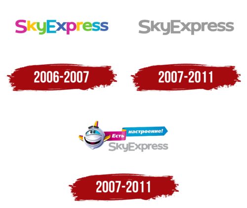
When Sky Express was established in 2006, the airline embraced a distinctive and expressive approach to its branding. The primary intent was to attract families looking to travel to resort towns where fun and joy are key to the holiday experience. This led to selecting a visual style that could fully express these emotions and create a celebratory atmosphere.
The Sky Express logo was crafted to elevate moods and draw the attention of young passengers and their parents. It incorporated multicolored, vivid letters that resembled images from children’s cartoons. Each letter was designed to be lively and playful, making the logo noticeable and memorable.
The company emblem aimed to enhance advertising materials and airplane fuselages; it sought to foster positive associations with travel. This was particularly significant for holiday journeys typical among families with children. Therefore, the logo was a visual message that promised celebrations, joy, and memorable experiences from upcoming trips.
A central feature of the logo was the pointed central bar of the letter “E,” crafted like a compass arrow. This element added a sense of dynamism to the visual representation and symbolized the company’s ambition for growth, advancement, and precise navigation along chosen paths. This symbol highlighted Sky Express’s focus on the future and its readiness to guide its passengers toward new adventures.
2007 – 2011
In 2007, the airline underwent a significant change in its visual identity, reflecting a new phase in its development. From this point, the company began operating regular flights, requiring the brand to adapt to the evolving demands of the market and passengers. The decision to radically transform the emblem aimed to attract and retain a new category of customers—businesspeople who became regular users of the airline’s services.
The new logo was designed in gray, a color chosen deliberately. Gray symbolizes professionalism, reliability, and functionality—highly valued in business. It relates to everyday work, budget flights, and predictability, which is particularly important to business travelers who need regular and dependable air transport.
The logo was styled to emphasize regular domestic flights’ stability and routine nature.
2007 – 2011
While the Sky Express brand was traditionally associated with a more formal, business-like image, the agency Attack! decided to evolve and enhance this perception. They built upon the original, cartoonish concept and integrated a recognizable element into the gray logo—a small airplane from a popular children’s TV show. This creative marketing move aimed to add a playful touch and ease of perception to the brand.
The airplane was nicknamed “smileplane,” highlighting its cheerful and friendly character. Behind the airplane in the image, a ribbon carried the company’s new slogan: “Feeling good!” This slogan and image were designed to evoke associations with carefree childhood and the joy of family travels. With this approach, the company aimed to reach a broader audience, including business travelers and families with children. As a result of this marketing strategy, Sky Express successfully merged two different styles and effectively impacted two target audiences, strengthening its position in the market.


