


![]() Skyscanner Logo PNG
Skyscanner Logo PNG
The Skyscanner logo isn’t just dynamic; it’s hyperactive. At least visually. Designers have filled it with elements that appear to move based on their location. This perfectly conveys the concept of a service that helps people travel.
Skyscanner began in Edinburgh, Scotland, in 2001. Gareth Williams, an IT specialist, was tired of checking airline websites one by one to compare ticket prices. Together with Barry Smith and Bonamy Grimes, he built a tool that collected fares from several sources and placed them side by side. The public service launched in 2003.
The company worked as a travel metasearch engine, not as a direct ticket seller. Users searched flights in one place, then completed bookings through airlines or agencies. By the mid-2000s, competition was growing, including Kayak, founded in 2004. Skyscanner focused on broad route coverage, regional airlines, and low-cost carriers, which helped it stand out beyond national markets.
The first outside funding came in 2007. In 2014, Skyscanner raised about $192 million in a round led by Sequoia Capital, using the funds to expand internationally, grow its engineering team, and open offices in cities such as Singapore, Beijing, and Miami. By the early 2010s, it had become one of the world’s major flight comparison services. The mobile app grew as trip planning shifted to smartphones, while hotels and car rentals were added to the platform.
In November 2016, Chinese travel company Ctrip bought Skyscanner for about £1.4 billion ($1.7 billion). At the time, the service had roughly 60 million monthly unique users. Ctrip later became Trip.com Group, while Skyscanner kept its own brand and Edinburgh development base. The market grew more competitive after Google Flights entered the segment in 2011, forcing independent aggregators to continually improve search speed, coverage, and interface quality.
Meaning and History
![]()
Skyscanner entered the tourism market in 2003. Three IT people founded it: Bonamy Grimes, Barry Smith, and Gareth Williams. It all started with the fact that one of them was going on vacation but could not find cheap plane tickets. This inspired computer experts to start an unusual startup. Together, they developed a website that combined search results from various online travel agencies to compare prices on selected flights.
Tens of millions of people now use it, and the service’s modern features allow you to book tickets directly. Travelers freely pay for them while also ordering additional services, including car rental and travel insurance.
Such a sharp leap in Skyscanner’s development is reflected in the company’s emblem. If the old symbol hinted only at air travel, then the modern version presents a universal sign associated with tourism. The brand image was last updated in 2019. The designers tried to maintain the traditional logo structure: a combination of an icon and a company name.
What is Skyscanner?
Skyscanner started as an online flight search tool and has since evolved into a full-service travel agency. Its headquarters are in Edinburgh, the capital of Scotland. At the same time, the brand is owned by the Chinese company Trip.com Group Limited, which bought it in 2016.
2002 – 2006
![]()
Although the Skyscanner organization was officially registered in 2003, the site of the same name launched a year earlier. Its emblem consisted of three arrows pointing in different directions. They looked like three pyramid ribs (top view) because one of them pointed to the upper-left corner, the second to the down, and the third to the upper-right corner. The center was the starting point for travel. Three arrows symbolize a large selection of flights that allow you to travel to any part of the world. On the other hand, the junction of the lines can be interpreted as a Skyscanner user. The arrows, in turn, can indicate the global scope of the search for air tickets using the online service.
On the right was the brand name, written in two different fonts. The first three letters (“SKY”) were uppercase. Their typeface was reminiscent of SoftMaker’s Quebec Serial Heavy, S-Core’s Core Sans B 55 Bold, or Paulo Pedott’s Doris PP bold. The end of the word was converted to lowercase but differed from the first part only in glyphs, as the designers standardized all letters to the same size. His typeface was roughly similar to Transmute Light from Typodermic Fonts Inc. The three-arrow symbol and “SKY” were dark blue, while the “scanner” was gray.
2006 – 2008
![]()
In 2006, the logo creators reduced the graphic symbol and moved it slightly higher. At the same time, they repainted all the elements in a new shade of blue and set the “SKY” in lowercase to make the inscription look harmonious. The new typeface looked like a cross between Ligurino SemiCondensed Book by Typodermic Fonts Inc. and Oslo Bold by Wilton Foundry.
2008 – 2012
![]()
In 2008, the investment company Scottish Equity Partners invested a large sum to develop Skyscanner. Meanwhile, the online service changed its logo. The designers made the arrow lines slightly thicker and slightly corrected the inscription. In particular, they slightly increased the intra-letter gaps of “e” and “a,” straightened the lower part of the stem of “y,” and expanded “c.” Adobe has a similar typeface. It’s called Myriad Hebrew Regular.
2012 – 2015
![]()
In 2012, Skyscanner opened a new office in Beijing and introduced a new logo that differed from the previous one. A schematic cloud, a symbol of air travel, has replaced the obsolete three-arrow symbol. It was light blue but not solid: the left side of the emblem was streaked with white, rounded lines, reminiscent of fragments of concentric rings: only three white stripes with a small circle in the middle. This element was similar to a radar signal used to detect airborne objects.
The brand name was in bold gray italics. Its closest counterpart is Hand Foundry’s Bronkoh Bold Italic, although the lowercase “a” looks like the corresponding letter from Durotype’s Aspira XNar Demi Italic.
2015 – 2019
![]()
The next logo changes took place in 2015. But they were not global: the company only updated the color, repainting the cloud and the inscription in a single light blue (#00b3d7). The hue was consistent across all parts, even though the left side appeared darker.
2019 – today
![]()
The turning point in Skyscanner’s visual identity history came in 2019. As the service expanded from just a flight-comparison metasearch engine to a travel company, it needed a universal sign. The cloud did not meet this criterion because it was associated with gloomy weather and did not inspire travel. The designers removed the variable cloudiness icon and replaced it with the opposite symbol, a radiant sun.
London-based studio Koto and more than 50 Skyscanner in-house designers worked on the brand’s new image. Together, they came up with a revolutionary concept that embodied four elements: discoveries, ideas, stability, and optimism. The icon features a curved strip with a triangle at the bottom and five short lines resembling the sun’s rays. The image is adapted for mobile devices because statistics showed that 60% of Skyscanner customers access the site on smartphones.
The brand name, as before, is on the right. Colophon created a new sans-serif typeface for it, Skyscanner Relative. The first “S” is capitalized, and the lower diagonal “k” is unusually curled up. The logo is dark blue.
Font and Colors
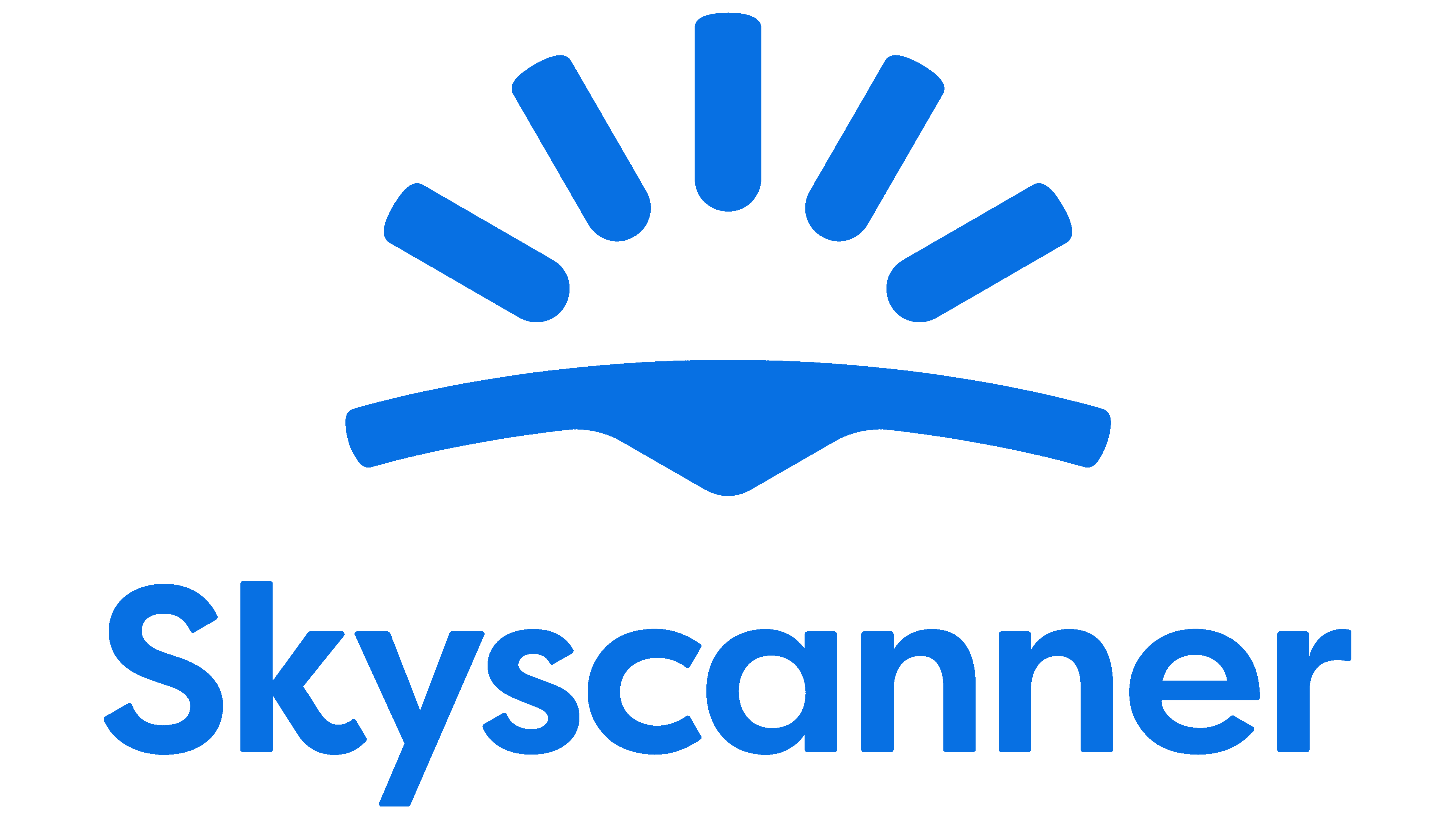
The Skyscanner graphic sign is shaped like the bottom of a swimsuit, so the associations with leisure and travel are obvious. Of course, the designers did not intend to convey such a meaning in the emblem. The large curved band represents the Earth and, in particular, the horizon. A small downward-pointing triangle symbolizes an arrow pointing to a destination. And five dashes, built in the form of an arch, represent the sunrise.

The Skyscanner Relative corporate font was specially developed for the company logo. The author of this grotesque is Colophon. Proportional, symmetrical letters look harmonious in combination with the rounded lines of the emblem. The color scheme is based on a rich shade of sky blue (#0770e3). It reflects the first part of the brand name (“Sky”) and connects to the old Skyscanner graphic signs.