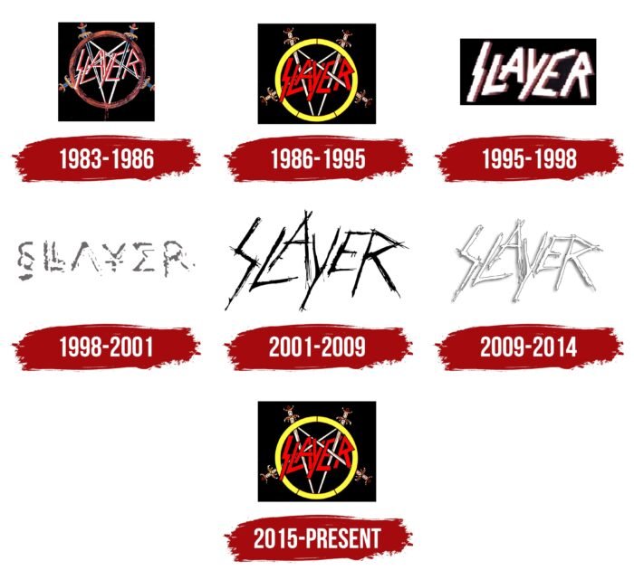
Aggressive energy, like a lightning bolt, comes from the emblem of a rock band. The theme of battle, protest, and opposition to this world’s rules and foundations is applied to the Slayer logo. The sign is consonant with the style of thrash metal, which was performed by the musicians.
Slayer: Brand overview
| Founded: | 1981 – 2019 |
| Founder: | Kerry King and Jeff Hanneman, Dave Lombardo and Tom Araya. |
| Headquarters: | Huntington Park, California, U.S |
| Website: | slayer.net |
Meaning and History
When the group first appeared, it did not have a name. The members gathered in Tom Araya’s garage and rehearsed cover songs to perform on stage. In late 1981, Jeff Hanneman suggested that the band be named Slayer, and everyone agreed. There were rumors that this was an abbreviated version of the word “Dragonslayer”: supposedly, the musicians considered it unoriginal and removed the “Dragon” part. This common mistake came up after an interview where “Slayer” and “Dragonslayer” were mentioned side by side in the same sentence.
The group has been repeatedly accused because of their name, black outfits, dark lyrics, and frightening artwork on the cover. Moreover, she was accused of links with Nazism, especially after Hanneman admitted collecting Nazi items. The drummer said that he had read books about Josef Mengele and was inspired by them for the song Angel of Death.
Another scandal was provoked by the name of the Slayer fan club – Slaytanic Wehrmacht. And the fact that the letter “S” on the logo of the musical group resembled the infamous “SS” (Schutzstaffel sign) only added fuel to the fire. Critics were once again convinced that they were right when, in 1990, the album Seasons in the Abyss was released with a Nazi eagle on the cover. In front of the bird was a wide ring in the style of Der Reichsadler. But unlike the coat of arms of the Third Reich, inside the circle was a pentagram of four swords, the blades of which pierced the red letters of the word “SLAYER.” The eagle held the fifth sword in its claws.
The designer of many of the rock band’s logos is credited to Steve Craig, who was the all-around manager. But the symbol with the image of an eagle was proposed by a completely different person – producer Rick Rubin. A native of a Jewish family, he picked up a book about Nazi medals and found a suitable reference in it. He wanted to manipulate public opinion, so he encouraged the scandals around Slayer in every possible way and fueled rumors that the musicians were neo-Nazis. And no one was embarrassed that the bass player was from Chile, and the drummer was from Cuba.
The band members even tried to justify themselves, but no one believed them because their graphic symbols looked as ambiguous as the lyrics sounded. Despite everything, they have become metal classics. By the time the group broke up, its logos had become famous worldwide.
1983 – 1986
In 1983, the first studio album, Show No Mercy, was recorded. Its cover was decorated with an incomplete pentagram composed of four swords. One more sword was missing at the bottom for the five-pointed star to be considered complete. The hilts of bladed weapons were lined up along a brown ring, and inside, across the crossed blades, was the red and white word “SLAYER.” This inscription appeared much earlier than the album. It was invented by David Lombardo when the band was starting to write covers.
The musicians sat in the living room of Tom Araya and wondered what they could do with the logo. Then Dave put the paper on the floor and scrawled the band’s name on it – as if the pencil had suddenly turned into a knife. Everyone liked the notches and decided to leave the inscription as it is. Therefore, on the debut album’s cover, the letters in the word “SLAYER” consisted of sharp, jerky lines.
1986 – 1995
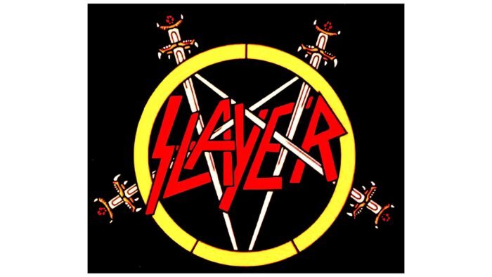
In an effort to maintain their identity, the group did not experiment with the logo. It retained the original structure, only the ring became yellow, and the inscription was repainted in bright red. The bluish sheen of the swords has disappeared, the shape of the blades and hilts has changed slightly.
1995 – 1998
In the mid-1990s, musicians abandoned the traditional pentagram symbol. They decided to focus on the inscription, which acquired a new design. The strokes of the letters were edited, but this did not affect the aggressive style. The name Slayer was white with a thin red shadow on the right side.
1998 – 2001
In 1998, the album Diabolus in Musica was released, named after the dissonant combination of sounds. Its cover was decorated with a redesigned logo, which was not similar to all previous versions. The occult script of the letters resembled runes, or at most typographic symbols. “S” looked like “§,” “A” lacked a horizontal stroke, “Y” looked like a single-stroke yen sign, and “E” imitated the mathematical sum symbol.
2001 – 2009
In 2001, fans cheered for the return of the original “SLAYER” lettering, created by the band’s drummer. But unlike David Lombardo’s version, the new design had nothing to do with “cuts” – they were rather carelessly drawn lines. The letters were black for the first time.
2009 – 2014
After the redesign, the inscription was again presented in white. At the same time, she had thin gray outlines that looked very chaotic. Small random dots surrounded the letters.
2015 – today
In 2015, the logo, which debuted in 1986, began to be used. The five-pointed star of swords set in a ring with a red inscription is a classic symbol familiar to old fans of the group.
Slayer: Interesting Facts
Slayer, a thrash metal trailblazer, has significantly impacted music and culture since the early 1980s. With their fast-paced tunes, bold lyrics, and striking themes, they’ve built a dedicated following and inspired many other bands.
- Beginnings: Slayer started in 1981 in Huntington Park, California. Its founders were guitarists Kerry King and Jeff Hanneman, drummer Dave Lombardo, and bassist/vocalist Tom Araya. Slayer blended metal with punk influences from bands like Iron Maiden and Judas Priest.
- “Reign in Blood”: This 1986 album, known for setting a new bar for thrash metal’s speed and intensity, is one of the genre’s best.
- Lyrics: Slayer’s songs often explore dark themes like death and the occult, sparking controversy but aiming to reflect reality and provoke thought.
- The “Big Four”: Along with Metallica, Megadeth, and Anthrax, Slayer is part of thrash metal’s leading quartet, instrumental in the genre’s rise during the 1980s.
- Guitar Techniques: Guitarists Hanneman and King are celebrated for their rapid, complex play and whammy bar use, shaping Slayer’s signature sound.
- Grammy Wins: Slayer won two Grammy Awards for Best Metal Performance, recognizing their top status in metal.
- Album Art: Their albums’ graphic covers mirror the music’s dark themes, with “Reign in Blood’s” bloody and skull-filled imagery being especially iconic.
- Lineup Changes: After guitarist Jeff Hanneman died in 2013, Gary Holt from Exodus joined as his replacement.
- Farewell Tour: Announcing their final tour in 2018, Slayer concluded their nearly 40-year career in November 2019.
- Enduring Impact: Slayer’s bold style and complex guitar work continue to influence a broad spectrum of metal bands and artists.
Slayer’s steadfast approach to music, combined with their talent and distinctive themes, cements their place in metal history. Their influence remains strong, inspiring generations of musicians even after their disbandment.
Font and Colors
The Slayer logo is inspired by thrash metal. Sharp and straight edges reflect the austere sound of the music. The most scandalous elements of the picture are the pentagram (an attribute of Satanism) and the letter “S,” similar to the Schutzstaffel sign. On the other hand, the “S” can symbolize lightning because it was Slayer who introduced the popular “thunder and lightning” motif into rock culture, which Metallica, Black Sabbath, and Steppenwolf later picked up. However, David Lombardo himself did not put any secret meaning into the letter. He just tried to play on the group’s name, imagining that the pencil is a knife.
The inscriptions on the logo are characterized by visual harmony and symmetry. It was invented by a drummer who used a pencil to cut paper. The fact that he is left-handed affects the angles of the lines. There is a similar font called Slaytanic. Chris Hansen developed it based on the original design.
Slayer’s graphics are predominantly black and white, but the latter is the brightest. It presents both expressive colors (yellow, red) and neutral tones (brown, black, white).
Slayer color codes
| Maximum Yellow | Hex color: | #fffe4c |
|---|---|---|
| RGB: | 255 254 76 | |
| CMYK: | 0 0 70 0 | |
| Pantone: | PMS 395 C |
| Red | Hex color: | #fc0106 |
|---|---|---|
| RGB: | 252 1 6 | |
| CMYK: | 0 100 98 1 | |
| Pantone: | PMS 172 C |
| Liver | Hex color: | #6b1d07 |
|---|---|---|
| RGB: | 107 29 7 | |
| CMYK: | 0 73 94 58 | |
| Pantone: | PMS 174 C |
| Black | Hex color: | #000000 |
|---|---|---|
| RGB: | 0 0 0 | |
| CMYK: | 0 0 0 100 | |
| Pantone: | PMS Process Black C |


