


![]() Slipknot Logo PNG
Slipknot Logo PNG
The lyrics’ aggressiveness, the music’s extremity, the vivid facial features, and the diversity of stage images collectively reflect the 1996 Slipknot logo. The verbal module, abstract symbolism, and the nonagram define the band’s distinctive style.
Slipknot began in 1995 in Des Moines, Iowa. Joey Jordison and Shawn Crahan formed the group and were soon joined by Paul Gray, Anders Colsefni, and others. Early lineups shifted frequently, and the sound remained rough. A turning point came in 1997 with the arrival of Corey Taylor, whose vocals became a key element. Sid Wilson joined the lineup shortly after.
In 1996, the band independently released the demo “Mate. Feed. Kill. Repeat.” and distributed it locally. Live shows began to build a reputation beyond Iowa. Around the same time, the concept of masks and numbering members from 0 to 8 took shape, creating a unified stage image.
In 1998, Slipknot signed with Roadrunner Records. Their debut album, “Slipknot,” was released in 1999, and the single “Wait and Bleed” received MTV airplay. Sales exceeded three million copies in the United States. The band was often compared to Korn and Marilyn Manson.
The album Iowa was released in 2001 amid internal conflicts. In 2004, “Vol. 3: The Subliminal Verses” expanded the sound, and the song “Before I Forget” won a Grammy Award in 2006.
In 2010, Paul Gray died. In 2013, Joey Jordison left the band due to illness. The album “.5: The Gray Chapter” was released in 2014 as a tribute. In 2019, “We Are Not Your Kind” reached the top of the charts, and “The End, So Far” reinforced the band’s position in 2022.
Meaning and History
![]()
Slipknot has several distinctive signs that define its style. These include a verbal designation and two abstract graphic symbols. One of them is a nine-pointed star, known as the nonagram. It appeared on the album cover back in 1995, becoming an integral part of the image.
Subsequently, an “S”- shaped logo was developed. Greg Welts, an old friend of the band and a tattoo artist, inked the logo on Anders Colsefni’s leg. The vocalist acknowledged that it initially served as a whimsical dollar sign, but they later adopted it as an emblem.
What is Slipknot?
It is an American music group from Des Moines, Iowa, formed in 1995. Its founders are Shawn Crahan (percussionist), Paul Gray (bass guitarist), and Joey Jordison (drummer), but the lineup has changed several times over the years. They play rock and various heavy metal genres.
1996 – 2014
![]()
2014 – today
![]()
Font and Colors

The nonagram consists of three equilateral triangles with concave sides. The geometric figures are rotated by 80°, 40°, and 0°, and superimposed. Despite popular belief, it is not a satanic attribute. Although the star looks sinister, it symbolizes eternal values: memory, friendship, loyalty, and unity. The nine diverging rays indicate the close relationships between team members.
The “$” sign has no hidden meaning. It’s a simple abstract pattern that serves to personalize Slipknot. The large number of spikes and sharp angles is associated with the band’s aggressive creativity.
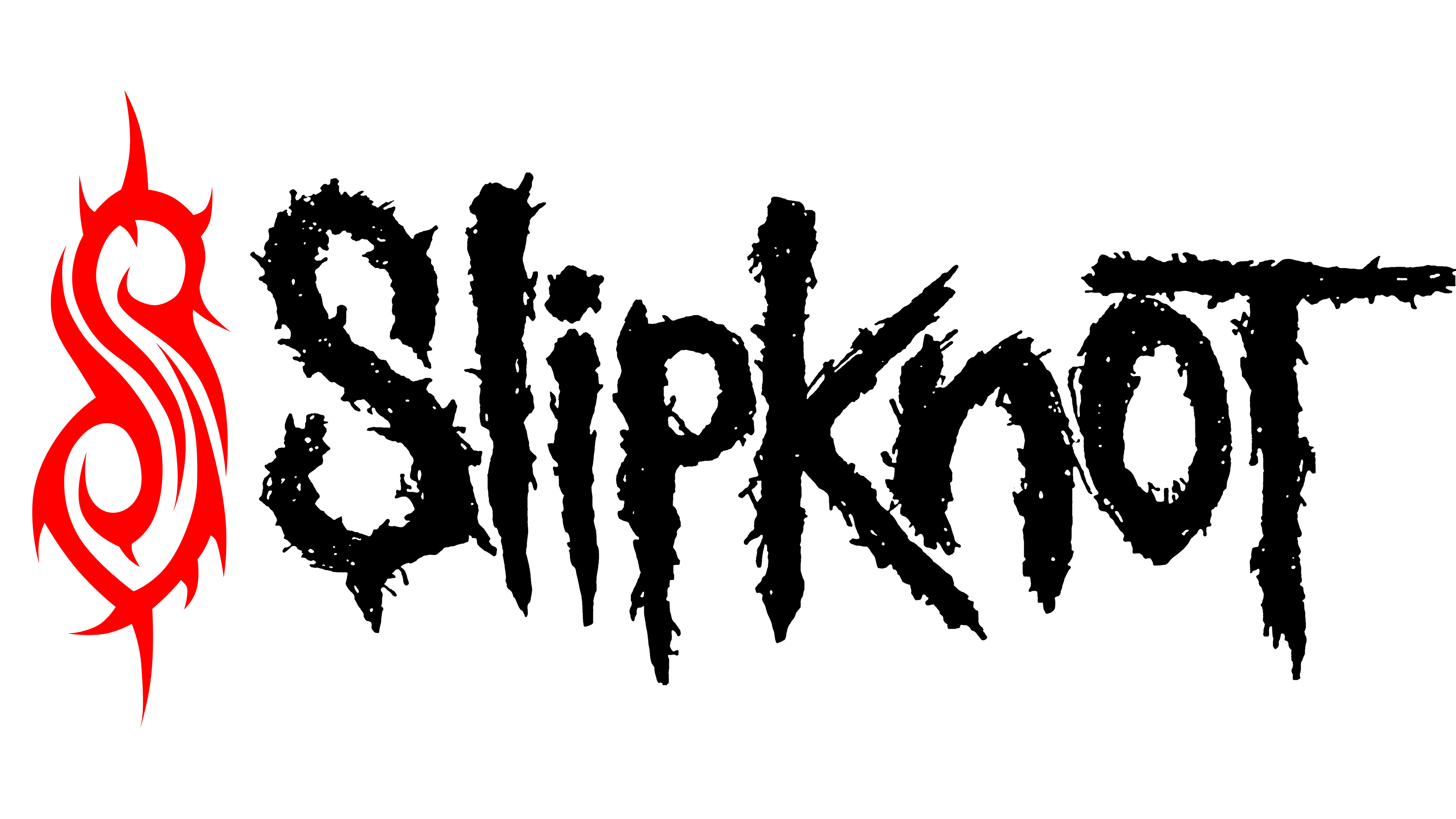
The word “logo,” rendered as the “Slipknot” inscription, has a distinctive style. The letters are not printed but drawn with chaotic, uneven lines. As a result, they have no clear boundaries: small strokes protruding from all sides resemble spikes and stripes. The unique font was specially developed for the music group. The members themselves conceived it to convey metal’s rebellious mood.
Red, black, gray, and white are the primary colors that dominate the American group’s emblems. They create a sinister contrast, even when used separately. The exact choice depends on the visual context.