Slurpee’s extensive rebranding initiative was spurred by the combined efforts of Safari Sundays and 7-Eleven’s customer research panel, Brainfreeze Collective. The mission was to revitalize Slurpee’s image to resonate with a new generation of consumers without alienating its dedicated fanbase, especially as Slurpee prepares to mark its debut in Speedway and Stripe’s outlets.
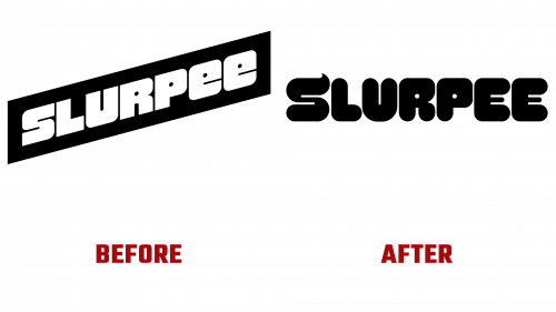
Taking cues from Slurpee’s vibrant colors, enticing flavors, and deep-rooted connection with youth culture, Safari Sundays injected fresh vitality into the brand’s visual identity. The rebrand began with a reinvention of the logo Slurpee, introducing a bright and lively “S” monogram that mirrors a freshly-poured Slurpee serving. This innovative logo, a significant shift in Slurpee’s visual narrative after four decades, adorns the new packaging and is featured prominently in the updated design language, inviting longstanding and new customers to “fill freely.”
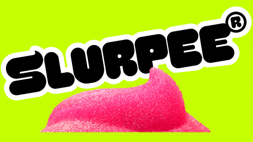
The fresh logo replaces the previous design’s dynamism with a sense of fun and a more tangible representation of the product. Despite its somewhat chunky letterforms, the new design conveys a personality that does not take itself too seriously. An unexpected standout feature is the oversized registered mark included in the logo, contributing an extra sprinkle of uniqueness. The distinct “S” monogram, ideal for social media representation, exhibits a sense of stability and adaptability with its broad structure.
Breathing additional vitality into the rebranding effort, Safari Sundays introduced a new mascot, “Styles,” a figure that embodies the playful spirit latent in everyone. Styles infuse the brand with added versatility and convey an aura of perpetual flow.
In a collaborative effort with Grilli Type, Safari Sundays crafted a unique typeface for Slurpee named “Swerve.” The design draws inspiration from Slurpee’s slushy texture and the “S” monogram, imbuing the brand with dynamism and accentuating Slurpee’s world of delight and playfulness.
The rebranding also incorporates a range of inventive and engaging designs in flat graphics, 3D visuals, illustrations, and collages, showcasing the brand’s versatility. This refreshed brand image harmoniously blends lively and whimsical elements, all tied together by the simple and recognizable new monogram and logo.
Slurpee’s bold overhaul of its visual identity is anticipated to mark a significant milestone for the brand, aiding it in carving a distinctive niche in a competitive market. The result is an audacious, vivid, and unconventional visual language that aligns with the brand’s character, ushering in a thrilling new era in Slurpee’s history.


