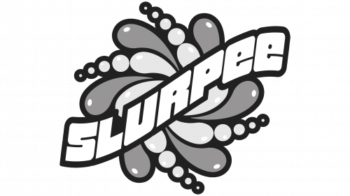
The Slurpee logo is a unique and distinctive emblem that instantly captures attention. It is predominantly textual but incorporates a creatively bent “S” with a sharp protrusion at the top. Its design elements, from the innovatively curved “S” to the cheerful bubble-like letters, work harmoniously to create a visual representation that encapsulates the brand’s spirit. It’s a perfect blend of creativity, joy, and uniqueness that communicates what the brand stands for and what customers can expect. A symbol of delight and innovation, it’s more than just a logo; it’s a statement of the brand’s identity.
Uniquely Curved ‘S’: The specially curved “S” is the hallmark of the logo. This individualistic touch adds dynamics to the design. It’s not just an ordinary letter but a symbol of the brand’s innovation. The pointed tip could signify the brand’s cutting-edge approach, always looking to create something new and refreshing.
Bubble-like Glyphs: The choice of a font with bubble-like glyphs imparts a fun and youthful appeal to the logo. These super-bold, wide letters with hardly noticeable inner space and rounded ends resemble air balloons. This design mirrors the effervescence of the beverage, making the logo visually appealing and relatable.
Versatile Color Choice: While the classic logo variant is black, the color can vary depending on the label’s background. This flexibility allows the logo to adapt to different packaging and marketing materials without losing its identity. It helps maintain consistency across various platforms, enhancing brand recognition.
Symbolizing Joy and Refreshment: The overall playful appearance of the logo aligns perfectly with the product it represents – a delightful, refreshing frozen beverage. The rounded and plump letters echo the pleasure and satisfaction one associate with enjoying a Slurpee, making it not just a logo but an expression of the brand’s essence.
Reflecting Brand Values: The innovative twist on the “S” and the bubbly nature of the letters reflect the brand’s values of creativity, innovation, and joyfulness. It clearly indicates that the company aims to deliver products that are out of the ordinary and fun.
Enhancing Memorability: The distinctive features of the logo make it easily recognizable and memorable. Whether the specially crafted “S” or the balloon-like letters, these elements work together to leave a lasting impression, building a strong brand identity.
Attracting a Wide Audience: The logo’s lively design has a universal appeal that resonates with many consumers. Its fun and approachable look can attract people of all ages looking for a joyful and refreshing experience.
Reinforcing Brand Positioning: The logo reinforces the brand’s positioning in the market as a delightful beverage provider that sparks joy and refreshment. It acts as a visual cue, reminding customers of the pleasurable experience they associate with the product.
Conveying Quality and Consistency: With its well-thought-out elements, the meticulous logo design also conveys a sense of quality and consistency. It reassures customers that they can expect the same delightful experience whenever they choose the product.
Slurpee: Brand overview
| Founded: | 1966 |
| Founder: | 7-Eleven, A-Plus, Speedway, Stripes |
| Headquarters: | United States |
| Website: | www.7-eleven.com/products/slurpee |
The birth of the Slurpee brand dates back to 1958, when an unexpected invention occurred. Omar Knedlik, a Dairy Queen franchise owner in Kansas, found himself creating the prototype of the first frozen carbonated beverage machine. This happy accident happened when his soda fountain malfunctioned, leading him to keep soda bottles in the freezer to ensure they remained chilled. He then discovered that the partially frozen bottles yielded a refreshingly slushy drink.
In 1965, The ICEE Company capitalized on Knedlik’s accidental invention and obtained a license for his frozen carbonated beverage machine, leading to the ICEE brand’s birth. Following the ICEE brand’s success, the convenience store chain 7-Eleven obtained a license for the same machine a year later, in 1966, and Slurpee was born. The name “Slurpee” was inspired by people’s slurping sound while sipping the drink through a straw.
The Slurpee brand quickly gained popularity across America throughout the 1960s and 1970s. 7-Eleven spearheaded campaigns to promote the frozen drinks and gave them catchy names like Fulla Bulla and Kissin’ Cousin, adding to their appeal. In 1967, Slurpee even found its way into space when the astronauts on Apollo 7 packed Slurpees for their mission, making it the first beverage of its kind in space.
Over the next two decades, the 1980s and 1990s, Slurpee unveiled more than 100 flavors. While Coke, Dr. Pepper, and Cherry flavors gained considerable popularity, limited-edition flavors such as Bug Juice and Full Moon Fever became collectibles among fans.
By 2002, Slurpee had made quite a mark in the beverage industry, with over 6 billion drinks sold. It was estimated that an average of 5,800 Slurpees were sold per 7-Eleven store each month.
Today, Slurpee retains its iconic status as a product synonymous with 7-Eleven, with over 1 billion Slurpees sold worldwide annually. The brand continues introducing unique flavors and promotions, ensuring the frozen beverage’s enduring popularity.
Meaning and History
What is Slurpee?
Slurpee is the name of a chilled beverage that can be purchased at 7-Eleven stores and its subsidiary brands. American entrepreneur Omar Knedlik invented it, and the trademark was introduced in 1966.

