


Smartstream has updated its brand presentation. A strict digital logo has replaced the silver mark from an earlier fintech aesthetic. The letter “S” is built from modules and refers to data, connections, and complex financial infrastructure.
Pony handled the “smart.stream” rebrand. The project included positioning, brand architecture, messaging, identity, and the website. For a company with more than 40 years of experience in financial systems, the update marks a new stage of growth. Smartstream produces software for back-end processes at major banks, including reconciliation and post-trade operations. Today, the brand is shifting its focus toward data, AI, machine learning, and intelligent insights while continuing to work with global financial institutions.
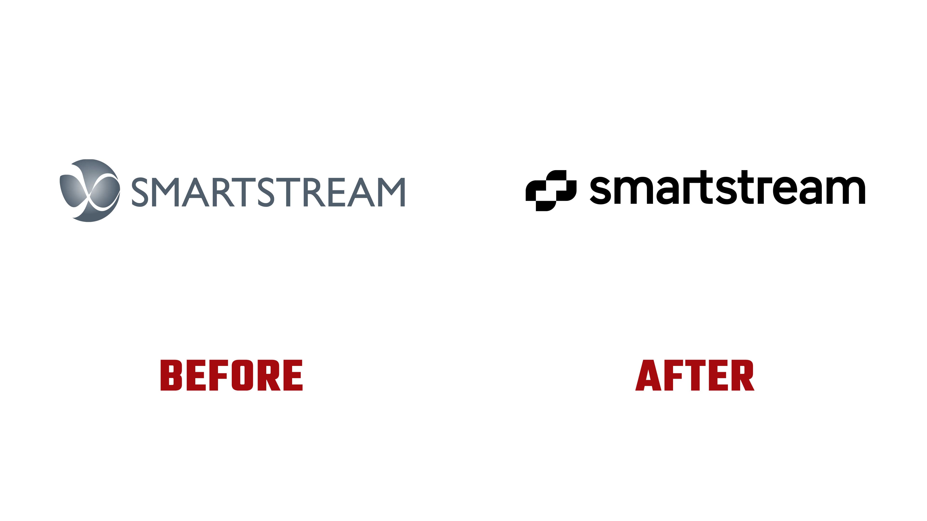
The old logo conveyed technology through volume, gradients, and a metallic sheen. The flowing form recalled a data stream, an infinity sign, or a financial network. Over time, the image became associated with early 2000s corporate aesthetics. The new mark moves away from decorative three-dimensional styling. The black modular symbol looks stricter and works better for interfaces, presentations, digital products, and B2B communication.
The logo is based on the letter “S.” The form is built from separate blocks, with an internal connection between them. The mark suggests data exchange, automation, a chain of processes, and system architecture. Large volumes of financial information move through this structure. In the motion system, the symbol splits into four parts, forming a frame for the content. Because of this, the logo works as part of the brand’s digital environment rather than as a static label.
The wordmark changed as well. The previous uppercase “SMARTSTREAM” was replaced by “smart.stream”. It looks softer and more current. The dot in the name connects the brand to a digital environment and moves it away from a heavy, corporate tone. After the update, product areas received the Smart prefix, making the brand architecture more unified and easier for the market to understand.
The new identity presents Smartstream as a data solutions leader rather than a traditional fintech provider with a long history. The brand maintains the trust it has built and extends it into data intelligence and AI-driven automation. Within the system, the logo works as a compact visual argument. Behind it are precision, scale, connected processes, and the ability to work with data in an environment where mistakes are costly.

For clients and partners, the new mark fixes the company’s change in role. Smartstream remains within financial infrastructure but speaks to the future through structure, data, and system intelligence. The modular “S” conveys the shift from an abstract flow to a managed network, where the parts are connected and work toward a shared result.