The Smith Optics logo combines individuality and creativity, so it represents the brand and skillfully tells its story, creating an aura of high professionalism and impeccable craftsmanship. The emblem reflects a businesslike atmosphere, considering every nuance in producing frames and glasses.
Smith Optics: Brand overview
Smith Optics was founded in San Gabriel, California, in 1965. Dr. Bob Smith, an enthusiastic skier and orthodontist, started the business. In addition to being a skilled dentist, Bob Smith had a strong interest in winter sports, which was crucial to the conception and growth of the company.
Bob Smith’s own need gave rise to the company’s idea. He loved to ski and frequently ran into the issue of his goggles fogging up. This made things on the slopes potentially dangerous and impaired his vision. Smith decided to apply his creativity and knowledge to solve this issue.
Bob Smith started experimenting with various materials and goggle designs in his home garage. He aimed to design ski goggles that would remain clear in extreme heat and exertion. After countless trials and errors, he created a ground-breaking dual-lens system with ventilation between the lenses.
The first Smith goggles were handmade prototypes. Bob used orthodontic foam and elastic to create a snug and comfortable fit on the face. Fogging was avoided because air was present between the two plastic layers that made up the lenses. This creative design served as the model for all upcoming Smith Optics products.
In 1969, Bob Smith was granted a patent for creating the first pair of vented ski goggles with two lenses. This was a watershed moment in the history of the business and the winter sports sector as a whole. Smith’s goggles quickly became well-known among skiers and snowboarders who valued their comfort and efficiency.
The company started expanding its product line in the 1970s. It released a range of goggles tailored to suit varied skiing situations and individual athlete preferences. Both the goods’ functioning and design received special consideration. The goal was to make goggles that were fashionable as well as functional.
The business moved to Ketchum, Idaho, from California in 1979. This calculated move put the company in a better position to reach its target market and ski resorts. Ketchum became the perfect place to test and develop new items because of its proximity to the well-known Sun Valley ski resort.
The company saw significant expansion and innovation during the 1980s. The business refined the dual-lens technique by experimenting with different materials and coatings. In this decade, the firm also grew internationally, becoming a well-known brand among winter sports fans worldwide.
When the company ventured outside the winter sports industry in the 1990s, it took a significant stride forward in its development. The business started making sunglasses for general outdoor use and sports like cycling and water skiing. By adding more products to its lineup, the firm established itself as a relevant brand all year long rather than simply in the winter.
Smith Optics debuted its first line of ski helmets in 1995. With the company’s background in shielding faces and eyes from wind and snow, this was a natural progression of their product line. Smith helmets became well-known quickly because of their dependability, comfort, and compatibility with the company’s goggles.
The business continued to innovate optical technology in the early 2000s. The firm created and received patents for several innovative technologies, such as the shatter-resistant Carbonic-X lens material, which offers excellent image quality and eye protection.
One of the biggest eyewear manufacturers in the world, Safilo Corporation SpA, an Italian corporation, purchased Smith Optics in 2006, marking a crucial turning point in the company’s history. This acquisition gives Smith Optics more access to resources, technologies, and Safilo’s extensive worldwide distribution network.
After joining Safilo Group, the firm maintained its unique character and persisted in emphasizing product quality and innovation. The business increased its production and research scope, creating even more sophisticated goods.
Throughout the 2010s, the company introduced new technologies and broadened its product line. The business unveiled several cutting-edge items, such as helmets featuring the Multi-directional Impact Protection System (MIPS) for increased safety and goggles with ChromaPop technology, which improves color and contrast.
A new stage in the brand’s growth was initiated in 2015 when the Italian business Safilo Group purchased Smith Optics. Thanks to this acquisition, Smith Optics received more resources for research and development and increased its market share abroad.
The firm unveiled a new range of bicycle helmets in 2017 that used cutting-edge Koroyd technology. Professional sportsmen and hobbyists hailed this technology for offering superior protection at a lower weight in helmets.
Smith Optics introduced a new line of sunglasses in 2018 that utilizes ChromaPop technology. This technology improved contrast and color perception for outdoor lovers and athletes.
In 2019, the company added ski goggles with improved ventilation and anti-fog coating for winter sports to its line.
The firm made 2020 a year to focus on sustainability. The business started utilizing more eco-friendly materials in its manufacturing, such as recycled plastic for packaging and eyeglass frames.
The company addressed the increased demand for eye protection when using digital devices in 2021 by launching a new line of everyday eyewear with blue light protection technology, continuing its breakthroughs in eye protection.
In 2022, the business debuted a new range of ski helmets with built-in audio systems. These helmets increased the safety of skiers and snowboarders on the slopes by enabling music streaming and hands-free phone calls.
In 2023, the corporation started a program to recycle used eyeglasses and goggles. The firm began accepting discarded products from customers to recycle and reuse materials to create new products.
By launching a new line of water sports eyewear in 2024, the business increased its market share in the sports optics industry. Models with improved UV protection and unique coatings to avoid fogging in high-humidity environments were available in this lineup.
Meaning and History
What is Smith Optics?
It is an American brand that manufactures high-performance goggles, helmets, and eyewear for outdoor activities and sports. The company was initially recognized for its breathable foam ski goggles. The brand offers various products, including sunglasses, prescription eyewear, ski and snowboard helmets, and mountain biking gear. It is known for its advanced lens technology and stylish designs, which target athletes and outdoor enthusiasts who require reliable gear for their adventures.
1965 – 2015
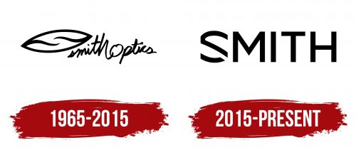
The designers chose an outline style for the Smith Optics logo to creatively depict an eye, making it both understandable and graphically appealing. The clear shape immediately signals to anyone interested that this is an eyewear company.
The clear shape is an almond-shaped oval, resembling a human eye. It has pointed ends on the right and left, connected by a semi-rounded arc with a smooth height transition. Wavy lines, reminiscent of small capillaries on the pupil, converge from both sides towards the center. They meet in the middle, forming an invisible white circle, with the curves of the lines clearly defining their boundaries.
The ellipse is tilted, seemingly making room for the optimal placement of the adjacent glyphs. It covers them from above, reaching the ” t’s vertical stroke.” All lowercase letters strictly follow the diagonal, progressing from the smallest “s” to the largest “h.” The difference between these two letters is remarkably significant:
- “s” is squashed, hook-shaped, and indistinct;
- “h” is large, sweeping, confident, and clear.
Overall, the inscription is in a hasty, messy handwriting, as if written quickly to get on with the primary work of producing the brand’s products. It also looks like a prescription note for making glasses and a record by someone with poor vision. This style is realistic: it builds customer trust, endears the brand, and shows that it is close to consumers with similar interests and even its flaws—such as the blurry logo text.
All the Smith Optics emblem letters are lowercase and black to resemble handwriting closely. No capital letters, even at the beginning of words, are connected into one. Thus, the text looks like a quick note made with a marker, pencil, or thick ballpoint pen, affecting the font’s boldness. It is semi-bold, italic, sans-serif, and unique to inspire buyer trust.
2015 – today
An Italian eyewear company updated its logo to demonstrate its high rank and professionalism. The result perfectly fits the required concept, as the emblem has a maximally strict and businesslike style, with no unnecessary details—just the name. This approach to identity truly helped the manufacturer present itself as a promising player in the international market and a formidable competitor, as the new mark aligns with the current standards of modern branding:
- concise;
- two-dimensional;
- clear;
The Smith Optics logo effectively introduces the public to the company’s name in an understandable form. It also intrigues potential clients with some graphic design features to spark interest in learning more about the product range. Notably, the first letter, “S,” is presented creatively. This is rarely seen and can be considered a unique style.
The glyph has vertically cut edges, and the connecting bar lacks an angular fragment. The protruding stroke on the left side is also slightly trimmed. Due to this missing piece, the letter comprises two geometric parts. The largest part resembles a frame section, while the smaller one resembles a glass arm.
The other letters are clear, large, and understandable, written in a classic sans-serif font. They are bold and geometric, with smooth edges and straight cuts at the ends. The smooth edges have perfect proportions, ensuring the inscription is easily visible on any medium. Overall, the glyphs resemble characters from an optometric chart for vision acuity testing, linking the logo to the company’s field of activity.


