


 Smith and Wesson Logo PNG
The Smith and Wesson logo perfectly reflects the refined style of the revolvers produced under this brand from the beginning. The emblem exudes sophistication, elegance, and extravagance, characteristic of the clients who prefer this type of firearm.
Smith & Wesson began in 1852, when Horace Smith and Daniel B. Wesson formed Smith & Wesson Company in Norwich, Connecticut. Their first project was the Volcanic revolver, designed for paper cartridges, but the business failed and was sold in 1855. On November 8, 1856, the founders founded a new Smith & Wesson company in Springfield, Massachusetts, the date associated with the current firm.
In 1857, the company introduced Model 1, its first widely successful revolver and one of the first commercial handguns using metallic cartridges. Demand grew during the American Civil War from 1861 to 1865, when Smith & Wesson supplied revolvers to the Union Army. In 1869, the company released the Model 3, its first large-caliber revolver, which was later used by the U.S. Army and exported abroad.
Technical changes continued in the late 19th and early 20th centuries. In 1887, the .38 Double Action became the company’s first double-action revolver. In 1899, Smith & Wesson introduced the .38 Safety Hammerless, which lacked an external hammer, and in 1905 it began producing its first semi-automatic pistol. During both World Wars, the company supplied large volumes of weapons to the United States and allied forces.
In the 1950s, Smith & Wesson released models that became part of American firearms history, including the Model 29 .44 Magnum, later associated with Clint Eastwood’s Dirty Harry films. In the 1960s and 1970s, it added handcuffs, police equipment, and accessories. Tomkins plc acquired the company in 1987, followed by management changes in the 1990s. In 2000, a safety agreement with the Clinton administration led to a boycott, and in 2001 Tomkins sold the business to an investor group.
Meaning and History
What is Smith & Wesson?
It is a renowned American firearms manufacturer known for its range of quality firearms, including pistols, rifles, and shotguns. Founded in the mid-19th century, the company has a long history in the firearms industry. It is known for its revolvers, semi-automatic pistols, and modern sporting rifles used by military, law enforcement, and civilians worldwide. The company is known for its performance and safety, making it one of the most trusted names in the firearms industry.
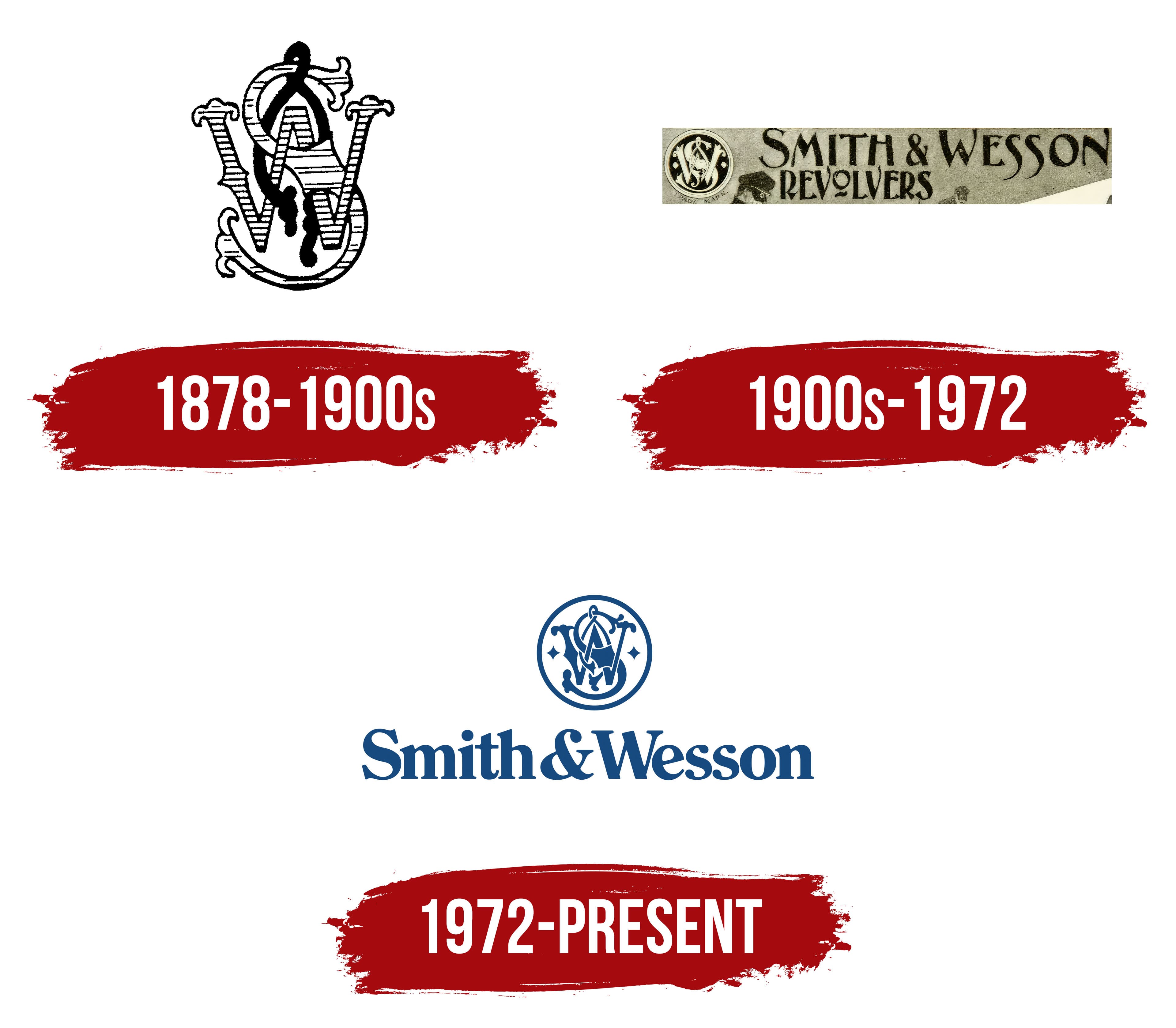
1878 – 1900s

Since the American company targets wealthy and titled firearm enthusiasts, it chose a luxurious vignette-style logo. This vintage design resembles a monogram, characteristic of the late 19th century. The logo serves several functions:
- Prominently representing the brand in a competitive market.
- Subtly yet persistently advertising the product.
- Visually attracting attention to the company.
- Intriguing customers with the product range.
- Being a memorable face of the enterprise.
- Conveniently marking all types of branded goods.
As the Smith & Wesson trademark targets nobility, officials, and high society, it preferred an emblem in which a standard monogram is set against an unconventional field. Therefore, it exudes sophistication, confidence, elegance, and security despite belonging to a highly risky industry.
The logo resembles a vignette, with three letters intricately intertwined, each depicted in an individual style. This helps the glyphs stand out, clearly distinguishing each symbol in the abbreviation.
- “S” is taken from the surname of the company’s founder, Smith. This is the largest and tallest letter in the logo. It connects the other two, acting as a unifying element. Despite its hook-like shape, the glyph is incredibly elegant, with split ends adorned with the popular heraldic element fleur-de-lis.
- “W” represents the surname of the brand’s second founder, Wesson. This letter is stretched in width and also features a fleur-de-lis design. The characteristic floral elements are located at the ends of the strokes. The entire glyph is lined with thick horizontal stripes.
- The ampersand entered the emblem as a connecting typographic symbol. It unites the two founders, showing them as equally important figures in the company’s operations. However, the depiction of the ampersand is somewhat sarcastic, as it looks like a piece of rope hanging from the upper curve of the “S.” It has knots at the ends, symbolizing determination and strength, and is colored black to stand out from the neighboring glyphs.
Both letters are designed in an Old English style, ornate and sophisticated, with spiked extensions at the center of the strokes. Along with the connecting symbol, they form a balanced, harmonious whole reminiscent of embroidered initials on fine batiste, carried by elegant ladies of high society. When they waved a handkerchief with such embroidery, it marked the beginning of a duel for their hearts, fought, as it should be, with Smith & Wesson revolvers.
1900s – 1972
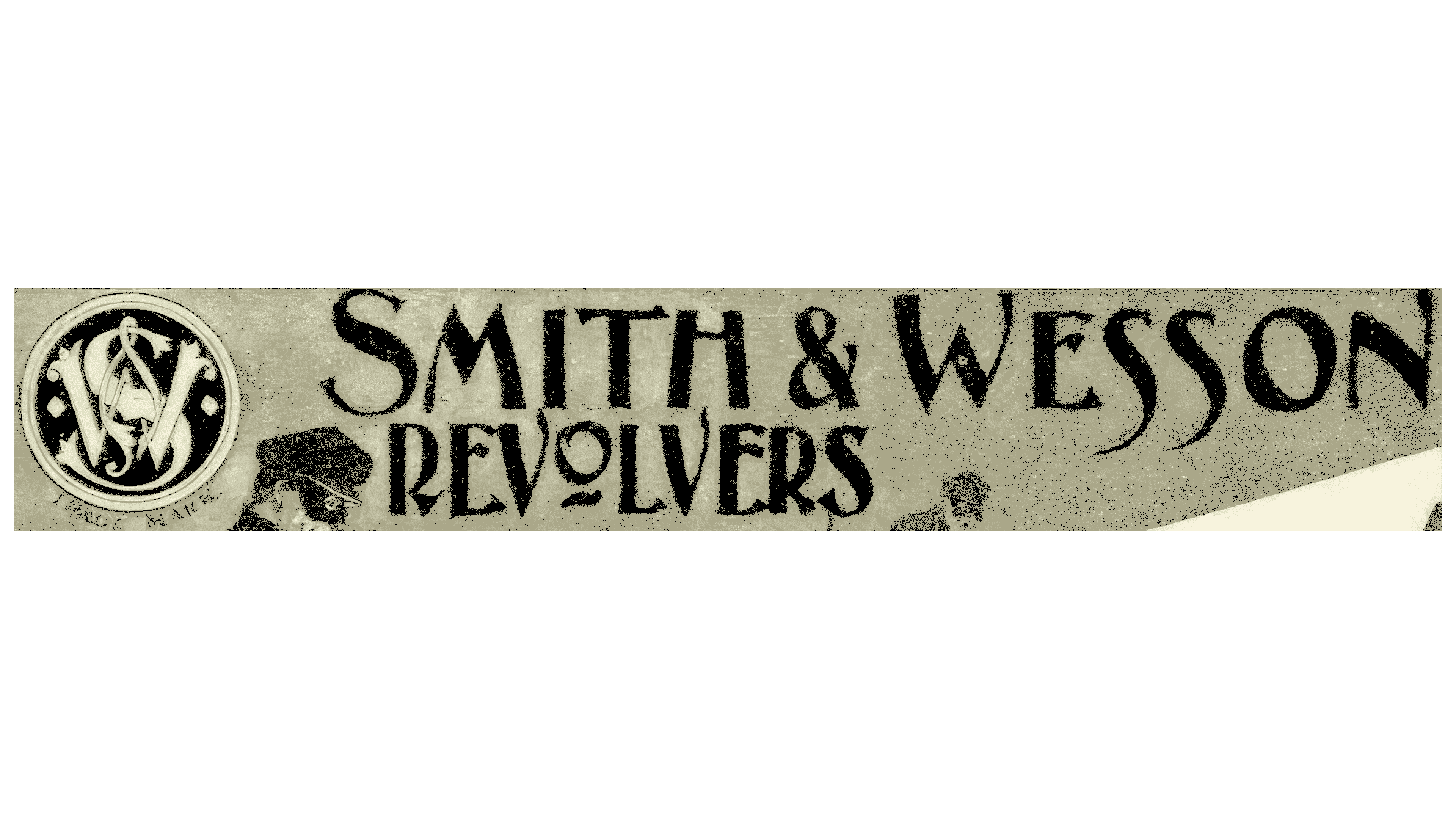
The vignette-style emblem remained and took precedence over other elements. The changes were minor and did not affect its shape or content. Designers only adjusted the ampersand to make it more familiar with contours. They also colored all the letters white and placed them in a black circle. The sharp contrast created a serious, businesslike atmosphere, even slightly alarming, to caution against the product’s dangerous nature.
The monogram is surrounded by a wide, light ring that slightly eases the tense atmosphere, instills confidence, and balances the interweaving of Old English-style glyphs. The emblem shows that Smith & Wesson respects its roots, so its design innovations are limited to supplementing the existing emblem rather than radically replacing it.
Next to the signature symbol, which serves as a marketing tool, is the firearms manufacturer’s full name. The first line contains the founders’ surnames, written in an elegant font and uppercase. The refined letters retain the nobility and elegance of the late-19th-century retro era.
All glyphs are semi-bold, alternating thin and thick lines, adding dynamism to the logo and expressing the two-dimensional object. Although the serifs may seem absent at first glance, they are present as miniature extensions at the ends of the strokes. The double “S” letters are particularly interesting, depicted like a trigger or a light puff of gunpowder smoke rising over the weapon after a shot.
The second line, with the word “Revolvers,” is in the same font as the top line. The letters are uppercase, serif, and semi-bold. They are also tall, as they are vertically stretched. The most interesting letter is the “O,” designed as a revolver barrel opening and underlined with a short stroke. The top and bottom inscriptions are misaligned with the ampersand. However, this does not make the emblem off-putting; on the contrary, the imperfect alignment intrigues and attracts attention.
1972 – today
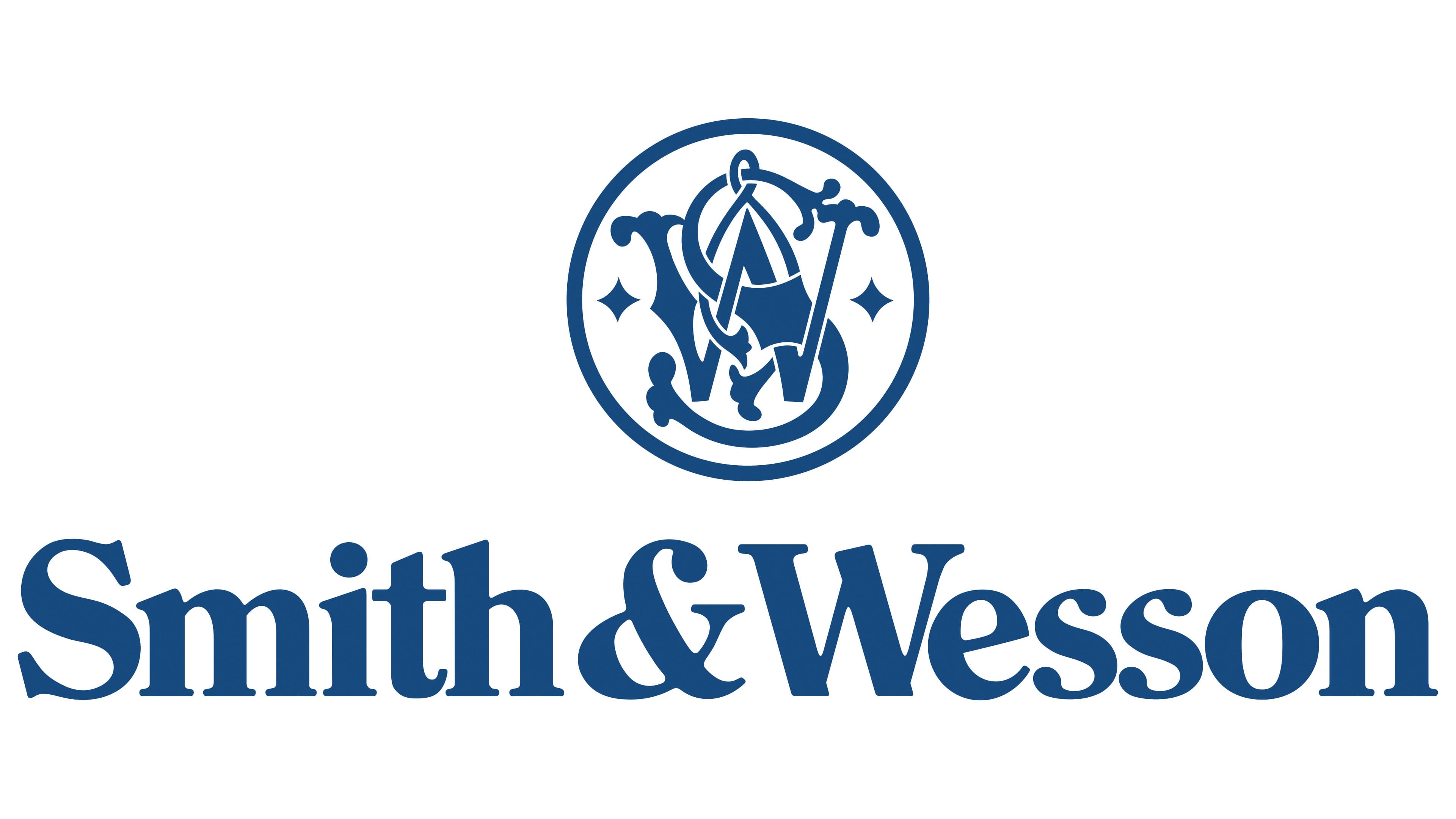
The Smith & Wesson logo remains relevant, having been updated with a modern design. The key feature is a round seal-like emblem with a monogram inside. This abbreviation of the firearm company’s name is transformed into a classic monogram to attract the target consumer segment and elevate the prestige of its branded revolvers. In this case, the circle and all its contents have been inverted: dark elements have become light, and light elements have become dark.
The capital “S” and “W,” intertwined, are flanked by two four-pointed stars. A long ampersand weaves through both letters, turning the ordinary emblem into a beautiful heraldic symbol. This significantly softens the aura of strictness, creating an atmosphere of artistic sophistication.

The word “Revolvers” has been removed from the text because, after many years of the brand’s existence, the world knows its range, making an introduction unnecessary. However, the remaining line has undergone a significant transformation. The inscription is in bold font with small serifs. The letters are now lowercase and have become massive, rounded elements, giving the impression of a flowing form due to the many curves in the glyphs.
The color scheme has also changed: the black-and-white palette has been replaced with blue and white. Blue symbolizes confidence, development, and reliability, evoking a sense of security, which is crucial for a firearm manufacturer. White represents beginnings, calmness, trust, and purity. This combination calms, relieves tension, and fosters a positive attitude towards the brand.