


 Smithsonian Logo PNG
In its current form, the Smithsonian logo embodies the sun’s radiance as a symbol of knowledge, illuminating the path for each student on their exciting and challenging research journey and the search for truth. The modern identity stands out for its harmonious blend of beauty and simplicity. While beauty has always been a feature of logos across eras, minimalism and restraint have reached their peak in the latest version.
The decorative elements, ornaments, and designs that once adorned the early prototypes of the logo gradually faded away, much like how a painting’s artist’s sketches give way to the purity of lines and simplicity of forms. Today’s logo embodies restraint and professionalism, emphasizing precision, clarity, and minimalism. It presents minimal information, but its delivery is so elegant that it symbolizes the Smithsonian Institution.
This logo belongs to one of the most renowned educational institutions, serving as a “beacon” of the country’s cultural heritage. It reflects the values on which the university is founded: curiosity about knowledge, a drive for intellectual growth, and a thirst for research.
The Smithsonian Institution began with the will of British scientist James Smithson, who died in 1829 and left his fortune to the United States for an institution devoted to the “increase and diffusion of knowledge.” In 1835, American diplomat Richard Rush traveled to England and secured more than 500,000 gold sovereigns from the bequest.
On August 10, 1846, President James Polk signed the act creating the Smithsonian Institution. Physicist Joseph Henry became its first secretary and placed early emphasis on research and scientific publication. The first building, known as the Castle, was completed in 1855 and later became the administrative center. In 1858, collections from the United States Exploring Expedition expanded the United States Exploring Expedition’s scientific holdings.
The Civil War, from 1861 to 1865, disrupted the institution, but its work continued. The United States National Museum was founded in 1879. The National Zoological Park followed in 1889, and the National Gallery of Art, now the Smithsonian American Art Museum, was founded in 1896. The National Museum of Natural History opened in 1904, adding major collections in anthropology, geology, and biology.
The 20th and 21st centuries brought wider growth. The National Air Museum was founded in 1923; the National Museum of American History opened in 1964; the Hirshhorn Museum and Sculpture Garden in 1967; and the National Air and Space Museum in 1976. Later additions included the National Museum of African Art in 1981, the National Museum of the American Indian and the Udvar-Hazy Center in 2004, the National Museum of African American History and Culture in 2016, digital projects after 2020, the 175th anniversary in 2021, and the reopening of the Arts and Industries Building in 2022.
Meaning and History

What is Smithsonian?
It is a collection of museums and research institutions run by the U.S. government and known as the Smithsonian Institution. It includes 19 museums, 21 libraries, nine research institutes, and a zoo. It is the world’s largest museum, education, and research complex headquartered in Washington, DC. The Smithsonian Institution has approximately 155 million objects and specimens in its collections, ranging from historical artifacts to scientific specimens. The National Museum of Natural History, the National Air and Space Museum, and the National Museum of American History are just a few of its many museums. A national treasure, the Smithsonian Institution plays an important role in presenting and preserving American and world history.
1846 – 1965
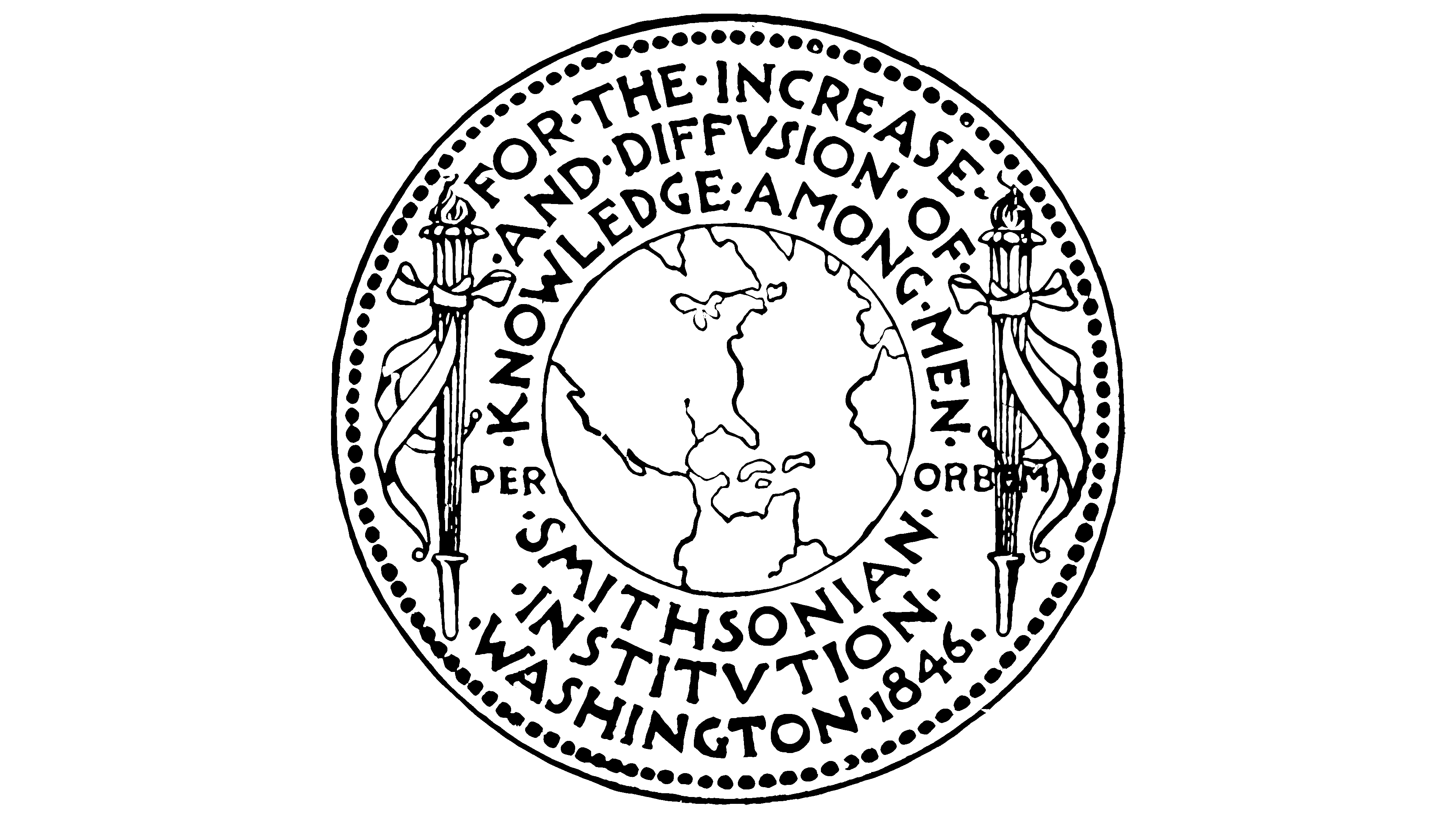
One of the most information-rich university logos was its very first version. This multifaceted symbol had a unique feature: the longer you looked at it, the more information it revealed. It remained relevant for more than 70 years, starting in 1864 when it was first introduced as the symbol of the educational institution. The logo changed for the bicentennial celebration of the founder’s birth, but its original charm is still remembered.
The centerpiece of this emblem was a meticulously drawn globe, which left an indelible impression on many generations. On both sides of the globe, unique torches symbolized the pursuit of knowledge and fundamental education.
The logo also included text elements above and below the globe, enhancing its informational richness. The simplicity and clarity of their content became additional advantages, strengthening the university’s symbolic image for many decades.
1965 – 1998

The symbolism of the new identity was almost completely revised. Replacing the two torches with an image of the sun was deeply meaningful. As a symbol, a torch can be extinguished in difficult circumstances, whereas the sun remains unchanged, an eternal and inexhaustible light source. This sun, present in many logos, carries sacred meaning. In this case, its rays symbolized development and striving towards the future. The white sun on a black background appeared logical and attractive, creating a powerful visual contrast.
The logo also included the university’s name as a textual element. Two placement options for the text were used: around the sun and over it. This is why two versions of the logo can be found in the preserved archives, each retaining its meaning but presenting it differently.
1998 – 2018

The black-and-white palette gave way to bright and saturated colors in the new period. Smithsonian University’s logo acquired a new color scheme, which has been highly praised. Modern graphics and design trends significantly influenced this choice, and the university had by then significantly raised its status.
The sun now dominates the text element, as it should. A golden sun shines at the top of the logo on a blue background, symbolizing the sky’s expanse and the beauty of clouds. Beneath this bright image is the university’s name, occupying an honorable position.
The font for the text element was carefully chosen to emphasize the organization’s importance and stability. Two words begin with capital letters, while the rest of the letters are displayed in elegant lowercase. The letters at the bottom of the logo, anchored to horizontal lines, lend the text a sense of solidity and stability, as if they stand on a pedestal, highlighting the image’s unique elegance and dynamism.
2018 – today
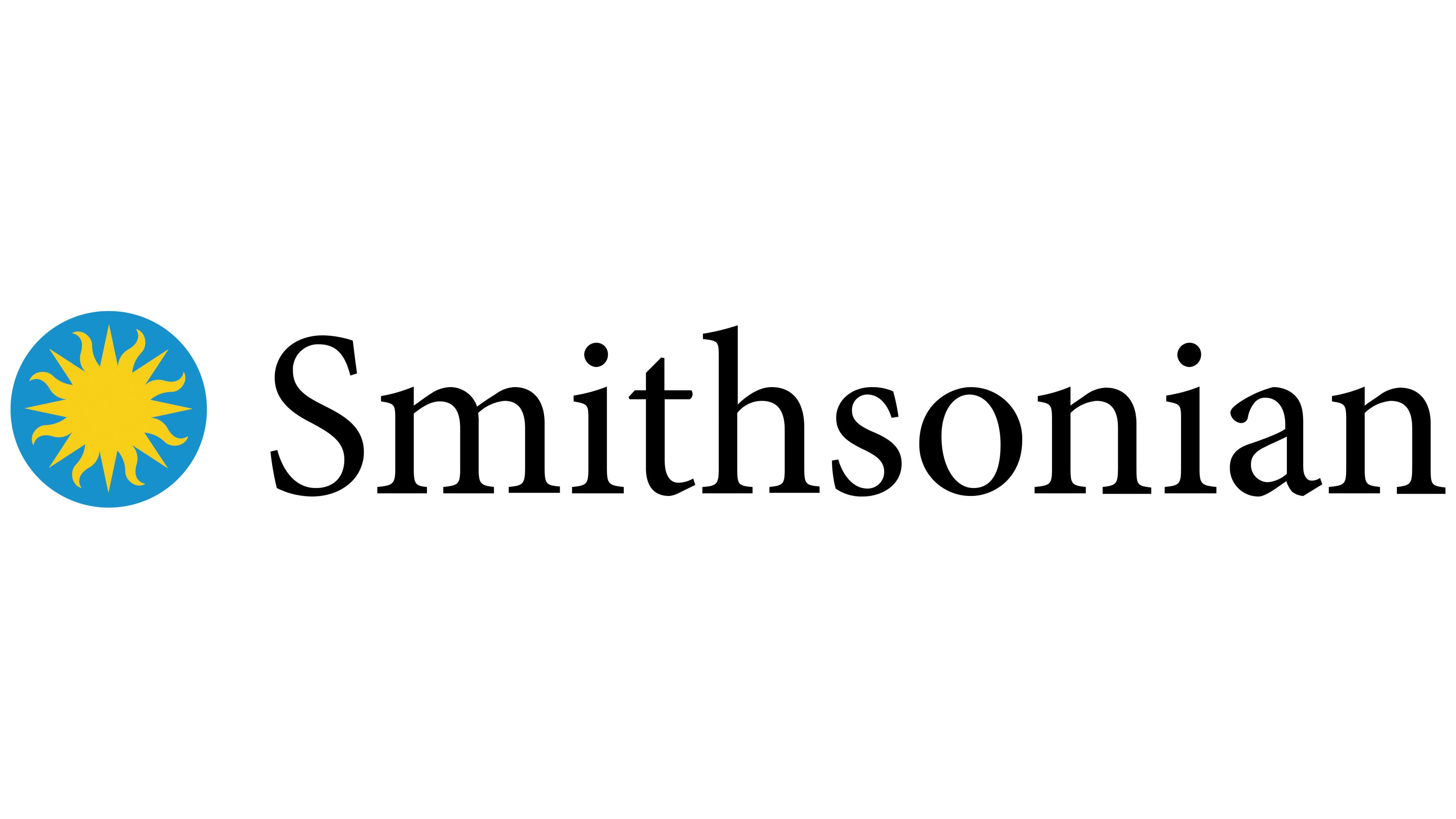
In 2008, the logo changed: the rising sun, which had previously shone brightly above the university’s name, was shifted to the left. It is now positioned parallel to the name, carrying deep symbolism. The sun represents knowledge, and the university serves as a center providing a wide range of academic programs. Thus, they exist in harmony, enhancing one another.
The new logo is distinguished by its unique presentation characteristics and visual integrity. The letters, aligned in a single row, remain noticeable and easy to read, emphasizing the university’s significance. The bright design on the right draws attention, thanks to the rich blue and yellow tones, which contrast with the simple yet expressive black font on a white background. The font has barely changed compared to the previous version, preserving continuity, and the university’s name continues to look impressive and grand.