


 Dartmouth Logo PNG
The Dartmouth logo reflects the historical heritage of the educational institution to which it belongs. It embodies its roots, concept, principles, teaching methods, and everything related to education at this institution. But the restrained palette demonstrates how serious a student must be to acquire the necessary knowledge without distraction.
Dartmouth College traces its origins to 1754, when Eleazar Wheelock, a Yale graduate and Congregational minister, founded Moor’s Indian Charity School in Lebanon, Connecticut. The school taught Native American students Latin, Greek, theology, and other academic subjects. Among its earliest students was Samson Occom, a Mohegan who became a Presbyterian minister and one of the first Native American authors published in English.
Occom became central to the college’s creation. From 1766 to 1768, he traveled through Britain to raise money for Wheelock’s school and collected about £12,000, a large sum for the period. Wheelock used much of the funding to establish a new institution in northern New England rather than expand the original school in Connecticut.
On 13 December 1769, New Hampshire Governor John Wentworth issued a royal charter in the name of King George III, founding Dartmouth College near Hanover, on the banks of the Connecticut River. The college was named after William Legge, the second Earl of Dartmouth, who oversaw the British donations. In 1770, Wheelock moved there with a small group of students and began instruction in a log cabin.
After Wheelock died in 1779, his son John Wheelock led the college. In 1819, Dartmouth won a landmark case at the US Supreme Court, Dartmouth College v. Woodward, after New Hampshire tried to turn the private college into a state university. Later milestones included the founding of the Geisel School of Medicine in 1797, the founding of the Tuck School of Business in 1900, coeducation in 1971, and the Dartmouth Review controversies of the 1980s.
Meaning and History
Initially, it was a school. The idea of its establishment is related to the Enlightenment work of Eleazar Wheelock, who aimed to provide education to the indigenous population of America. The teaching was to be carried out by missionaries. To implement his plan, the priest took an incredible step for that time: instead of attracting students to his institution, he moved it to where the potential future college visitors lived. Thus, New Hampshire gained its educational institution, which has grown into a prestigious center.
The visual identity of Dartmouth has its roots in its historical past. This is particularly evident in the emblem, executed in a heraldic style. The coat of arms’ shape, rays, light source, and a separate segment with the founding year all set a serious tone and demonstrate respect for its heritage. The educational institution’s name is presented in the same design, with bold letters bearing the imprint of ancient chronicles. They have lines similar to those drawn by a quill dipped in green ink. This is evident in the curves as they transition from one level to another: in some places, they are wider; in others, they are narrower.
What is Dartmouth?
Dartmouth is an American educational institution that offers 60 majors in the humanities, engineering, natural sciences, and social sciences. It was founded in 1769 by the renowned Enlightenment figure Eleazar Wheelock. The college is located in the town of Hanover, New Hampshire.
before 2018

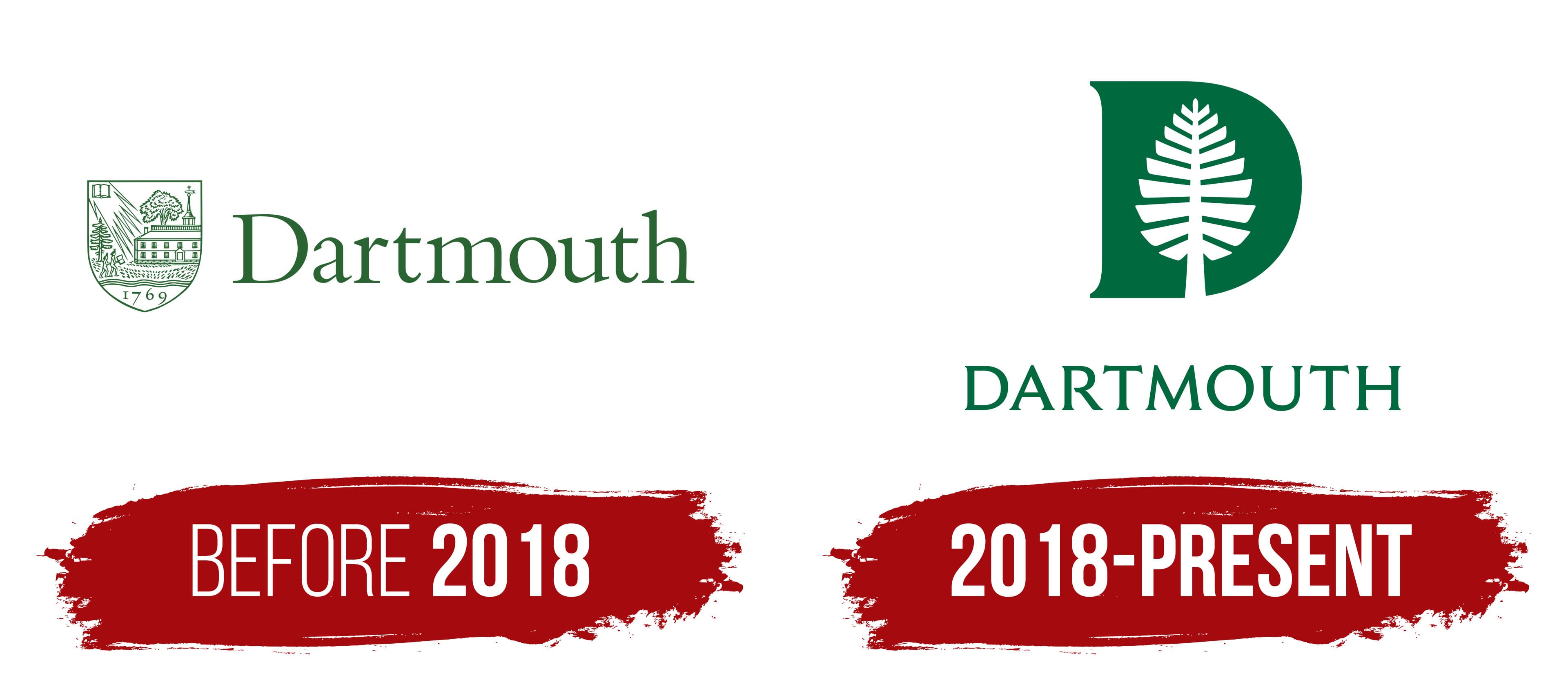
On the Dartmouth logo, to the left, is a heraldic symbol: an individual coat of arms in the shape of a triangular shield. It features iconic elements: a pine tree, the first building, a tower with a weather vane, a deciduous tree with a spreading crown, a lawn, and two students walking toward the school. But the most iconic detail is the book. It symbolizes the knowledge that the founder of the educational institution pursued as a goal.
The students hold one book. They have high hairstyles, indicating that they are Native Americans. These “elevations” clearly resemble the traditional feathered headdress worn by the indigenous people. The second book is placed at the top left. From it emanate light, sharp rays directed at the building. In this way, the designers embodied the idea that the book is the beacon of knowledge. Below the three wavy lines is the college’s founding year, 1769. To the right of the coat of arms is the name. It is large and features elements of the Gothic style.
2018 – today
The emblem remains a graphic-text combination, but its content has changed dramatically. The evolution relates to the transformation of the shield into a block “D,” within which the designers placed the legendary tree. This tall pine tree previously stood to the left of the college building. The large letter is entirely green, with the tree’s outline emerging in white space (essentially negative space), featuring numerous symmetrical branches. The powerful trunk reaches the glyph’s bottom edge.
This tree played a significant role in the history of the area where the educational institution is located. In the past, it was the site of local elders’ meetings and the making of momentous decisions. Initially, it was called the Old Pine, and later the Lone Pine. At the end of the 19th century, lightning damaged the trunk during a storm, so the tree was removed in 1895. However, it still adorns the Dartmouth logo, symbolizing the wisdom of the people. Following the tree is the college name, set in a modified font. The designers shifted the text downward, maintaining a minimum distance of the height of the capital “D,” as specified in the manual.
Font and Colors

The foundation of the college’s visual identity lies in a unique typeface named after its creator, the Czech typographer Rudolph Ruzicka. Dartmouth Ruzicka consists of letters with delicate serifs and elegant curves. As noted in the identity application guide, this font conveys the prestige of the educational institution, reflects its heritage, and emphasizes its scientific and cultural significance. It is the very history, the voice of the brand.
To update the typeface and align it with modern requirements, Jesse Ragan slightly reworked it. He continued where Rudolph Ruzicka left off, adding weight to the letters and transforming the serifs into miniature additions that harmoniously merged with the large glyphs. The typographer also converted the font to uppercase and increased the letter spacing. For other educational institution materials, the National Two typeface is recommended.

The colors of the emblem are also unique. They belong to the Spring Green category from the tertiary palette and bear the same name as the college. If the wordmark is used without the graphic image and is on printed materials, it is colored in Dartmouth Green.