


 Columbia University Logo PNG
The Columbia University logo is serious and austere, with a touch of regal grandeur. It embodies everything from history to modernity, presented subtly and infused with an aristocratic spirit. Every detail of its visual identity is designed to inspire the best qualities in a person.
Columbia University was founded in 1754 as King’s College under a charter from King George II. Its first class had eight students, with Samuel Johnson serving as president. Classes stopped during the American Revolution, and the college building became a military hospital. In 1784, the institution was renamed Columbia College to reflect the new republic.
The medical school opened in 1814, and the college moved to 49th Street and Park Avenue in 1858. Under Frederick A. P. Barnard, it expanded into a research institution. The move to Morningside Heights followed in 1896, and the name Columbia University was adopted in 1897. Journalism opened in 1912 and business in 1916.
During World War II, university researchers contributed to the Manhattan Project. Student protests over Vietnam and civil rights reshaped campus life in the 1960s. Women entered the main undergraduate college in 1983. New research centers appeared in the 1990s, while a fundraising campaign launched in 2006 raised more than $6 billion by 2013. The Manhattanville campus opened in 2016.
Later growth included international centers, the Northwest Corner Building in 2011, and Columbia World Projects in 2019. Richard Axel won the 2004 Nobel Prize and Martin Chalfie followed in 2008. The journalism school continued administering the Pulitzer Prizes, whose centenary was marked in 2017. The Columbia Lions compete in NCAA Division I through the Ivy League, including football, basketball, rowing and other varsity sports.
Meaning and History
What is Columbia University?
It is a university located in the center of New York City. It ranks among the top universities in the United States, offering undergraduate, graduate, and professional students a wide range of programs in fields such as engineering, medicine, arts, and science. The university is characterized by high academic standards and a vibrant urban learning environment where students interact with top-notch faculty and enjoy Manhattan’s cultural diversity, access to prestigious libraries, and cutting-edge research resources. The university draws students from around the world, attracted by the opportunity to study in one of the world’s most dynamic cities, and its historic ivy-covered buildings are juxtaposed with state-of-the-art research centers.
Old

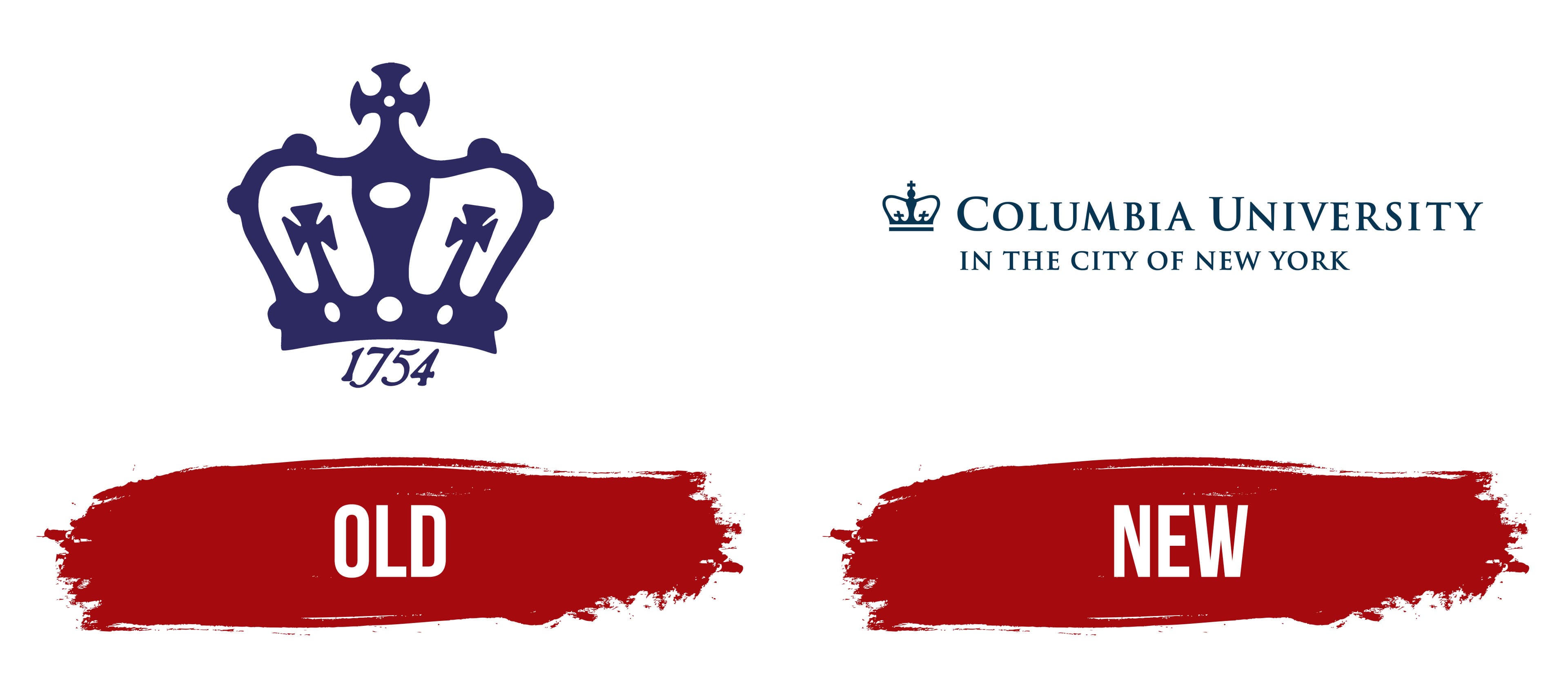
The Columbia University emblem features a crown, the primary symbol of royal authority. It affirms the university’s unique identity and hints at the impeccable education available within its walls. Its key characteristics are minimalism, lightness, and refinement.
The crown is square, drawn with broad lines that create open spaces, giving it a lacy appearance. The side bulges are intended as spots for setting gemstones, so the crown is perceived as a priceless adornment. At the top sits a large cross in the Templar style.
A cross on each side resembles shortened cross pattées with wide arms tapering toward the center. A long stem, merging with the base, supports them. However, this logo includes two elements:
- An imperial crown;
- The founding year (1754).
The date is written at the bottom, discreetly nestled under an arched line. It is rendered in Old English glyphs, elegant and italic, with smooth alternations of thin and thick strokes. Large dots at the ends of some numerals add an antique and noble look to the inscription.
The emblem is dark blue, similar to royal blue, perfectly aligning with exclusivity, high society, prestige, and exquisite taste. This is precisely what Columbia University strives for, aiming to highlight its impeccable reputation.
New

The theme of superiority and royal refinement continues in the updated Columbia University logo, where the crown remains the central element. It opens the composition, majestically rising next to the university’s name. This time, there is no hint of a Templar order, as the top cross lacks rounded edges; instead, they are straight, smooth, and precise, forming 90-degree angles. The cross sits atop a small sphere resembling an orb, which appears as another symbol of supreme authority.
The side crosses now have shorter stems, creating more open space and making the crown airy and delicate. To the right and left of the center are two arcs that gently curve downward, connecting the top to the base. Beneath it is a solid, moderately wide horizontal bar, resembling an elongated rectangle. All elements are colored in a distinct shade called Columbia Blue (developed from the Philolexian Society’s palette).
The university’s name occupies the right side of the emblem. The “Columbia University” inscription is stretched into a single line with wide spacing between letters. Although the text is in uppercase, the first letters of each word stand out in a larger size. The glyphs are adorned with small but sharp serifs, lending elegance to the visual identity.
The university conveys the idea of an outstanding education at one of America’s finest institutions through simple graphic elements. It showcases its long history, authenticity, and nobility. After all, the original building was adorned with a copper crown, first used at the college’s inception and now closely tied to the university’s identity. This logo exudes refinement and aristocracy.
The Seal

The seal of Columbia University is a distinguished symbol representing the institution’s commitment to knowledge, learning, and historical legacy. The design features the university motto, “In lumine tuo videbimus lumen,” which translates from Latin as “In your light, we shall see light,” reflecting the pursuit of enlightenment and wisdom. Traditionally, the seal includes symbols such as an open Bible, highlighting the importance of scholarship, and is surrounded by classical imagery that speaks to the university’s rich heritage since its founding in 1754. The Columbia seal remains an emblem of academic excellence and integrity.
1784 – 1787
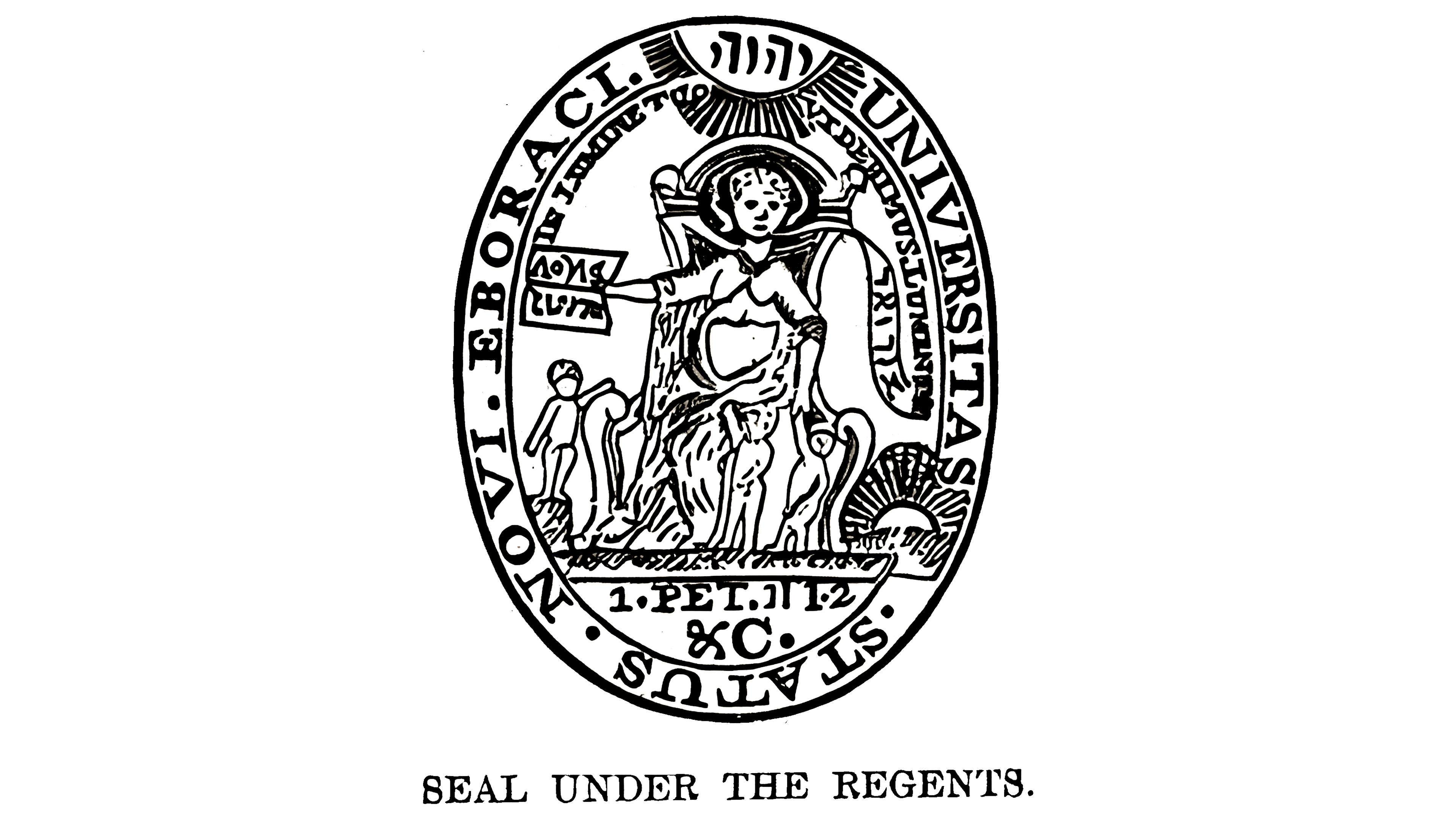
The Columbia University seal is a sacred symbol that the institution still uses to authorize academic documents. It is also depicted as a bas-relief on one of the interior walls, underscoring its significant role in the university’s history.
The theme of this emblem is religious and moralistic. It depicts a Lady seated on a throne, symbolizing the seat of state. Gathered around her are the children she teaches to approach the pursuit of wisdom rightly. The Lady holds one student’s hand, signaling her intention to guide him toward virtue and truth. She also holds a sheet with the Greek inscription “ΛΌΓΙΑ ΖῶΝΤΑ,” which translates into English as “living or lively Oracles.” This phrase is taken from the Holy Scriptures (Acts 7:38), where it serves as an epithet.
To the left of the throne, a ribbon bears the Hebrew words “אוּרִיאֵל” (God is my light), suggesting that learning is light and ignorance is darkness. This is why the Lady aims to enlighten the children. A sun rises at the chair’s base as a testament to the belief that education brings light. Above the Lady’s head are thin rays, intersecting with the motto “In Lumine Tuo Videbimus Lumen.” This is taken from Ps. 36:9 and means, “In thy light shall we see light.”
Around the edge of the vertical oval runs another inscription: “UNIVERSITAS · STATUS · NOVI · EBORACI,” which translates as “State University of New York.” All letters are bold and uppercase and feature fine serifs.
Now

Once again, the updated Columbia University seal features the Lady, now depicted in a different, more modern, light, and clear style. She sits on a high throne, looking forward, holding an open book in her right hand bearing the Greek words “ΛΌΓΙΑ ΖῶΝΤΑ.” This phrase is from the Holy Scriptures (Acts 7:38) and translates as “living or lively Oracles.” Three children stand nearby, receiving her guidance on the importance of education to emerge from the darkness of ignorance into the bright world of knowledge.
A broad ribbon extends from the back of the chair, ending in a curl with an additional inscription underscoring the necessity of education. To the right of the Lady and above her are fragments of a sun with rays, symbolizing the light of learning. In the upper half, there is another phrase in an arc, in Latin, reading “In Lumine Tuo Videbimus Lumen,” further emphasizing the importance of light (enlightenment) in people’s lives.
Completing the composition is a wide ring with the name of the institution to which the seal belongs. It reads in uppercase serif letters, “SIGILLVM COLLEGII COLVMBIAE NOVI EBORACI.” To prevent the large words from merging, interpunct dots are placed between them. As before, the seal is drawn with fine black contour lines. It is calm, imposing, and moralistic.
The Shield
The shield of Columbia University serves as a formal emblem of the university’s identity and heritage. It typically features a crown, symbolizing Columbia’s origins under King’s College and representing authority and honor. The shield’s design reflects the university’s commitment to leadership and intellectual pursuit, as well as its historical roots dating back to 1754. Used on official documents, ceremonies, and branding, the Columbia shield marks the institution’s legacy and dedication to knowledge and advancement.
Old

The Columbia University coat of arms pays homage to tradition and is an unofficial symbol for use on anything associated with the institution. It replaced the seal, which is reserved for important administrative documents.
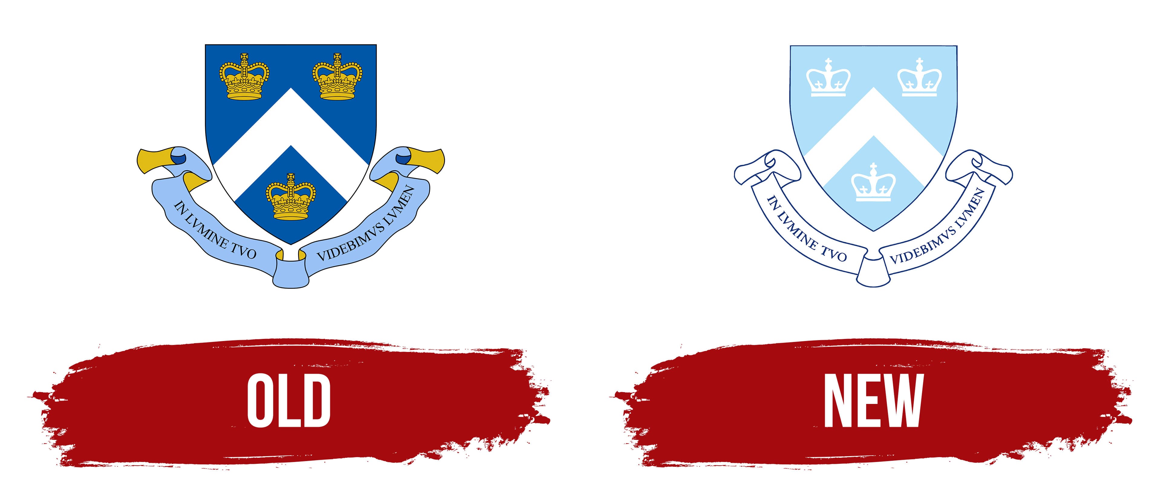
The coat of arms is based on a triangular heraldic shield inspired by Samuel Johnson’s personal coat of arms, an American linguist, educator, philosopher, and historian. The design features three miniature crowns, representing the university’s oldest symbol, which originated at King’s College. Thus, the crown thanked His Majesty for granting permission to establish the institution.
The shield also contains a white triangular stripe pointing upward, dividing the space into two unequal parts. Below is a flowing ribbon inscribed with the university’s Latin motto: “In Lumine Tuo Videbimus Lumen,” which translates to “In thy light shall we see light.” This motto is rendered in bold serif type with short but sharp serifs.
The coat of arms is colored in three shades: light blue (Azure), dark blue (Columbia Blue), and yellow (Or). Together, these colors create an atmosphere of refinement. The golden color conveys a sense of nobility, symbolizing the shine of a precious metal. White, a neutral and traditional school color, is used sparingly in this design.
New

The drive for minimalism in visual identity, driven by digital advancements, has led to a simplified coat of arms for Columbia University. Despite heraldic elements, it lacks previous grandeur; the streamlined design highlights the university’s modernity while honoring its history. The coat of arms includes only two elements:
- The shield;
- The ribbon.
The shield is still adorned with three royal crowns, but they now appear much simpler, resembling the crowns in the university logo. Two crowns are placed at the top and one at the bottom, separated by a chevron, a broad triangular band.
Beneath the shield is a long ribbon that extends to the right and left, curving into an arc. Its ends have graceful roundings, bringing movement and lightness to the coat of arms, which the solid emblem previously lacked. The Columbia University motto is written in bold, serifed letters on the ribbon. The antique font is elegant, with a harmonious combination of angles and curves.
The coat of arms’ color palette is restrained, leaning toward pastel tones. The azure has become so light that it seems sun-faded. Dark blue is used only for outlining. Meanwhile, there is an abundance of white coloring on all the crowns, the chevron, and the ribbon.