The Snapple logo is like an air bubble rising through water depths, imbued with the theme of beverages, carbonation, and tea. The emblem evokes a sense of freshness and creates a desire to quench one’s thirst. It hints at the naturalness and purity of the company’s products.
Snapple: Brand overview
| Founded: | 1972 |
| Founder: | Keurig Dr Pepper |
| Headquarters: | United States |
| Website: | snapple.com |
Snapple is an American brand of juice-infused beverages and ready-to-drink teas with over 30 different flavors. It was born from Unadulterated Food Products, founded in 1972, which supplied juices to health food establishments. Since 2018, the brand has been owned by Keurig Dr. Pepper.
Meaning and History
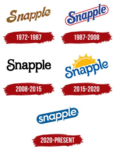
Despite changes in color and font, the brand’s logo remains stable, reflecting the consistency of the products manufactured. Minor adjustments occur due to changes in ownership or an expanded product range. The logo’s transformations revolve around the themes of water and beverages, with an emphasis on carbonation. The emblem underlines that the products perfectly quench thirst and are sugar-free.
Creating innovative taste combinations and using only high-quality ingredients are the main advantages of the Snapple brand. This fact is reflected in the logo, which emphasizes the uniqueness and individuality of the company’s beverages.
What is Snapple?
Snapple is a beverage brand owned by Keurig Dr. Pepper. The product range includes chilled teas and carbonated drinks. The company’s production facilities are located in various states across the US, with each plant specializing in specific flavors. Snapple’s headquarters is situated in the city of Plano.
1972 – 1987
The original emblem of the brand features a name formed by combining the words “quick” and “apple.” This name was given to one of the company’s first products – carbonated apple juice. In the 1980s, the word became the general name of the corporation, and all products continued to be released under this brand.
The logo text is done in a green-brown color scheme, reminiscent of the shade of apple juice. Using natural colors symbolizes that all the company’s products are made from natural and beneficial ingredients. The logo complements the company’s assertion about quality components.
The letters are arranged in such a way that they resemble ascending gas bubbles. The legs of the letter R, similar to apple stems, widen at the ends. The elegance of the text highlights the excellent taste of the beverages.
1987 – 2008
2008 – 2015
2015 – 2020
2020 – today
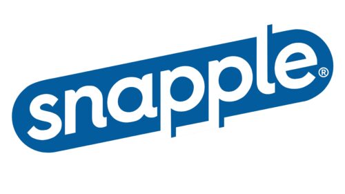
The contemporary logo consists of white lowercase letters on a blue oval background. An original technique is used in the text: blue duplicate outlines are added next to the white characters of part of the word. As a result, the word “apple” can be seen in the background, associated with fruits and juices, emphasizing the drink’s naturalness. These nearly imperceptible symbols also remind us of the past when the brand name originated from apple juice.
The blue oval background symbolizes water, while each white letter represents an air bubble rising upwards. The tilt of the logo enhances the association with buoyancy as if the word is emerging to the surface.
Font and Colors
The white color of the letters symbolizes eco-friendliness. The company has reduced its use of polyethylene terephthalate in bottles and switched to 100% recycled plastic. This shade also speaks to natural ingredients, sugar-free beverages, and health benefits.
The blue background reflects water – the primary ingredient in all the brand’s products, associated with quenching thirst and restoring water balance.
The logo font – Hurme Geometric Sans No 4 Bold Oblique – features rounded, smooth letters reminiscent of bubbles.
Snapple color codes
| Lapis Lazuli | Hex color: | #035d9d |
|---|---|---|
| RGB: | 3 93 157 | |
| CMYK: | 98 41 0 33 | |
| Pantone: | PMS 7684 C |
