The Sodexo logo is both expressive and friendly, reflecting the nature of a food service network that aims to welcome its visitors and provide them with enjoyment from a pleasant stay, delicious food, and a comfortable atmosphere. The emblem captures all of this, setting a positive tone for customers.
Sodexo: Brand overview
Pierre Bellon established Société d’Exploitation Hotelière (SEH) in Marseille, France 1966, marking the beginning of Sodexo’s history. Bellon, whose family was in the marine catering industry, decided to grow the company by concentrating on offering meal services to organizations, companies, and educational institutions.
The business was initially modest, catering to the needs of nearby hospitals, schools, and businesses in the Marseille area. Bellon took an active role in day-to-day operations, frequently delivering meals to customers. By taking a hands-on approach, he could fully comprehend his client’s needs and provide the groundwork for the company’s future expansion.
Early on, SEH expanded quickly, bringing in more clients across France. The business was renowned for its creative approach to catering, delicious meals, and a wide range of services, such as facility maintenance and cleaning.
In 1968, the business rebranded itself as Sodexho, which stands for “Société d’Exploitation Hôtelière, de Restauration et de Collectivités.” This modification showed that the business was growing beyond providing catering services.
The 1970s were a time of substantial expansion for the firm. 1971, the company established its first branch in Belgium and expanded into other markets. Expansion into other European nations, such as the Netherlands, Italy, Spain, and Germany, came next.
Sodexho debuted in the Middle East market in 1975 when it was awarded a contract to maintain a base camp in the desert of Saudi Arabia. This project was a major turning point that showed the company could handle large-scale operations and function in difficult conditions.
The business continued its global expansion in the 1980s, expanding into Japan, Russia, South America, and North America. When the enterprise went public in 1983 and listed its shares on the Paris Stock Exchange, it raised extra money for expansion and improvement.
Sodexho pursued its acquisition-based expansion strategy throughout the 1990s. A notable procurement occurred in 1995 when it bought Gardner Merchant, a preeminent catering enterprise in the United Kingdom. This acquisition greatly enhanced the company’s position in the corporate catering industry and the UK market.
Universal Ogden Services, a US business specializing in remote site management, and the corporation combined in 1997. This merger solidified the firm’s position in facilities management and increased its footprint in North America.
By acquiring Wood Dining Services in 2000, the company increased its market share in the US, especially in the education sector. That same year, the business rebranded itself as Sodexho Alliance to better represent its intention to provide a wider range of services than only food.
The company’s history was significantly altered in 2001 when the “STOP Hunger” campaign was introduced. By tackling hunger and malnutrition in the nations where the firm conducts business, this global program demonstrates the company’s commitment to social responsibility.
By acquiring Universal Services in 2002, the enterprise greatly increased the scope of its technical maintenance and facilities management capabilities.
The corporation launched a rebranding initiative in 2005, omitting the “h” and shortened its name to Sodexo. This modification better represented the company’s transition from a provider of food services to a multi-service enterprise.
By acquiring Radhakrishna Hospitality Services Group (RKHS) in India in 2009, the firm considerably increased its footprint in the quickly expanding Indian sector.
The 2010s were marked by continued growth in the business’s services. The company aggressively pursued developments in energy efficiency, facilities management, and employee personal services.
In 2017, the corporation purchased a US company called Centerplate, which specializes in catering to sporting and entertainment events. This purchase further enhanced the company’s sports and entertainment catering market position.
By paying $675 million to acquire Centerplate, a top supplier of food and hospitality services in North America, in 2018, the firm proceeded with its expansion and diversification strategy. The company’s position in the U.S. market for sports and entertainment venue services was greatly enhanced by this acquisition.
“Better Tomorrow 2025” is the name of a new worldwide corporate responsibility plan that the company introduced in 2019. This program attempted to enhance the standard of living for both clients and staff while advancing environmental, social, and economic growth in the areas where the business conducts business.
By announcing a strategic relationship with Dynamify in 2020, the enterprise increased its digital footprint and created cutting-edge food service and management solutions. This partnership aimed to incorporate machine learning and artificial intelligence into food service management procedures.
With an emphasis on sustainability, the firm committed in 2021 to cut its carbon emissions by 34% from 2017 to 2025. In addition, the business started aggressively adding plant-based substitutes to its cafeteria and restaurant menus in response to consumer demand for more ecologically friendly food options.
By purchasing Frontline Food Services, an Australian company specializing in remote site services, in 2022, the enterprise broadened its business into the corporate services sector. The company’s services were expanded through this transaction, and its market share in Australia was reinforced.
The business introduced a new worldwide platform for managing digital workspaces in 2023. The firm persisted in developing and adapting to the market’s shifting demands.
Meaning and History
What is Sodexo?
It is an international company that provides services to improve its clients’ and customers’ quality of life. These services include food, facilities management, employee benefits, and personal and home services. It operates in various sectors such as corporate, healthcare, education, government, and remote sites. The company provides comprehensive solutions that enhance well-being, efficiency, and productivity, whether catering services, cleaning and maintenance services, or employee recognition programs.
1997 – 2008
The key element of the Sodexo logo is its name. Other elements complement it, not merely adding decoration but fulfilling several important functions, as they:
- reveal the essence of the name;
- create a pleasant impression;
- introduce visitors to the food service network;
- turn the emblem into an eye-catching sign.
Additionally, the company establishes visual contact with potential clients through various details accompanying the text, evokes trust, and conveys its concept. Positive feelings are crucial in this business because the brand is linked to the common human factor of liking or disliking. Thus, the organization strives to appeal to most visitors so they repeatedly use its services.
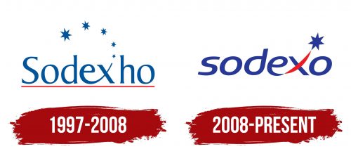
The emblem features the company’s original name, “Sodexho,” which stands for “Société d’Exploitation Hotelière.” This is because, in its early days, the company also managed hotels. The inscription is arranged horizontally in one line and is set in a thin-serif font. The elegant typeface creates a pleasant aura and generates a positive impression. Even the serifs do not detract from this feeling, as they are very small and subtly widen at the ends.
All characters are perfectly straight and tall, alternating thicknesses and thins that add dynamism to the emblem. The proximity of the “e” and “x” is particularly interesting. Their lower strokes are connected, giving the impression that the glyphs are holding hands. This is an allegory for the trusting relationship between service provider and user. From the “x” extends a series of stars upward. This might hint at:
- exceptional living and dining conditions;
- five-star level service;
- the brand’s popularity among various celebrities.
The Sodexo emblem’s color scheme is red and blue. A thin red line underscores the name, while all other elements are blue. Red symbolizes peak enjoyment, joy, positivity, and passion. Blue represents reliability, stability, relaxation, and a drive for development.
2008 – today
After a shareholders’ vote, the Sodexo logo received a new look. Changes were made to adapt the identity to the international market. Since the “xh” combination is difficult to pronounce correctly in various languages, the company decided to simplify its name by removing the “h.” The remaining letters are easy to pronounce and work well in every country because the vowels and consonants alternate harmoniously.
Another major change involves removing four stars, leaving just one out of the original five. It still sits at the upper right end of the “x.” This glyph continues to warmly greet guests and new clients of the food service network as if raising its hand to invite visitors. The letter appears to wave joyfully. Additionally, the designers moved the red stripe, so now half of the “x” is colored red, resembling a gentle smile.
The serif font was replaced with a sans-serif typeface featuring rounded letters tilted to the right. This typography adds dynamism and a sense of purpose to the emblem, showing that the company is confidently moving forward, guided by its lucky star depicted above the text. All glyphs are lowercase and sans-serif, indicating the network’s openness and dedication to pleasing clients. This makes the logo friendly and clean. The blue color became more saturated, while the red lightened, adding a touch of optimism. This contrast-enhanced the logo’s brightness and expressiveness.


