


![]() Solingen Logo PNG
Solingen Logo PNG
The Solingen logo promises clean and well-groomed nails, clean-cut lines, and easy cuticle removal. As the emblem shows, the master’s tools are often left backstage, but the beauty and quality of the manicure depend on them.
In 965, a settlement in the Wupper valley was first recorded. By the XIV century, Solingen gained fortified city status and developed into a center for blade production, supported by local iron ore, beech forests for charcoal, and water power from the Wupper and nearby streams.
By the XII–XIV centuries, blacksmiths and grinders had formed a structured craft system. Production was divided into stages, including forging, sharpening, hardening, and polishing. Solingen blades were traded across Europe, including Anglo-Saxon kingdoms.
In 1571, knife makers secured the right to mark products as “Made in Solingen”. Scissor makers followed in 1794. Counterfeiting became widespread, leading to long-term legal protection. In 1938, the Solingen Decree restricted the use of the name to goods fully produced in the city and nearby Haan, placing it alongside protected origins such as Champagne and Parmigiano Reggiano.
Industrialization in the 19th century introduced steam power and mechanization. The city evolved into a major manufacturing cluster. Zwilling J.A. Henckels registered its trademark in 1731, and Wüsthof was founded in 1814.
Alongside knives, precision grooming tools expanded. In 1923, Ernst and Friedrich Nippes founded a workshop during hyperinflation. Hans Kniebes appeared in 1926, ERBE in 1930, and Niegeloh in 1936. By the 1960s, around 700 enterprises employed up to 19,000 workers.
World War II caused heavy damage, but recovery followed within a decade. Stainless steel became standard, and production diversified into razors and manicure sets, many of which were exported worldwide.
Meaning and History
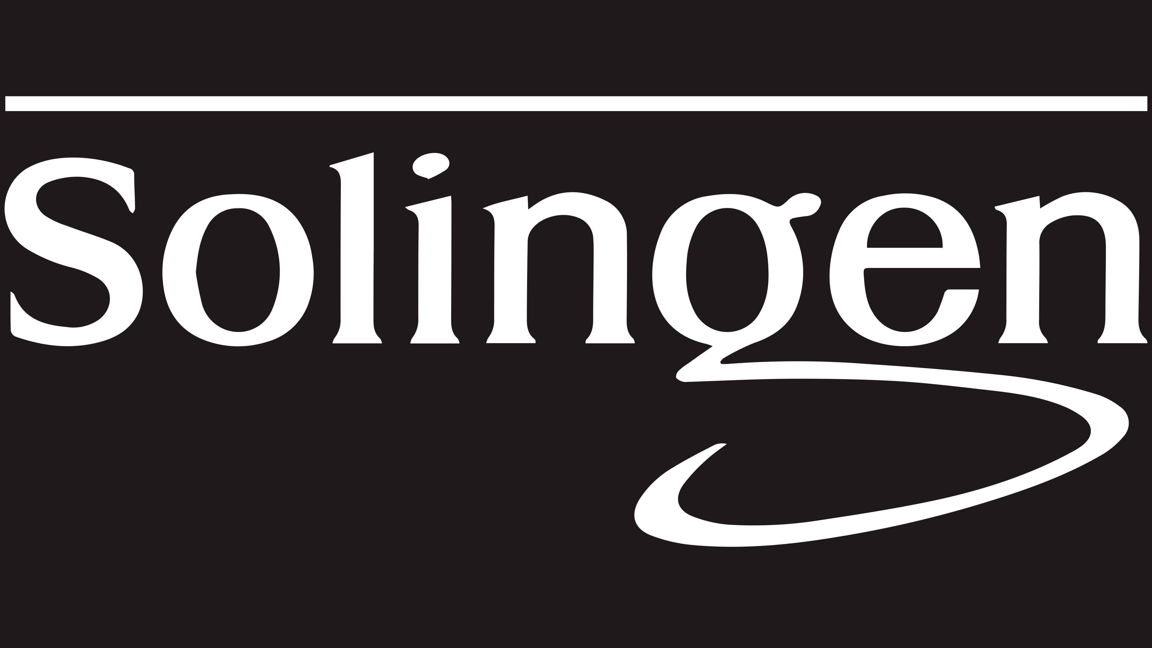
The logo has accompanied this company’s products since the beginning and is stamped on all of them. The visual identification text mark occupies almost the entire part of the corporate symbol. It reflects the main brand concept of high professionalism. Since the locality where manicure and pedicure accessories are produced has long been renowned, it is named after the man who made it so.
There are no graphic elements in the logo – only text. This role is played by the company’s name, in which the tail of the last letter is extended. At the same time, “g” forms a curved stroke, shaped like a manicure tool. The rest of the characters are standard. There is a straight horizontal line above the label.
What is Solingen?
Solingen is a German company that produces razors, scissors, and manicure sets. It focuses on grooming products and draws on the region’s rich experience, as Solingen has long been considered the city of blades. The best scissors, swords, and knives have been produced there since the Middle Ages.
Font and Colors
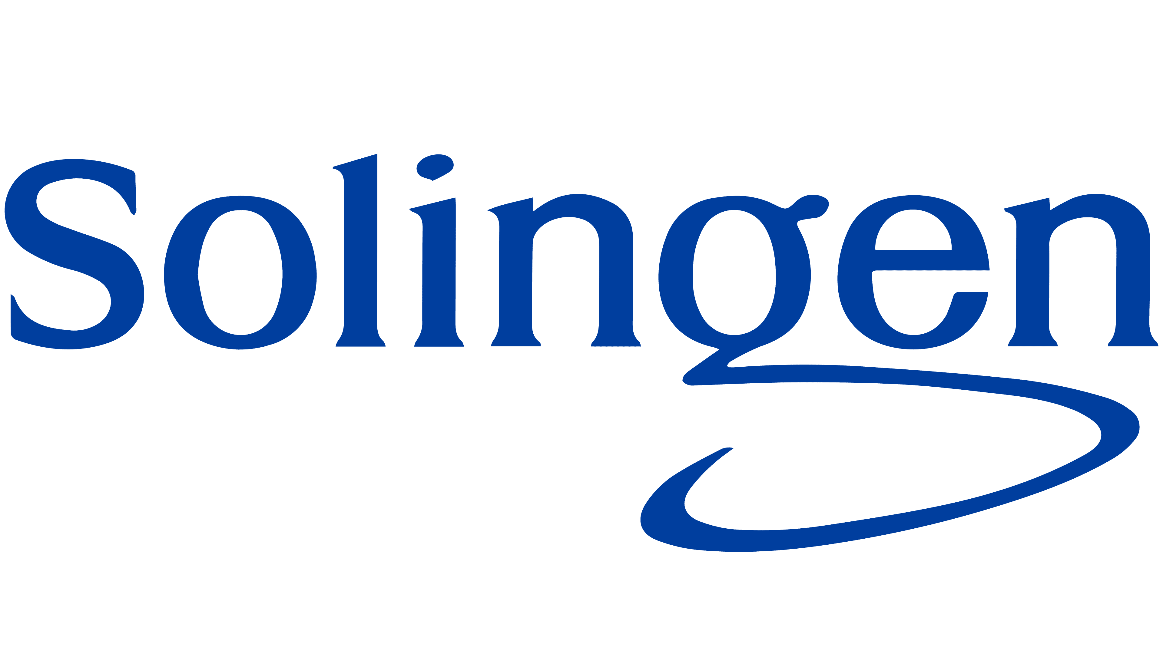
The typeface used for the word “Solingen” is a classic serif. Disjointed letters with optimal inter-character breakdown. The main feature of the font is the looped “g” with a pointed end. The palette is modest, consisting of black and white.