Somersby logo is a combination of freshness and creativity that fills all elements of the image. The logo conveys a rich apple flavor with notes of sweetness and invites you to try a refreshing and invigorating vitamin drink.
Somersby: Brand overview
| Founded: | 2008 |
| Founder: | Carlsberg Group |
| Headquarters: | Copenhagen, Denmark |
| Website: | somersby.com |
Somersby is one of the ten most popular cider brands. It was developed in 2008. It belongs to the Carlsberg Group. In addition to the classic taste, the Somersby logo represents the drink with additives: blackberry, elderberry, citrus, and watermelon.
The classic recipe of the low-alcohol product is more than 300 years old. Carlsberg has only added more flavor nuances by choosing a special apple variety. The drink was developed for the inhabitants of Denmark. Later on, “entering” a new country, additional ingredients more familiar to the local audience were added to the recipe. Today there are ten different flavors, low-calorie drinks, and cider with beer addition.
Meaning and History
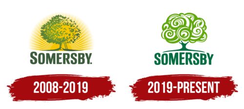
Somersby is an alcoholic brand known for its ciders based on apple juice with the addition of other fruits and berries. Its logo depicts a tree that reflects the main ingredient in its drinks. At first, the apple tree was before a bright sun, symbolizing dawn and optimism. A ladder was attached to the apple tree to show the company’s continuous work on the quality of its products. But then the design changed: the tree’s crown in the form of twisted spirals began to look like a bouquet of fanciful flowers.
Nevertheless, all the Somersby emblems have something to do with the apple theme. The general concept didn’t change either: the signs reflect the idea of communication, bright mood, and joy that is associated with drinking cider. Designers experimented only with a design to make the logo correspond to consumers’ modern trends and tastes.
What is Somersby?
A brand of Carlsberg’s low-alcohol Danish beverage made based on apple juice. The production license has been sold to 47 countries.
2008 – 2019
Carlsberg introduced the product as natural. Therefore, the first logo of the brand is very realistic. It depicts a harvest. The apple tree studded with apples hints at the main ingredient in cider (the drink is made by fermenting apple juice).
The fruits must be ripe and of special varieties. The emblem conveys the juiciness and fullness of the fruit through the bright setting sun illuminating the tree in the background. The sun speaks of warmth, late summer to early fall when it’s time to harvest.
Symbolizes the sun and the heat needed to ferment the raw material. The finished product can also be consumed warmly, adding honey and spices.
The emblem gives the impression that the sun is looking down on the tree, showing the company’s greatness, rise, and prosperity.
The yellow hue that dominates the image echoes the drink’s color and its rich, concentrated sweet flavor. When you look at the emblem, a pleasant warmth spreads over the body, conveying cider’s stimulating and tonic properties.
Under the visual part is the name of the brand. The word Somersby is used as the surname of the lord who supplied cider to the court of the English king. It is a fictional character created for the brand legend.
The big capital letters stand for the prevalence of the drink, which is known in 47 countries worldwide. Their proximity tells of a high concentration of ingredients. The dot at the end of the inscription says, “If you drink cider, only Somersby. There’s nothing better.”
2019 – today
In 2019, the decision was made to rebrand because the cider market had grown tremendously, and the Somersby brand was young enough to be lost against the competition. Management decided to make the brand more recognizable and its visual identity distinctive. Elmwood Leeds agency was given such an assignment and presented a new logo.
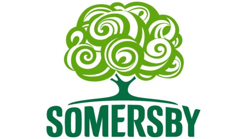
Keeping the main element of the past composition – the tree, the designers gave it a more fabulous and creative look. This made the element exclusive, standing out from similar pictures. The main objective – to make the brand more recognizable – was realized thanks to this. At the same time, the image fixed in the consumer’s consciousness was not broken.
It is no longer possible to distinguish the fruit on the branches. For 2019, in addition to the apple drink, a pear drink and variations with flavorings were produced, so the emblem was smoothly moved away from specifics, leaving the general image of a fruit tree. At the same time, filler elements are added to the crown of the living tree on the specific flavor label.
The green color of the modern logo is fresher, matching the hue of the ripe apples used in the classic recipe.
The sun’s disappearance helps focus attention on a single and well-remembered element that directly connects with the making of cider. The hues of the finished drink have also changed, and the yellow notes no longer play an important role in the image.
The curves and swirls on the crown convey a passion for the flow of life and enjoyment of each day. The bright colors of the drink lift the spirits and encourage customers to rejoice and have fun.
The brand’s name is more in harmony with the image thanks to the resizing of the letters to match the curve of the soil under the tree. The trunk seems to be holding on to the Somersby name with its roots, showing the birth of the brand from the legend of a lord who lived centuries ago.
Font and Colors
The logo’s main color is green, in different tones and shades, with the addition of yellow. Gamma evokes a feeling of warmth and coziness. It tells about drinking cider in the company of pleasant people.
- Green suggests the naturalness of the drink and the high level of tannin, typical for the green varieties of Granny Smith apples used in the recipe. The overtones create a sense of the richness of flavor, adding various fruity nuances.
- Yellow – conveys the gas bubbles that fill the glass and the caramel color of the drink.
The lettering font is similar to Ozonos Bold but has curved E and M edges.
Somersby color codes
| Cadmium Green | Hex color: | #036d41 |
|---|---|---|
| RGB: | 3 109 65 | |
| CMYK: | 97 0 40 57 | |
| Pantone: | PMS 7726 C |
| Kelly Green | Hex color: | #61a70e |
|---|---|---|
| RGB: | 97 167 14 | |
| CMYK: | 42 0 92 35 | |
| Pantone: | PMS 361 C |


