


![]() Sonos Logo PNG
Sonos Logo PNG
One hears a clear and subtle sound when looking at the Sonos logo. The emblem’s symbols encode adjusted frequencies, lightness, and good audibility. The elements are like two big speakers that look at the user and invite them to listen.
Sonos was founded in 2002 in Santa Barbara, California, by John MacFarlane, Craig Shelburne, Tom Cullen, and Tristan Badgett. The founders focused on building a wireless multi-room audio system at a time when digital music was rapidly growing. Early development focused on solving synchronization problems so that music could play across multiple speakers without delay.
The company introduced its first products in 2005 with the ZP100 players and the CR100 controller. A year later, Sonos released the more affordable ZonePlayer ZP80, designed to connect with existing stereo systems. In 2008, the launch of a controller app for the iPhone changed how customers interacted with the platform, replacing dedicated hardware controllers with smartphones.
Sonos expanded beyond connected components in 2009 with the PLAY:5 speaker, followed by PLAY:3, the SUB subwoofer, and the PLAYBAR soundbar. Partnerships with services such as Spotify, Amazon Music, and iHeartRadio helped the ecosystem grow. In 2017, Sonos introduced the One speaker with built-in Amazon Alexa support, furthering its push into voice-controlled home audio.
The company went public on the NASDAQ in 2018. Later products expanded into the portable and home theater categories, including the Move speaker with Wi-Fi and Bluetooth support, and the Arc soundbar with Dolby Atmos technology. By 2023, Sonos had developed a broad lineup of speakers, soundbars, and voice-enabled audio systems.
Meaning and History
![]()
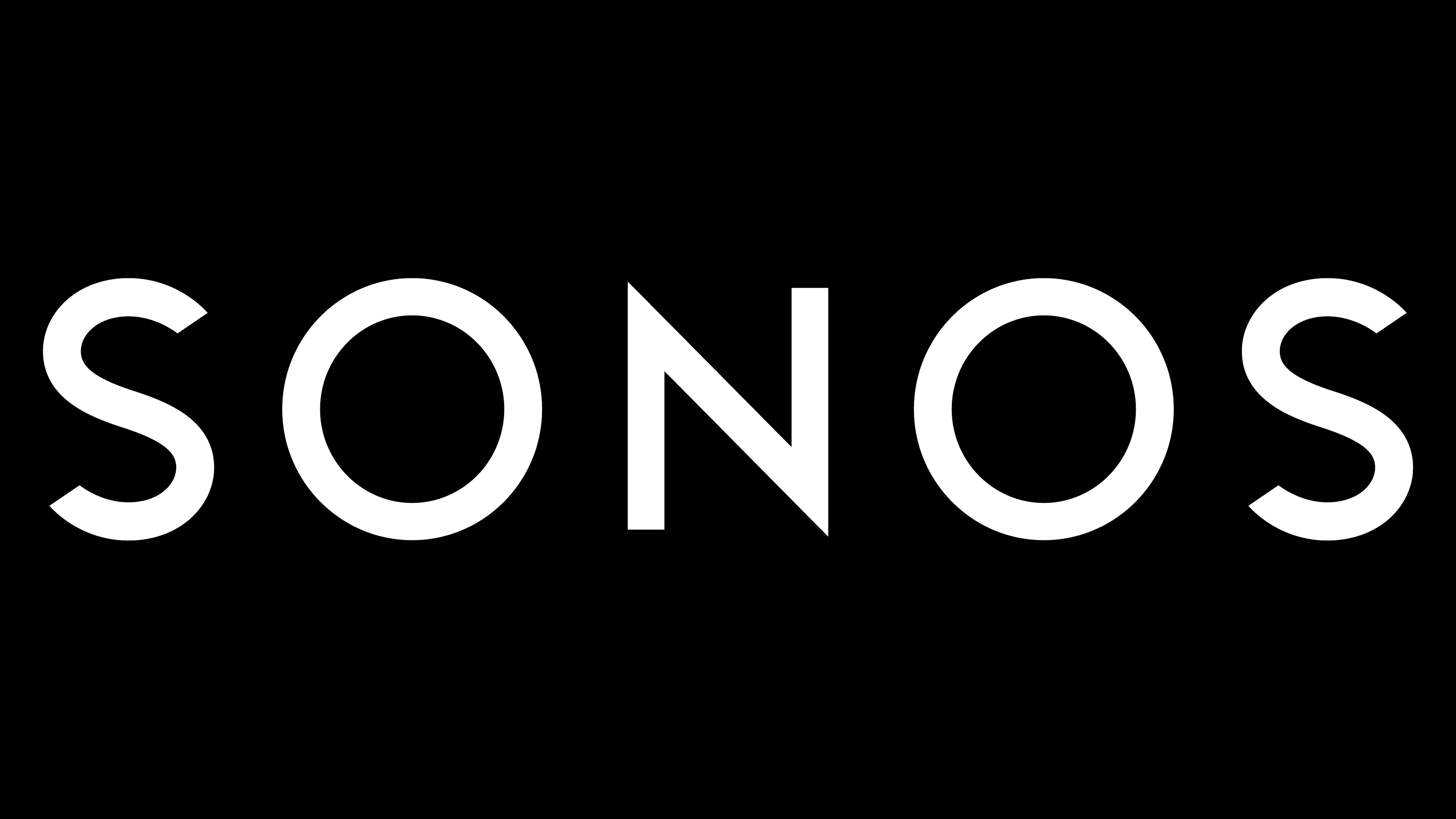
The most important thing about the Sonos logo is its name. This word is a palindrome, read from right to left and left to right. The designers did not add decorative elements to the lettering to maintain symmetry. The only exception is the first character in an oval frame.
2002 – 2011
![]()
In the debut logo, the word “SONOS” is set within a light, geometric rectangle with rounded corners. The background color is not uniform but white-gray, with a shadow and a gradient. The brand name is in a thin black sans-serif font. The inscription is surrounded by a narrow, broken frame with two red inserts.
2011 – 2015
![]()
The second Sonos wordmark was developed in collaboration with Bruce Mau Design. The geometric shape disappeared in rebranding, leaving five black letters on a blank white background. The font has become bolder compared to the previous one. In 2015, the same company, BMD, slightly modified the logo, making the lines even wider. However, the concept has not changed: the designers have kept black-and-white minimalism and classic, simple shapes.
Although the background has been removed, the inscription has not lost its attractiveness. Although it has the simplest design, it remains recognizable and memorable. The emblem’s utilitarian style balances out other, more striking visual identity elements, including iconography.
The word “SONOS,” written in black capital letters, is a mirrored ambigram. This means you can read it in any position, even upside down.
2015 – today
![]()
Due to several changes, the Sonos logo has become more noticeable and striking. The letters in this version have been thickened, making the text more expressive and confident. The font has remained the same, with simple and smooth lines, but it is now denser, emphasizing the brand’s stability and reliability.
The emblem’s background adds an extra accent, making it stand out on any surface. This gray rectangle does not distract from the main text but helps it become more prominent. The background’s gray color symbolizes neutrality and balance, emphasizing the versatility of the company’s products. This design suits a company specializing in audio systems, where simplicity and sound quality are important, and there is no unnecessary embellishment.
Interestingly, the logo is a palindrome that reads the same way in both directions. This emphasizes evenness and symmetry, which can be associated with the clarity and balance of sound the brand aims to deliver. The thick, clear lines of the font convey strength and professionalism, indicating that the company is focused on high-quality standards.
The company emphasizes convenience, quality, and innovation in its products, and the updated visual sign reflects this well. The thick letters convey solidity, while the minimalist design shows that the products prioritize sound quality over unnecessary details.
Font and Colors
The fonts on the old and new logos are roughly the same, although there are slight differences in line length and thickness. Bruce Mau Design has sought to preserve the lettering’s identity while making it look contemporary.
It used to be a sans serif typeface with subtle strokes, a perfectly round “O,” and a pointed “N” at the top and bottom. Aramis SemiLight is very similar to a sans-serif font created in 2014 by the typographer Gert Wiescher, which supports several dozen languages. The only difference is the capital “S” style: in the word mark Sonos, the top is wider than the bottom.
The company’s official font is now the Sonos Brand, but it does not match the logo design. The developers have modified one of the existing typefaces to give it individual features. A possible option is the Gill Sonos Regular, although the deviations at the ends of the letters are very noticeable. There are some similarities with the Futura Md BT Medium, except for the tweaked “S” shape. The only thing we can say for sure is that after the redesign, the inscription became bolder.
The first emblem featured a multi-component color scheme: several shades of gray were combined with white and dark, and a gradient was applied to the geometric shape. Everything is much simpler now: the text is black, and the background is white, with no smooth transitions between shades or additional color accents.