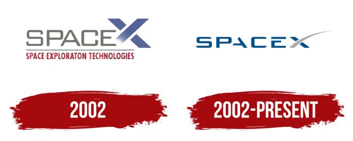
The production of space technology, high-tech developments, and the mission is the colonization of Mars; the goal is to make space more accessible; all this reflects the SpaceX logo. The American company Elon Musk has a balanced emblem that conveys confidence, strength, and stability.
SpaceX: Brand overview
| Founded: | March 14, 2002 |
| Founder: | Elon Musk |
| Headquarters: | Hawthorne, California, United States |
| Website: | spacex.com |
Meaning and History

NASA has always attracted private contractors to build ships. You can tell who owns the space capsule by looking at the logo on the device’s side: the recently launched Crew Dragon has the ‘SpaceX’ lettering with a stylized ‘X.’ The name is short for Space Exploration Technologies.
What is SpaceX?
SpaceX – short for Space Exploration Technologies Corporation from the USA. It specializes in the production of spacecraft and launches vehicles for them. The company is also involved in satellite communications. Its founder is Elon Musk. The company was established in 2002, with headquarters located in Hawthorne, California.
2002
The old SpaceX logo was featured on the company’s website. It consists of a two-level inscription, where the top line is occupied by the gray word “SPACE” and a stylized letter “X” formed from three wide blue stripes. One long diagonal is directed towards the “E,” but they do not connect: the designers used a gradient to make the end of the “X” dissolve into space. At the bottom, under a long horizontal line, is the red phrase “SPACE EXPLORATION TECHNOLOGIES” – the full name of the space technology manufacturer. All letters are capital and do not have serifs, but the font in the two lines is different. In the first case, it is more strict and rectangular, and in the second, it is elongated vertically.
2002 – today
The presented logo had two versions, but the first one was not used for a long time. The designers found many bugs in it that needed fixing. The horizontal lines of the letters “S,” “C,” and “E” seemed to them unbalanced in height, the rounded corners were inconsistent, and the vertical stripes were too wide.
The space between “A” and “C” they considered disproportionately large because “A” had no left side. The top horizontal “E” stroke was torn away from the rest of the letter, which the developers also mentioned: they did not like many creative elements, while the SpaceX logo was supposed to look solid and professional.
The stylized X was also criticized: its inner edges were too close to the dividing line, and the long curve narrowed very smoothly, which created a feeling of fragility. All this led to the fact that the designers corrected the mistakes and created a new logo.
When organizing the first flight with astronauts on board, SpaceX placed its logo on the vehicle. The Tesla vehicles that were supposed to bring the astronauts and the Crew Dragon suits and the Falcon 9 rocket featured an old NASA symbol known as the “worm.”
It was returned only for this historic event – the main sign of NASA is the blue circle “meatball,” which appeared in the 1990s. It was also used during SpaceX’s debut launch into orbit.
SpaceX: Interesting Facts
SpaceX is a company started by Elon Musk in 2002 that’s changing how we explore space.
- First Private Rocket in Orbit: In 2008, the Falcon 1 rocket was the first one built by a private company to get into orbit around Earth. This showed that governments and private companies can do big things in space.
- Reusable Rockets: They made the Falcon 9 rocket, which can be used more than once. This makes going to space much cheaper because we can use the same rocket again.
- Sending Astronauts to Space: In 2020, SpaceX, with NASA’s help, sent astronauts to the space station. This was the first time in a long time that astronauts flew to space from the USA.
- Starlink Internet: SpaceX is putting many small satellites in space to provide fast internet worldwide, even in hard-to-reach places.
- Dreaming of Mars: Elon Musk wants to send people to live on Mars. SpaceX is working on a big spaceship called Starship to make this happen. They hope it will help humans live on other planets one day.
- Fast Building and Testing: SpaceX works quickly to make and test new spaceships. This differs from how space stuff was usually done, which was much slower.
- Car in Space: They sent a car into space on their super-powerful Falcon Heavy rocket, now moving around the sun.
- Thinking About the Planet: SpaceX tries to be mindful of the environment. They use a fuel that could be made on Mars and is cleaner than others.
- There are many Launch Sites: They have several places to launch rockets, including a special spot in Texas and others in Florida and California.
- Breaking Records: SpaceX sets new records for the number of rockets it launches. Each successful launch helps us learn more about space and what we can do there.
SpaceX isn’t just about building rockets; it’s about starting a new chapter in space travel where companies play a big part. They’re always looking to do more and dream big about the future, like living on other planets.
Font and Colors
The revised version of the logo reflects a balance of curved and straight shapes. The edges of the letters look symmetrical; the top “A” is enlarged and aligned. The designers have also improved the proportions of horizontal and vertical lines to match each other in width. The rounded corners “E” (left) match the shape of the “C,” and the rectangular edges (right) blend into the sharp-angled sides of the “X.”
The developers have adjusted the letter spacing, which made it possible to set the reading pace. Now “SPACE” and “X” are a little distant, although they still form one word and represent the company’s name. The final letter has also been corrected: its inner corners emphasize the arc’s dynamic trajectory, and the cut corner of a long line creates a sense of confidence and strength. The vertical version of the emblem looks just as representative. It is intended for missiles where it is impossible to place a horizontal version of the inscription.
Simultaneously, SpaceX does not abandon the old logo and considers its use as a natural stage in the evolution of the brand. The company admits the idea that it may return in some projects and exist simultaneously with the new brand name.
As SpaceX jokes, they want to make a good impression on the Martians, which is why the space industry leader pays attention to his logo’s visual quality. And he also gives it a special meaning because the diagonal stroke “X” is shaped like a rocket launch trajectory. The association becomes apparent when you superimpose a letter on the condensation trail of the launch vehicle engines. This stylization accurately conveys the main mission of the company, which symbolizes progress and advanced technologies.
In the first version of the emblem, the design was more creative: “A,” “E,” and “X” were missing whole fragments. In the second version, the developers made “A” and “E” readable by returning the missing parts. Despite this, all the letters in the word look unusual, and the smooth curves convey a sense of speed. The SpaceX logo does not use any of the existing fonts: the inscription was invented from scratch by RO-Studio from New Jersey.
Except for the curved line in the letter “X,” all parts of the word are colored dark blue. It symbolizes dedication, perseverance, and constancy. The line representing the trajectory of the missile launch is light gray. This shade is associated with stability and calmness.
SpaceX color codes
| Medium Electric Blue | Hex color: | #005288 |
|---|---|---|
| RGB: | 0 82 136 | |
| CMYK: | 100 40 0 47 | |
| Pantone: | PMS 7462 C |
| Dark Gray | Hex color: | #a7a9ac |
|---|---|---|
| RGB: | 167 169 172 | |
| CMYK: | 3 2 0 33 | |
| Pantone: | PMS 429 C |


