The American telecommunications corporation Sprint, whose logo reflected the connection between its past and present, ceased to exist in 2020. The name was a tribute to its “telegraphic” history, and the image represented the use of cutting-edge technologies.
Sprint: Brand overview
| Founded: | December 21, 1899 |
| Founder: | Cleyson Brown, Jacob Brown |
| Headquarters: | Overland Park, Kansas, U.S. |
Sprint was a communication company headquartered in Overland Park. It ceased to exist as an independent organization in April 2020 when it was acquired by T-Mobile US Corporation. The Sprint brand was discontinued on August 2, and T-Mobile took over all wireless and wired communication services.
This was due to unsuccessful management decisions. First, the merger with Nextel in 2004. It turned out that Sprint’s network was unsuitable for Nextel’s mobile devices. The second reason was the provision of 4G using WiMax technology, while other operators chose the LTE standard.
Meaning and History
The now-defunct telecommunications company has a rich history that began with a telegraph wire stretched along railroad tracks. The word “Sprint” was formed from the initial letters of the system’s name: Southern Pacific Railroad Internal Networking Telecommunications.
Several decades later, the company began providing long-distance telephony services, and in 1992, it became a monopoly in the field of wireless communication in the USA. Later, it became known thanks to a loud advertising campaign and a thoughtful corporate style.
Until 1991, Sprint existed under various names, and each time, it had a new logo. The last name, Sprint Corporation, appeared in 2012 when the SoftBank holding bought 80% of its shares. Until that moment, the company was known as Sprint Nextel Corporation. It received this name in 2005 after the unsuccessful merger with Nextel Communications. Simultaneously, a logo was adopted, containing a black inscription and five yellow stripes in the form of a wing.
What is Sprint?
Sprint was an American telecommunications corporation. It was founded in 1899 and became the fourth-largest operator in the country during its existence. The company’s headquarters were in Overland Park, Kansas.
1972 – 1987
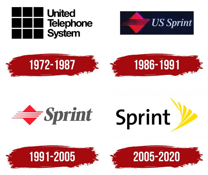
The telecommunications company Sprint began its professional path in the nineteenth century. It underwent numerous rebrandings, one of which was the rebranding of United Telecommunications and United Telephone System. This happened in 1972. Then, the organization got a logo with a large black square consisting of eight smaller squares. The composition of quadrilaterals resembled the dial buttons on a landline phone. To the right of it was a three-line inscription, “United Telephone System” in black. All three words were aligned to the left and set in the Helvetica font family.
1986 – 1991
In 1986, a merger of two companies, US Telecom and GTE Sprint, occurred. As a result, the US Sprint Communications organization emerged. Its emblem featured two red triangles positioned in a mirror reflection: one on top, the other below. They were separated by six horizontal stripes of the same red color. They were angled like a staircase and alternated with white lines. To the right of the geometric figures was the gray phrase “US Sprint.” The font used was Times New Roman Italic. Sometimes, this logo appears on a black background.
1991 – 2005
In 1990, US Sprint finally became part of United Telecom, which recently changed its name to Sprint Corporation. Meanwhile, the brand’s logo changed slightly. The number of red stripes between the two triangles was reduced to four. The abbreviation “US” disappeared from the inscription, and the remaining word was repainted in a dark shade of gray. In the upper part of all letters, except for “S,” cuts were made at one angle. As for the letter “S,” its serifs became wide and massive.
2005 – 2020
The last rebranding of the telecommunications company was timed to its merger with the wireless communication operator Nextel Communications. As a result, a logo appeared that was used until the disappearance of the Sprint corporation. It was designed by the American studio Lippincott. The designers tried to create the illusion of movement, using something like a stroboscopic effect. They drew five yellow lines of different sizes and arranged them along an imaginary circle so that the trajectory of movement was smooth. Thanks to the tips at the ends, the stripes resembled feathers, and their “fan” resembled a bird’s wing. The emblem was associated with lightness, ease, and trust. The word “Sprint” became black and moved to the left side. The font also changed: the designers replaced the italics with massive serifs with the elegant TheSans SemiBold.
Sprint: Interesting Facts
Sprint has a long history in the phone and internet business.
- How It Started: In 1899, Sprint began as the Brown Telephone Company in Kansas. It was set up to help get phone service out to places without many phones.
- The Name “Sprint”: Sprint stands for something kind of funny: Southern Pacific Railroad Internal Networking Telephony. It’s because they first laid phone lines along railroad tracks.
- Fiber Optics: In the 1980s, Sprint was one of the first to use fiber optics, making phone calls clearer and more reliable over long distances.
- Helping Build the Internet: Sprint helped build the early Internet by supporting a large network connecting many places.
- Going Global: In the 1990s, Sprint teamed up with companies from France and Germany to create a network called Global One, which helped businesses worldwide communicate with each other.
- Firsts in Tech: Sprint was the first to have a big network that was all digital and fiber-optic, and also the first to bring 4G, a fast way to use the internet on your phone, to the U.S.
- Joining Forces with T-Mobile: In 2020, Sprint and T-Mobile merged to create a super-big company that could spread 5G, the fastest internet, nationwide.
- Caring for the Planet: Sprint has been called one of the greenest companies because it tries hard to recycle and not harm the environment.
- Great Customer Service: Sprint was known for trying to make customers happy, like offering help any time, day or night, and letting people try their service without worrying about getting stuck.
- Helping the Community: Sprint cared a lot about helping out, such as supporting schools, helping after disasters, and working on community projects.
Sprint has achieved many firsts in technology and has always tried to be good to its customers and the world around it, making it a big name in how we talk to each other today.
Font and Colors
Although this telecommunications company has gone into the past, giving way to T-Mobile, its former customers still remember the combined sign adopted in 2005. The elegant word “Sprint” and the smoothly curving abstraction showed the ease with which the company provided wired and wireless services to millions of consumers.
The drawing did not carry a significant semantic load. Its main task was to evoke trust in the population at the level of positive associations. Therefore, the five-pointed stripes resembled feathers in a wing, symbolizing freedom, sublimity, and the absence of boundaries. The logo was used as a sign above the entrances to branches, and the uniforms of employees were decorated to emphasize corporate identity.
After the Sprint brand was joined by T-Mobile US and discontinued, its emblem also ceased to exist. But it entered history as a reminder of the past of the telecommunications company and served as a good example of a successful identity.
To make the name expressive, the designers used The Sans Semi Bold font. Dutch typographer Lucas de Groot invented this typeface. The emblem was uniform in color – the palette consisted of black and yellow (#FFDD05). The chosen combination of shades became part of Sprint’s corporate style in 2005 when the company merged with Nextel Communications.
Sprint color codes
| Golden Yellow | Hex color: | #ffdd05 |
|---|---|---|
| RGB: | 255 221 5 | |
| CMYK: | 0 13 98 0 | |
| Pantone: | PMS 108 C |
| Black | Hex color: | #000000 |
|---|---|---|
| RGB: | 0 0 0 | |
| CMYK: | 0 0 0 100 | |
| Pantone: | PMS Process Black C |
FAQ
What does the Sprint logo represent?
The logo depicts an improvised wing. It conveys the shape of a fan-shaped fiber optic cable. This means high-speed sound transmission, as Sprint was the first in the US to use fiber optics for long-distance telephony.
Who founded Sprint?
The Sprint Telephone Corporation was founded in 1899 by Cleyson Brown and Jacob Brown. It no longer exists – it ceased to exist in 2020, being absorbed by T-Mobile US.
When did Sprint change its logo?
The last change to the Sprint logo occurred in 2005. It was then that straight lines symbolizing telephone wires were transformed into wing-like, demonstrating the speed of the fiber optic cable. This is the company’s final logo.
What do the letters in the word Sprint mean?
The word SPRINT is an acronym. Each letter denotes an element from the long name: S – Southern, P – Pacific, R – Railroad, I – Intercontinental, N – Network, T – Telecommunications.
