


 SSC Logo PNG
The SSC logo symbolizes the high speed and unmatched performance that speed enthusiasts demand. The emblem shows how exterior design and internal engineering work together.
Jerod Shelby founded SSC North America in Richland, Washington, in 1999, originally as Shelby SuperCars Inc. The company started with a clear goal: to build a production car that could become the fastest in the world. Its early years were spent on research, design, aerodynamics, and the development of its own high-performance engineering base.
In 2004, SSC presented the Aero prototype after five years of work. Production began in 2006 with the Ultimate Aero, a supercar built around an in-house engine and a body shaped for extreme speed. In 2007, the Ultimate Aero reached 256.18 mph (412.28 km/h) on a closed road in Washington. Guinness World Records recognized the result, giving SSC a place in the global supercar market.
In 2011, the company announced the Tuatara, planned as a more advanced successor with higher performance targets. Development took several years and focused on materials, aerodynamics, and high-speed stability. The production Tuatara was shown at the Pebble Beach Concours d’Elegance in 2018. Limited production started in 2019, with a planned run of 100 hand-built cars.
In October 2020, SSC claimed the Tuatara had reached 331.15 mph (532.93 km/h) in Nevada. Still, the result was questioned due to concerns about data accuracy. A second run in January 2021 produced a confirmed top speed of 282.9 mph (455.3 km/h). In 2021, SSC added the Tuatara Striker with higher downforce and the track-only Tuatara Aggressor. In 2022 and 2023, the company continued improvements in production, deliveries, and assembly.
Meaning and History

What is SSC?
Founded in 1999, SSC North America (originally Shelby SuperCars Inc.) has changed the high-octane sports car industry. Spearheaded by proprietor Jerod Shelby (who is not affiliated with the famed car designer Carroll Shelby), this American automotive manufacturing firm, based in Richland, Washington, has established itself as a gold standard in the automotive sector. Over the past twenty years, SSC North America has led the charge in auto engineering, building a distinguished reputation through pioneering developments and achievements.
1999 – today
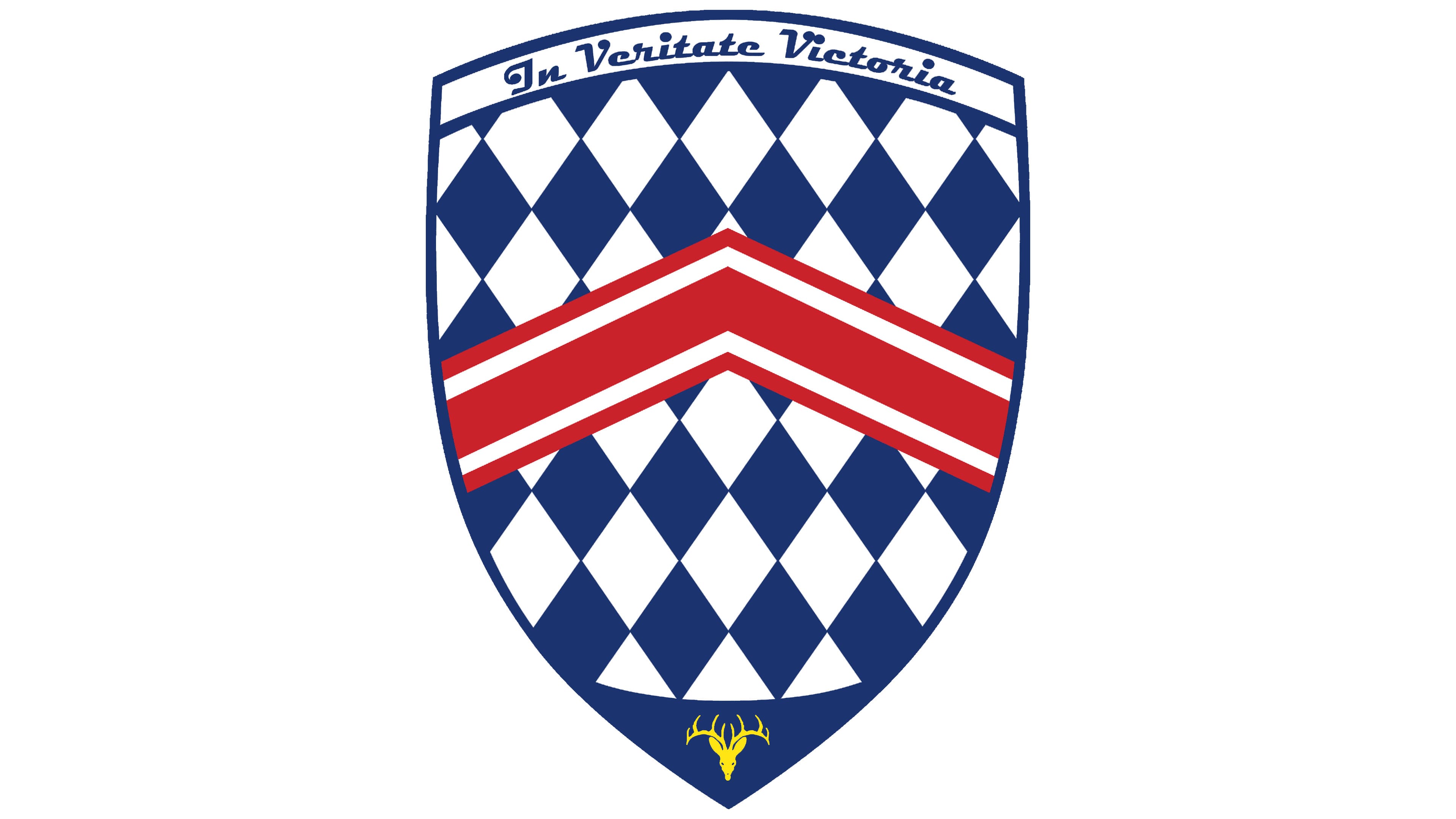
This emblem encapsulates everything essential for an automotive company in a small piece: dynamism, history, nobility, speed, sophistication, responsibility, reliability, and perfection. These qualities are conveyed through simple elements made from basic geometric shapes that, together, ideally represent the SSC brand globally.
- Triangle: Its top edge is slightly curved, resembling a shield. As a heraldic element, it fits perfectly within the sports-car logo format, showcasing its noble origins and affiliation with the elite circles of the automotive world.
- Rhombus: Many identical rhombuses, differing only in color; white rhombuses alternate with blue ones. These geometric shapes are arranged vertically, evenly filling the emblem’s entire inner space.
- Broken Line: Here, five narrow lines and one wide line are placed between them. They are bent in the middle, forming a single angle. This arrangement makes the element resemble a chevron on a uniform.
At the bottom of the shield is the head of a noble deer with branching antlers. It symbolizes speed and conveys the company’s unique character, occupying the central part of the emblem’s blue tip. To ensure the animal is distinctly recognizable, even in miniature, the designers colored it yellow.
At the top of the logo on a curved white stripe is the sports car manufacturer’s motto: “In Veritate Victoria.” Translated from Latin, it means “Victory through Truth.” This indicates the company’s complete confidence in its cars and instills this belief in speed enthusiasts. It’s no surprise their cars have set several speed records and are listed in the Guinness World Records.
The text is primarily in lowercase, mimicking a handwritten script. The letters have smooth curves and decorative dots, especially the initial glyphs of each word. The central line on the shield is colored red, which enlivens the blue-and-white background and adds tension, passion, and dynamism to the logo.