The Starz logo is large and large-scale, as is the company’s audience. The symbols of the emblem indicate sharp stories and, interesting news, strong and reliable communication channels. The image is a sign of combining into one whole a large number of separate services and programs.
Starz: Brand overview
| Founded: | February 1, 1994 |
| Founder: | John J. Sie |
| Headquarters: | Santa Monica, California, U.S. |
| Website: | starz.com |
Meaning and History
The opening of a new network with its logo took place at exactly 20.00 on 02/01/1994. She made her debut with two melodramas – “The Crying Game” and “Scent of a Woman,” released two years earlier. Initially, the service operated as a joint venture between TCI and Liberty Media, controlled by John Malone.
It should be noted that the channel was conceived as a multi-network channel, with many additional branches according to topics and interests, which was reflected in the identity. In the course of development, a large number of subsidiaries appeared, which adopted a single name. By 1996, Starz was watched by about 3 million subscribers. But despite this, in the early years of its operation, the paid television service suffered huge losses and was restructured many times with a change of logo.
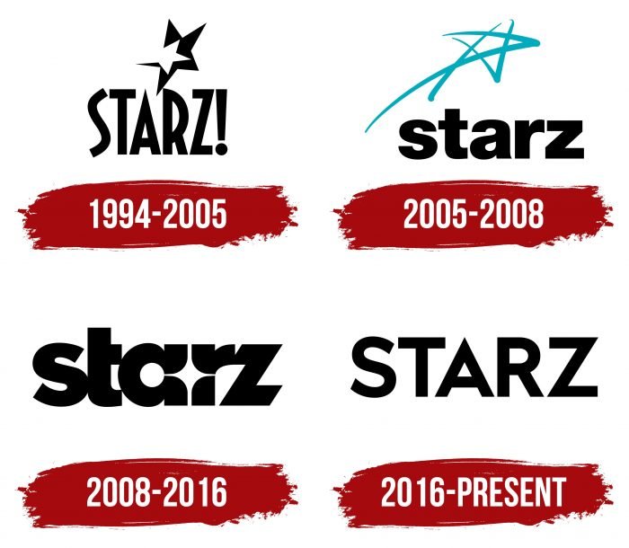
As a result, by the end of the spring of 1998, its subscriber base numbered over 7.5 million households subscribed to satellite or cable television. And each key stage of the channel’s reorganization was accompanied by a redesign of the logos, of which he had four.
What is Starz?
Starz is a television network owned by the American entertainment company Starz Inc., which in turn is part of the media conglomerate Lions Gate Entertainment Corporation. It broadcasts various content, including TV shows, original series, and Hollywood movies. Its channels are available throughout the United States and are also accessible online via the streaming platform Starz Play.
1994 – 2005
The first logo consisted of two parts: a text that included the television service’s name and a hand-drawn icon that visualized the channel’s name. The developers used an unusual font – disproportionately elongated to emphasize the new network’s stardom, with sharp corners and straight lines. Therefore, the letters resembled stylized rays of stars.
The only flowing symbol was “S,” but it also looked more like a wriggling strip. There was an exclamation mark at the end of the uppercase word “Starz.” Above the inscription was a double star: white on black, which gave the impression that a light silhouette was carved against a dark background.
2005 – 2008
At the end of March 2005, the parent service had several branches, and to indicate its individuality, the main channel changed its logo. It was developed by PMcD Design and Landor Associates. They proposed a hand-drawn star, which was executed in three strokes: in the form of the Latin letter “V,” the mathematical sign “>” and a diagonal line. The authors also chose a new writing style, using the rounded Helvetica Bold font instead of elongated, angular characters. In this version, the word “Starz” was in lower case.
2008 – 2016
Another redesign brought significant changes to the logo. Now the star was not with five, but with four rays that broke through the name. Representatives of Troika Design Group have placed it right in the word “Starz” – between the letters “a” and “r.” As a result, all the characters in the inscription looked unusual: “t” was missing the left side of the crossbar, “a” was divided into two segments, the lower part of “r” was separated from the upper one, and “z” became oblique. There was practically no spacing between the letters, so some of them merged at several points.
2016 – today
Troika Design Group also designed the current logo. She removed the star, leaving only the word “Starz.” This is because the network underwent a rebranding and received a new name – Starz Encore. Moreover, the authors returned the inscriptions to capital letters, making them thin, well readable, with a wide indentation.
Starz: Interesting Facts
Starz is an American TV network known for premium cable and satellite content, impacting entertainment since it started.
- Starting Up: Starz kicked off on February 1, 1994, under Tele-Communications Inc. (TCI), then a leading cable company, which later joined forces with AT&T and Comcast.
- Movie Magic: Starz initially stood out by focusing on movies, securing deals for exclusive rights to show films from big studios, making it popular among movie fans.
- Original Shows: In the 2000s, Starz began producing its series, with hits like “Outlander,” “Power,” and “Black Sails,” boosting its reputation for quality original content.
- Joining Lionsgate: In December 2016, Lionsgate, a major entertainment company, bought Starz for about $4.4 billion, merging their production and distribution strengths.
- Going Global: Starz went international with StarzPlay, a streaming service in Europe, Latin America, and the Middle East that features Starz originals and other licensed shows and movies.
- Digital Firsts: Starz embraced online streaming early on with its service, allowing users to subscribe directly without a cable plan and responding to the surge in streaming demand.
- Vast Library: With over 7,500 episodes and movies, including original and licensed content, Starz holds a strong position in the competitive streaming market.
- More Than Just Starz: In addition to the main channel, Starz runs themed channels like Starz Encore, Starz Comedy, and Starz Kids & Family, catering to various tastes.
- Critically Acclaimed: Starz’s originals have won awards and critical praise, showcasing the network’s dedication to compelling stories and high production values.
- Tech-Savvy Streaming: Starz has focused on digital features, including offline viewing and easy platform switching, to improve the streaming experience for mobile users.
Starz has evolved from a channel primarily showing movies to a key name in original programming and global streaming, adapting well to changes in the entertainment world.
Font and Colors
The Starz logo has undergone several major transformations, which primarily affected the presentation style of the TV service’s name. The first and last options have thin uppercase letters, the second and third have wide lowercase letters. The graphic part is absent only in the current logo, and in all other cases, it is played up in various ways. So, the star was in the form of a double black-and-white silhouette, a line-like pattern, and in the form of rays showing through the inscription.
The debut emblem is written in a grotesque stylized Zingende Bold Typodermic by Fonts Inc. The second version contains the Helvetica Bold font, which echoes Foundation Sans Black by FontSite Inc. The logo now uses a serrated typeface close to the commercial Noyh Geometric Heavy (by Typesketchbook).
But the color palette is stable: it has always remained monochrome and consisted of black letters on a white background. The only exception is the blue star in the second version of the logo.
Starz color codes
| Black | Hex color: | #000000 |
|---|---|---|
| RGB: | 0 0 0 | |
| CMYK: | 0 0 0 100 | |
| Pantone: | PMS Process Black C |
