


![]()
The State Library of Western Australia has revealed a refreshed logo and visual identity, emphasizing its role as a modern center for knowledge, culture, and the preservation of history. The redesign combines simplicity and clarity with a nod to the library’s long-standing legacy as a vital educational and informational resource for the state.
Established in 1887, the library has been a hub for research, public lending, and safeguarding Western Australia’s documentary heritage. The updated branding reflects its evolution, aligning with the library’s goal of embracing digital trends and connecting with a broader audience.
![]()
The new logo features a clean, minimalist design anchored by bold, straightforward typography. The sans-serif font emphasizes professionalism and accessibility, with large, legible letters highlighting the library’s reliability as a source of information. The text is arranged within two rectangles, symbolizing order and the systematic organization of knowledge.
Departing from the colorful, hand-drawn lines of the previous logo—which might have represented books or the shape of Western Australia—the new design focuses on a monochromatic black-and-white palette. This restrained approach enhances the logo’s adaptability across various platforms and ensures it makes a strong impression in digital and print formats.
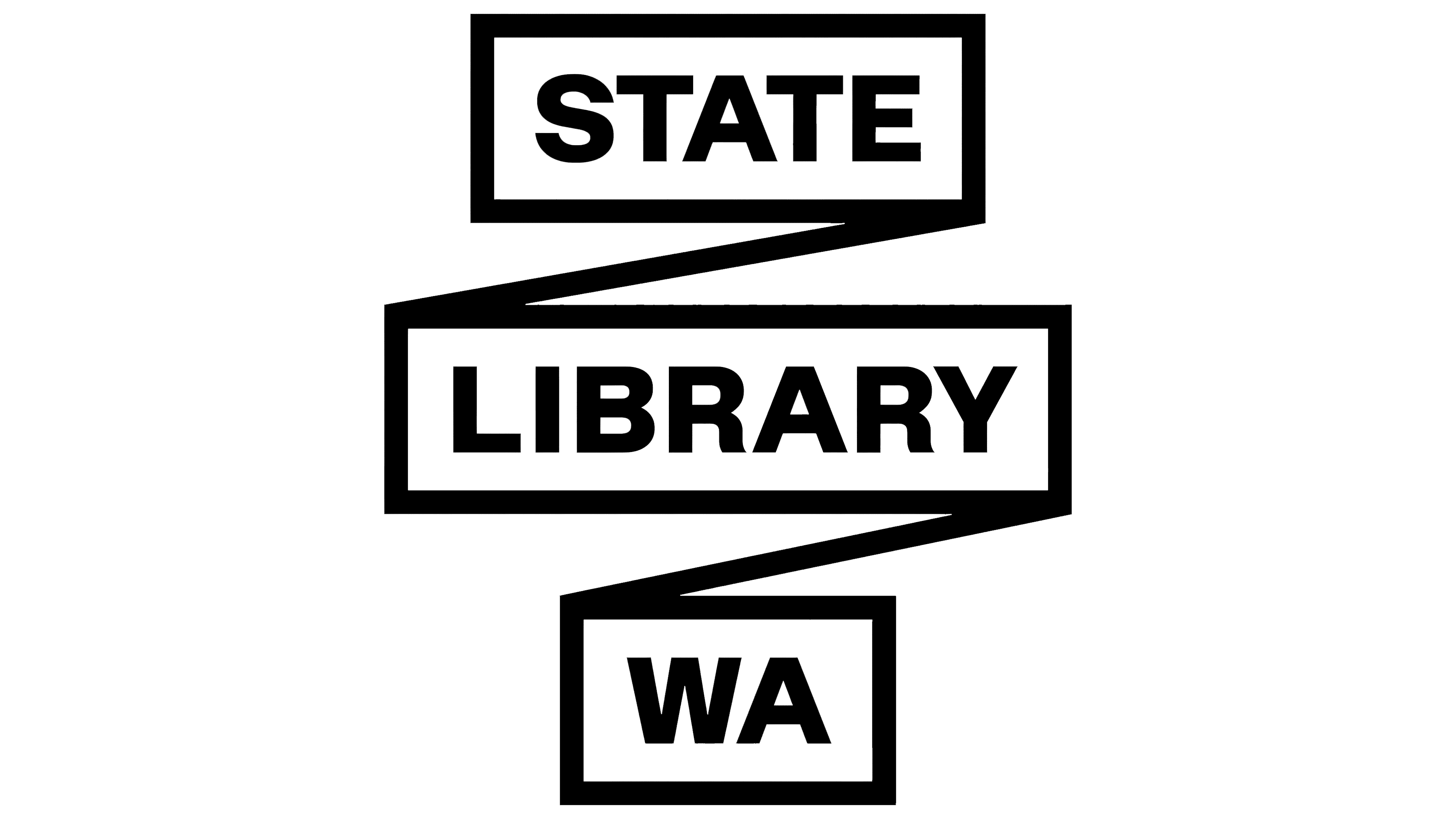
The logo’s geometric structure, featuring two slightly offset rectangles, adds subtle depth and movement. These elements suggest shelves, books, or layers of preserved knowledge within the library’s archives, connecting the design to the institution’s core purpose. The modern arrangement conveys a sense of progress while maintaining a minimalist aesthetic.
This shift from a detailed and colorful design to a streamlined logo underscores the library’s commitment to staying current with design trends while preserving its mission. The new look is designed to appeal to younger, tech-savvy audiences without losing its connection to the long-time community it serves.
![]()
The library’s monochrome color scheme and structured layout reinforce its authority and reliability. The absence of unnecessary decoration reflects its focus on functionality and clarity, aligning with its role as a key resource for education, literacy, and cultural engagement.
The State Library of Western Australia’s updated identity represents its dedication to evolving with the times while maintaining its foundational values. The new logo encapsulates its mission to remain a modern, accessible, and forward-thinking institution, continuing to support learning and community engagement for generations to come.