


![]() Stella Artois Logo PNG
Stella Artois Logo PNG
The Stella Artois logo creates a cheerful and celebratory atmosphere. Symbols show that the drink suits holidays, parades, and tournaments. The emblem alludes to white foam in tall glasses and the bright, natural-ingredient taste of beer.
Stella Artois traces its history to Leuven, Belgium. Tax records from 1366 mention the Den Hoorn brewery, whose name means “The Horn” in Dutch. The hunting horn later remained part of the brand label. The first specific document confirming Den Hoorn dates to 1466, though the company uses 1366 as its starting point.
In 1708, Sébastien Artois joined Leuven’s brewers’ guild and trained under Den Hoorn’s head brewer, Jacob de Bruyn. In 1717, he bought the brewery and renamed it Brouwerij Artois. After his death, the business passed through the Artois family until 1840, when Jeanne Marie transferred the family’s breweries to Albert Marnef.
The modern Stella name appeared after a reconstruction of Den Hoorn in the early 20th century. In October 1925, brewers made five test batches under the code “X.” On January 19, 1926, the Stella trademark was registered in Leuven. The beer was created as a Christmas gift for the city, and “stella” means “star” in Latin. By 1930, it was brewed year-round and sold beyond Belgium.
After World War II, exports resumed, and by 1964 Stella Artois was sold in other European countries. In the 1980s, Whitbread promoted it in the UK with the “Reassuringly Expensive” campaign, competing with Heineken and Beck’s. In 1988, Brouwerij Artois helped form Interbrew, and David Taylor refreshed the packaging around the 1926 label, the Den Hoorn horn, the 1366 date, and exhibition medals. Interbrew merged with AmBev in 2004 to form InBev, then acquired Anheuser-Busch in 2008 to create Anheuser-Busch InBev.
Meaning and History
![]()
The roots of this enterprise go deep into history. In 1366, a tavern in the city of Leuven brewed its alcoholic drink for hunters. Its debut logo featured a hunting horn, which the owners used to mark their products. Back in those days, the brewery was called Den Hoorn.
In 1717, the factory was bought by Sebastien Artois, who had been the head brewer there since 1708. He called it by his surname. At that time, the company was known as Brouwerij Artois. In 1926, the manufacturer first produced Christmas beer, timed to coincide with the winter holiday and named after the Christmas star. In 1930, product deliveries to the European market began.
In 1988, artist David Taylor of Taylorbrands redesigned the label, packaging, and bottle design. He connected the brewing brand’s history with its present by depicting a hunting horn. He also indicated the opening date of the Den Hoorn brewery, which served as the basis for Stella Artois. The new design also contains architectural elements specific to the city of Leuven.
What is Stella Artois?
Stella Artois is the name of the beer and the company that produces it. The main plant is located in Belgium. This drink was first brewed in 1366, when the brewery was named Den Hoorn, and was served in a tavern to hunters. Under the modern brand, it appeared in 1926. Anheuser-Busch InBev SA/NV owns the Belgian brand through its subsidiary Interbrew International B.V.
1366 – 1717
![]()
In the first years, when the brewery was combined with a tavern, its main distinguishing feature was a hunting horn. This is because it served alcoholic drinks to the hunters, which was reflected in the name Den Hoorn. Translated from Dutch, it means this particular instrument. The emblem of that time also contained the inscriptions “Van Roy” (above) and “Brouweru” (to the left of the horn). The text was typed in a grotesque font, and the horn was placed in a regular rhombus.
1717 – 1926
![]()
After the rebranding, the company became known as Brouwerij Artois. A single star lit up above the hunting horn, denoting the main winter holiday, Christmas. Nearby was the name of the company’s new owner, Sebastien Artois. The letters were thinner and sleeker in this version, with miniature serifs.
1926 – 1962
![]()
A laconic logo containing only the brewery’s name belongs to that time. The inscription was black, sans-serif, and set in an elongated type with thickened lowercase letters (the initial characters in each word remained in capitals). The first part of the name was in quotation marks because it was used not in its direct meaning but as a symbolic one (as a nickname).
1962 – 1973
![]()
In 1962, the labeling of Stella Artois beer changed dramatically. It received a genuine label and was developed in accordance with all design rules. The emblem depicted a square with a light brown border. Inside was a wide white frame, behind which was another dark brown one that framed the central red square. It contained the company’s name. The letters were white, with a black outline around the edge. Above the inscription was a pointed star in a circle, reminiscent of a compass bearing. She had a single “A” in the middle. The logo also featured the year the brewery was founded, the type of beer, and other production information.
1973 – 1975
![]()
In the simplified version, the theme of the Christmas star became predominant. Therefore, the designers enlarged the part within the circle, transforming it into an oval with a stylized “A” that had a bright star instead of a crossbar. The main color palette consisted of red (basic elements), black (frame), and white (background).
1975 – 1977
![]()
This version used an emblem of a very complex structure. The multi-component sign included three wide semi-oval stripes separated by thin black lines, supplemented with information of a different nature. A red background occupied the center, with the beer brand name painted white for contrast. The inscription was grotesque and in uppercase. Below was the year the company was founded, and above was a small icon depicting the previous logo.
1977 – 1985
![]()
For several years, the emblem was again minimalist. It was based on the name, divided into two parts, and painted white with slight shading on the right side. At the top was the word “Stella,” below which was “Artois.” In the center of the red square, a black oval-shaped ring was placed. Its middle was empty, just white.
1985 – 1988
![]()
This logo was a simplified version of the one used from 1975 to 1977. The number of edging stripes has been reduced to one wide stripe and two thin stripes. The designers removed the text, retaining only the name, which was centered. The oval now has a light-brown square in the background.
1988 – 2022
![]()
This iconic logo was created by graphic artist David Taylor at Taylorbrands. He worked extensively on the brewery’s visual identity, presenting a label that connects to the enterprise’s history and activities. The developer kept the red background and centered the title, but regrouped everything else by adding new elements. Curly lines and curls appeared around the text, resembling hop stalks. However, this is stucco, characteristic of the architecture of the buildings in Leuven, where the brewery was opened.
At the top, the author placed a hunting horn, reminiscent of how it all started in a tavern, where beer was served to hunters and for whom it was made. Around the cone, ears of barley, wheat, and hop cones are visible. Above them, the archway bears the year of the brand’s creation: “Anno 1366”. And between the word and the date is a miniature star. Under the company’s name, the artist depicted three medals awarded to outstanding beer.
2016 – 2023
![]()
The modern logo lacks a red-and-gold palette, as red is chosen as the main color. The designers removed the lower elements and simplified the upper ones, leaving only two ears, one hop leaf, and one cone. They restored the 1973-1975 shape to the star and removed the black outline from the letters and the side curls.
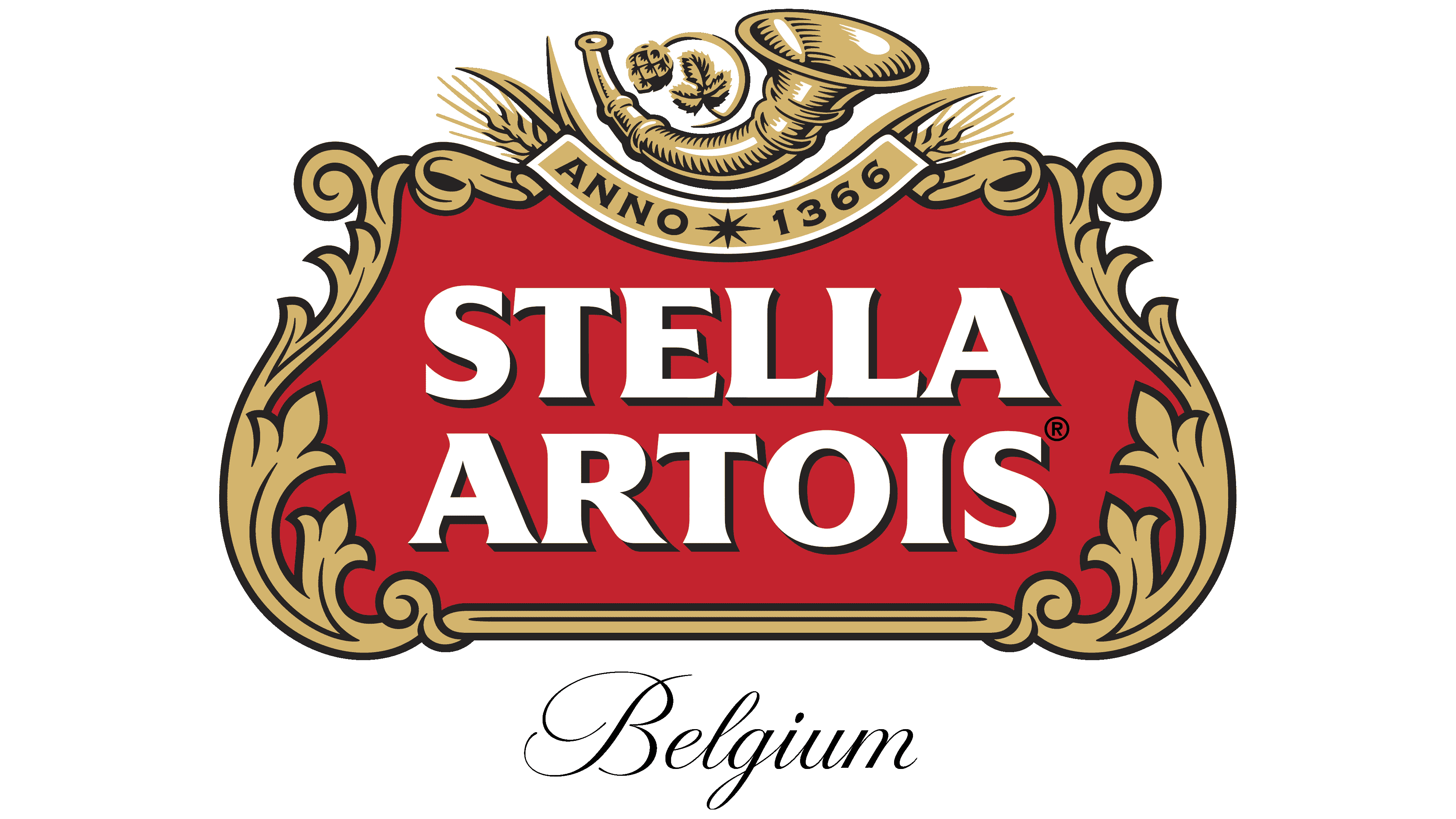
2023 – today
![]()
The Stella Artois logo conveys respect for brewing traditions and craftsmanship while remaining fresh and modern. At its center is a bright red trapezoid featuring the brand name in large white letters. The serif font adds a sense of solidity and emphasizes its connection to history.
A horn is at the top of the logo, symbolizing artisanal traditions and craftsmanship. Its rounded shapes and golden hue evoke a rich flavor, while details such as shadows and curves add depth, making the image more expressive. A hop stem with a cone and leaves emerges from the horn, highlighting the ingredients’ natural origin and high quality.
Above the horn is an eight-pointed star, symbolizing light and a festive atmosphere. Its bright red makes it stand out without disrupting the overall design harmony. Nearby are the numbers “1366,” the brewery’s founding year, emphasizing the brand’s rich history and pride in its roots.
The sides of the logo are adorned with scrollwork in a historical style. The golden lines of these patterns add elegance and a sense of luxury to the visual symbol. Despite the decorative elements, the composition remains easy to perceive, creating an image of craftsmanship honed over centuries.
The color palette of red, white, black, and gold effectively highlights the brand’s prestige. The red background makes it striking and noticeable, golden details add sophistication, and white letters ensure clarity. Black is used for the numbers, drawing attention to the historical legacy.
The updated design has preserved the key elements tied to the brewery’s traditions while eliminating unnecessary details, making it more modern and easier to perceive. The Stella Artois emblem reflects the elegance and craftsmanship the brand has carefully cultivated for centuries.
Font and Colors
The Stella Artois logo alternates between simple and complex designs. They were used every other time: a minimalist sign prevailed; in another, a multi-structural one. The main emphasis has recently been on the company’s historical roots, when it was known as Den Hoorn and brewed beer for hunters. The Christmas star also plays an important role in the brand’s identity, as the brand is named after it.
The Friz Quadrata typeface is used in modern logo versions as a bold sans-serif with elegant, almost invisible serifs. The corporate palette comprises red, gold, and white, with black as the delimiting color.