Strawberrynet: Brand overview
In 1998, Strawberrynet, a company initiated by Rodney Miles, emerged in Hong Kong. Initially, this online platform carved a niche for itself by offering discounted perfumes and cosmetics. Over time, it became a popular destination for Asian consumers looking to purchase premium, low-price cosmetics from international brands.
Not stopping there, Strawberrynet has expanded its range of products to offer a wider range of products from skincare and makeup to hair care products. The company’s unwavering commitment to authentic products has enhanced its reputation in the beauty industry. With Hong Kong becoming a global shopping mecca, Strawberrynet organized an extensive supply chain and warehouse system to ensure prompt deliveries to its ever-growing clientele around the world.
The 2000s marked a significant milestone for Strawberrynet. The company experienced exponential growth as online shopping gained momentum in Asia, coupled with a growing demand for overseas beauty products. The company sends 2 million parcels annually to a variety of consumers from over 100 countries.
Despite tremendous growth, Strawberrynet remains an independent entity, with founder Rodney Miles actively leading its development as CEO. The digital sphere remains a major driver of sales, capitalizing on the potential of e-commerce and online marketing. Today, emerging from its Asian roots, Strawberrynet is well positioned in the global beauty retail arena, neighboring industry titans such as Sephora and Ulta.
Meaning and History
What is Strawberrynet?
Strawberry, a privately held company headquartered in Hong Kong, is a preferred supplier of cosmetics, skincare, hair care, and fragrances. It offers premium beauty products at reasonable prices. Asian beauty enthusiasts especially admire it. With a team of over 200 dedicated employees and delivery services operating in over 100 countries, Strawberrynet is prominent on the global stage.
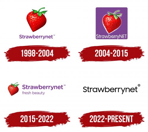
1998 – 2004
2004 – 2015
2015 – 2022
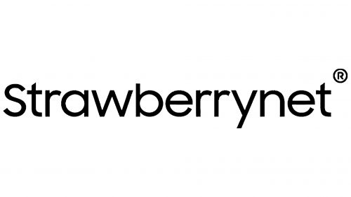
2022 – today
This online cosmetics store chose a simple two-dimensional logo in black color. It features only the name and the letter “R” in a circle. The symbol is located at the end of the word “Strawberrynet,” right above the letter “t.” The text is mostly lowercase, with the only capital “S” being the first letter. The glyphs have a good balance between smooth and angular, with no serifs and smooth ends. The letter “t” has a slanted cut; the others are straight.
The logo resembles smooth black coffee without sugar or cream. The letter “R” in the shape of a small coffee bean at the top indicates that it is real coffee. The first capital, “S,” is like the first sip, the awakening. The rest of the word just pours out, like the warm feeling when you realize you’re starting the day right. The straight and slanted ends of the letters make it feel ornate but not too flashy.
Strawberrynet color codes
| Maximum Purple | Hex color: | #722b8e |
|---|---|---|
| RGB: | 114 43 142 | |
| CMYK: | 20 70 0 44 | |
| Pantone: | PMS 2593 C |
| Black | Hex color: | #000000 |
|---|---|---|
| RGB: | 0 0 0 | |
| CMYK: | 0 0 0 100 | |
| Pantone: | PMS Process Black C |


