![]() Street Fighter Logo PNG
Street Fighter Logo PNG
The Street Fighter logo reflects the combative atmosphere and energy of fighting video games. It emphasizes the franchise’s distinctive features, such as combat, mastery, and rivalry. The emblem’s shape conveys the high dynamics of the battles, creating a sense of intense action to attract gamers’ attention.
Meaning and History
![]()
Each game in the main Street Fighter series has its distinctive sign. The earliest of them appeared in 1987, with the release of the first part of the franchise. Until the early 2020s, the logos were characterized by vivid colors and uneven shapes. The red-yellow inscriptions with carelessly drawn letters resembled street graffiti. They were rebellious, aggressive, and youthful, and expressed the dynamism of the fighting genre. In contrast, Street Fighter 6’s emblem embodies calm and cold calculation. Its minimalist design not only broke stereotypes but also sparked debates among gamers.
What is Street Fighter?
Street Fighter is a media franchise based on the eponymous series of video games. The first part was released in 1987 and was dedicated to a martial arts tournament, allowing gamers to control the main character, Ryu. The second game was released in 1991 and established new rules in the fighting genre, offering a wide selection of characters with different characteristics. Street Fighter 6 was released in 2023. The series is developed by Capcom, which also owns franchises such as Devil May Cry, Monster Hunter, and Resident Evil.
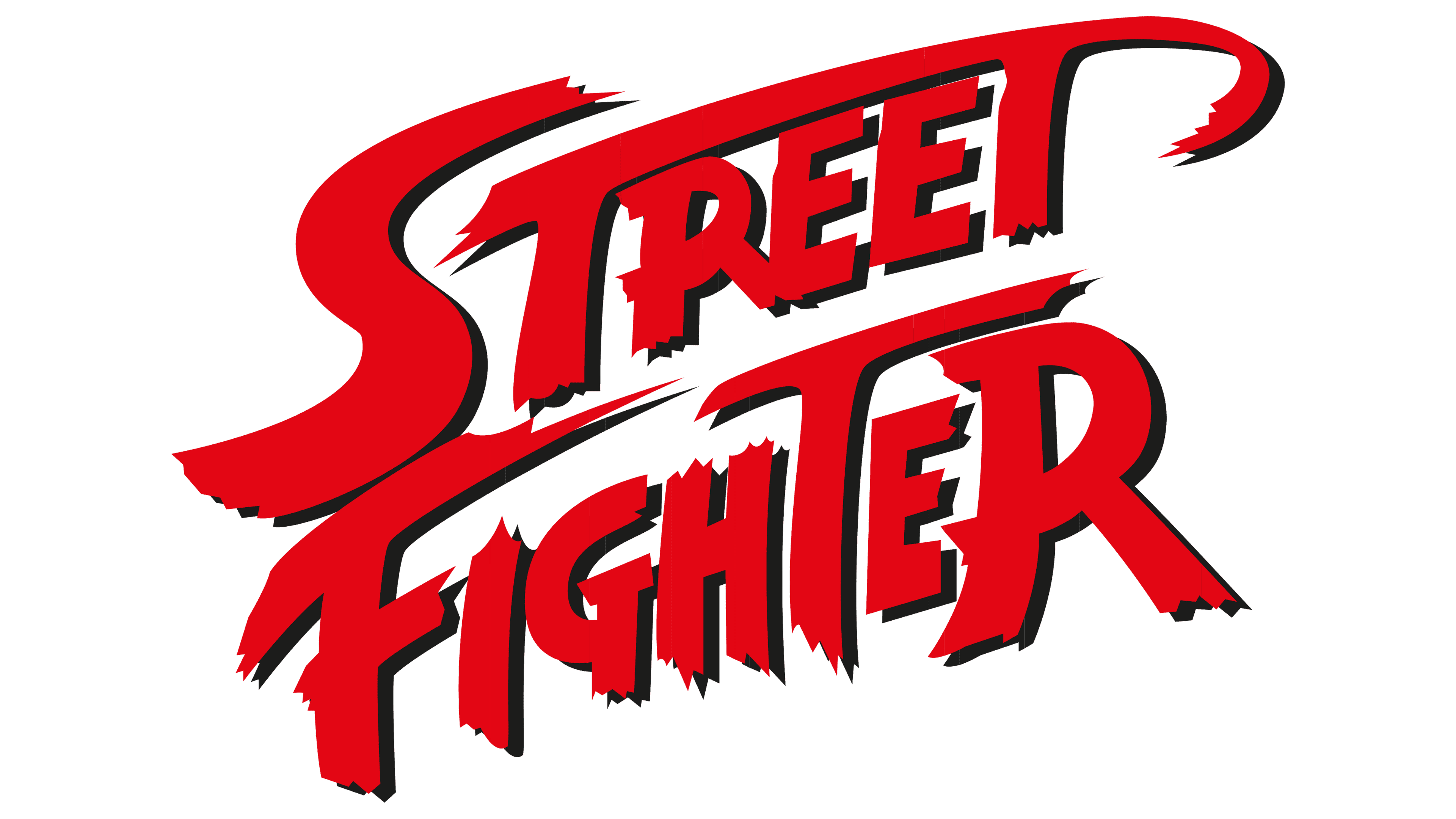
1987 – today
![]()
This logo has been in use since the release of the first game in the series. Designers stylized its name in graffiti style, with each element featuring uneven edges and serrations. The wordmark occupies two levels, with almost no gap between them. The right side is raised upwards, symbolizing the aspiration for progress and leadership. All letters are uppercase, but they vary in size: the largest are the initial “S” and “F,” as well as “T” and the final “R” in “FIGHTER.”
Both lines have a red top and a yellow bottom, with a smooth gradient between them. This palette signifies strength, vibrant temperament, and inexhaustible energy. Black shadows falling to the right and slightly downwards create a volumetric effect.
1991 – today
![]()
In 1991, the franchise introduced a new logo with a two-level inscription. Here, the colors were reversed: red at the bottom and yellow at the top. The gradient remained, but the shades became darker. The shape of the letters also changed, although the style remained informal. They are still uneven and have serrated edges. The two “T”s in “STREET” are connected by a common horizontal strip, forming a “roof” over “REE” and curving smoothly on the right side. The emblem, like the original version, is placed diagonally and complemented by thin black shadows.
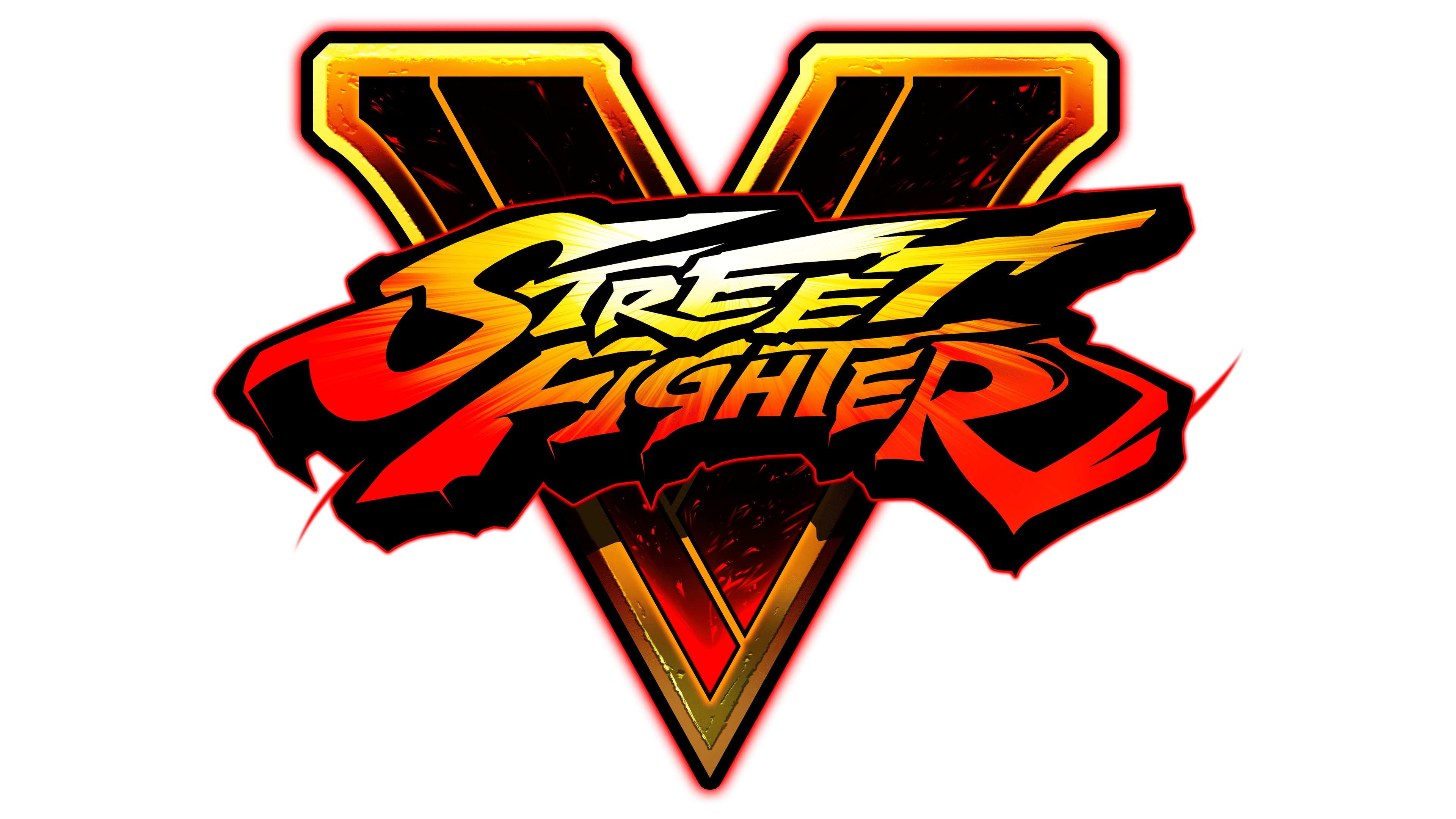
2016 – today
![]()
This logo uses a radial gradient with a white center that gradually transitions to yellow and then red. The letters are transformed so that the side parts of the inscription are enlarged, creating a convex effect. Many of them have sharp protrusions and spikes. The top line is raised on the right side, and the bottom line is curved into an arch. Black shadows became solid and dense to contrast the bright red text.
2022 – today
![]()
The Street Fighter emblem maintains a powerful aesthetic that highlights the dynamism of the battles. Its design includes elements associated with martial arts, but indirectly, through sharp angles, stark lines, and clear contours. The shape of the letters conveys the atmosphere of intense and thrilling fights. In turn, bright colors symbolize passion, energy, and combat.
Font and Colors
The franchise name has always been set in a custom font, reflecting the franchise’s originality and uniqueness. The colors are also chosen to express the uniqueness of the fighting genre: since 1987, the logos have predominantly featured red, yellow, and black. This is a contrasting combination associated with strength, dynamism, and vivid emotions.