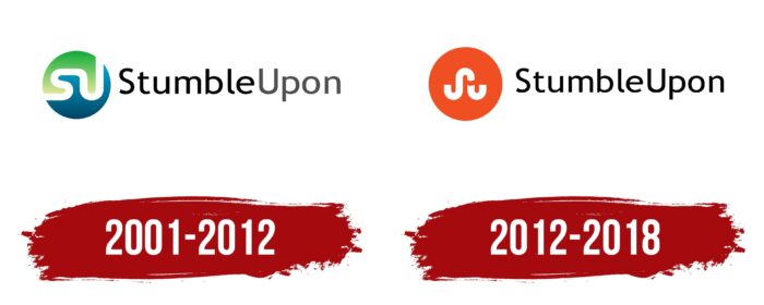
For the search engine, the StumbleUpon logo symbolizes the process of randomly generating results. After all, this service worked on the principle of roulette and redirected users to the most unexpected places on the Internet. In fact, both the emblem and the search engine looked like the result of a crazy experiment.
StumbleUpon: Brand overview
| Founded: | November 2001 – June 2018 |
| Founder: | Garrett Camp & Geoff Smith |
| Headquarters: | San Francisco, California, United States |
| Website: | stumbleupon.com |
Meaning and History
StumbleUpon Inc. started as a small startup in 2001 when Geoff Smith, Garrett Camp, and Eric Boyd launched a search engine that recommended personalized content to users. Their business gradually grew and attracted large investments. In 2007 the site was sold to eBay. But the creators of StumbleUpon thought this was a bad decision, so they teamed up with investors and bought out their product just a couple of years after the previous deal.
At first, everything was fine: the service’s popularity grew until the number of users exceeded 12 million. In 2011, its owners carried out a major redesign, which was criticized. Then StumbleUpon got a new orange emblem instead of blue-green. Due to the new visual identity, site traffic has plummeted. Meanwhile, the company chased profits and even laid off some employees to save money. Attempts to cut costs and increase traffic were unsuccessful, so in 2018 the search service was closed, unable to withstand the competition with social networks.
What is StumbleUpon?
StumbleUpon is an unusual search engine that recommends new online content to users based on their interests. She found a variety of websites, for which it was enough to click on the orange “Stumble” button. Since 2018, the service has not existed: it was closed due to a sharp decline in popularity.
2001 – 2012
The first StumbleUpon logo contained a blue-green circle divided in two by a sinuous white stripe. This line symbolized a circular format, similar to how a website redirected users from page to page, helping them navigate the web. Both halves had a gradient: there were light shades closer to the middle and dark ones along the edges. Fun fact: The two-tone badge looked like a mini pack of Cascade Complete dishwashing detergent.
The inscription with the service’s name was to the emblem’s right. The designers chose a sans-serif typeface for it, roughly similar to Asap Bold by Omnibus Type. The first word (“Stumble”) was black, and the second word (“Upon”) was gray.
2012 – 2018
On December 6, 2011, a new design for the StumbleUpon website was unveiled as it was getting ready to go international. At the same time, a minimalistic version of the logo appeared – this time without the famous blue-green circle. An orange circle replaced it with a short curving line in the middle. The white stripe was split into two sections so that the left side looked like a diagonally turned “S” and the right side looked like a “U.” The wordmark became completely black but remained in its place. At the same time, the font was slightly changed: the developers kept the grotesque but made it more round, similar to Roger White’s Yoxall Bold.
The company’s designers created the visual identity in collaboration with the Huge agency. Before making the changes, they conducted several surveys and found out that people liked the upcoming changes. But when the rebrand was completed, it caused a flurry of criticism because StumbleUpon began to resemble Pinterest in appearance, and users did not like it. The logo remained relevant until 2018 when the service closed.
Font and Colors
The first letters of the company’s brand name are encrypted in a white winding stripe: “S” and “U.” But this is not just a stylized monogram but a symbol with a deep meaning because the white line resembles a winding road that leads into the unknown. This value echoes the main function of StumbleUpon – random content search. The emblem represents progress, forward movement, development, and an exciting journey from one page to another.
The brand name is written in a sans-serif font. Even though “Stumble” and “Upon” are concatenated, both words start with a capital letter. The geometric sans serif chosen by the designers is similar to GNU FreeFont’s FreeSans Bold, but with rounder glyphs, as in Roger White’s Yoxall Bold.
After the logo update in 2012, the most criticized was the change in the color scheme. During this period, there was a sharp transition from a combination of blue and green to a dark orange hue (#EB471D). The strip inside the circle remained white, and the inscription became completely black, whereas before, its second half was gray.
StumbleUpon color codes
| Coquelicot | Hex color: | #eb471d |
|---|---|---|
| RGB: | 235 71 29 | |
| CMYK: | 0 70 88 8 | |
| Pantone: | PMS 172 C |
| Black | Hex color: | #000000 |
|---|---|---|
| RGB: | 0 0 0 | |
| CMYK: | 0 0 0 100 | |
| Pantone: | PMS Process Black C |


