


![]() Sublime Logo PNG
Sublime Logo PNG
The unusual Sublime logo matches the group’s style. It is serious, mysterious, and daring at the same time. Behind the standard framework lies a freedom-loving spirit that wants to break out. This can be seen both in fuzzy forms and in broken proportions.
For Sublime, the logo reflected the album’s content because the group performed songs across a variety of genres. He gave particular preference to ska-punk, hip-hop, dub, heavy metal, reggae rock, and their mixture. The band formed in 1988 and disbanded in 1996 due to the death of frontman Bradley Nowell. He was also a guitarist and vocalist, with Eric Wilson on bass and Bud Gaugh on drums. The rockers were based in Long Beach, California.
It all started with the friendship of Bud Gaugh and Eric Wilson, who had known each other since childhood. One of them was taught to read music by his father, so the friends formed a musical group and invited Michael Happoldt, who later became Sublime’s manager, to join. Their punk band, The Juice Bros., consisted of three people, and Bradley Nowell later joined them. At that time, he had just left the University of California and met Gaugh and Wilson. Reggae, ska, and punk rock, which resulted in an inimitable musical fusion, were carried away from the beginning.
The band played its first show in the summer of 1988. The concert took place in a small local club. But many were skeptical about their eclectic style, so they refused to invite musicians to events. In response, they created their label – Skunk Records. This added to their solidity and increased demand.
In the years that followed, the rockers started playing venues more often with other ska acts such as the Skeletons, No Doubt, and Smokestacks. Sublime recorded three major albums, but their real popularity came after the breakup. World fame came to them through the collection of the same name, released by the latter. Thanks to it, the musicians in 1997 were recognized as the most famous American rock band.
Now they are also trying to be creative, recording cassettes and making remixes. One of the latest projects dates to 2021: the digitally remixed album Sublime Meets Scientist & Mad Professor Inna LBC was released. The emblems of rock artists changed with each album’s release, and since there were few of them during their careers, there are also few logos.
Meaning and History
![]()
What is Sublime?
Sublime was an American rock band from Long Beach, California, active in the 80s and 90s. They formed in 1988 and ended their career in 1996 following the leader’s death. Now, musicians release only remixes. The main direction of their work is a mixture of ska-punk, hip-hop, dub, heavy metal, reggae rock, and some other styles. The group included Bradley Nowell, Eric Wilson, and Bud Gaugh.
1992 – 1994
![]()
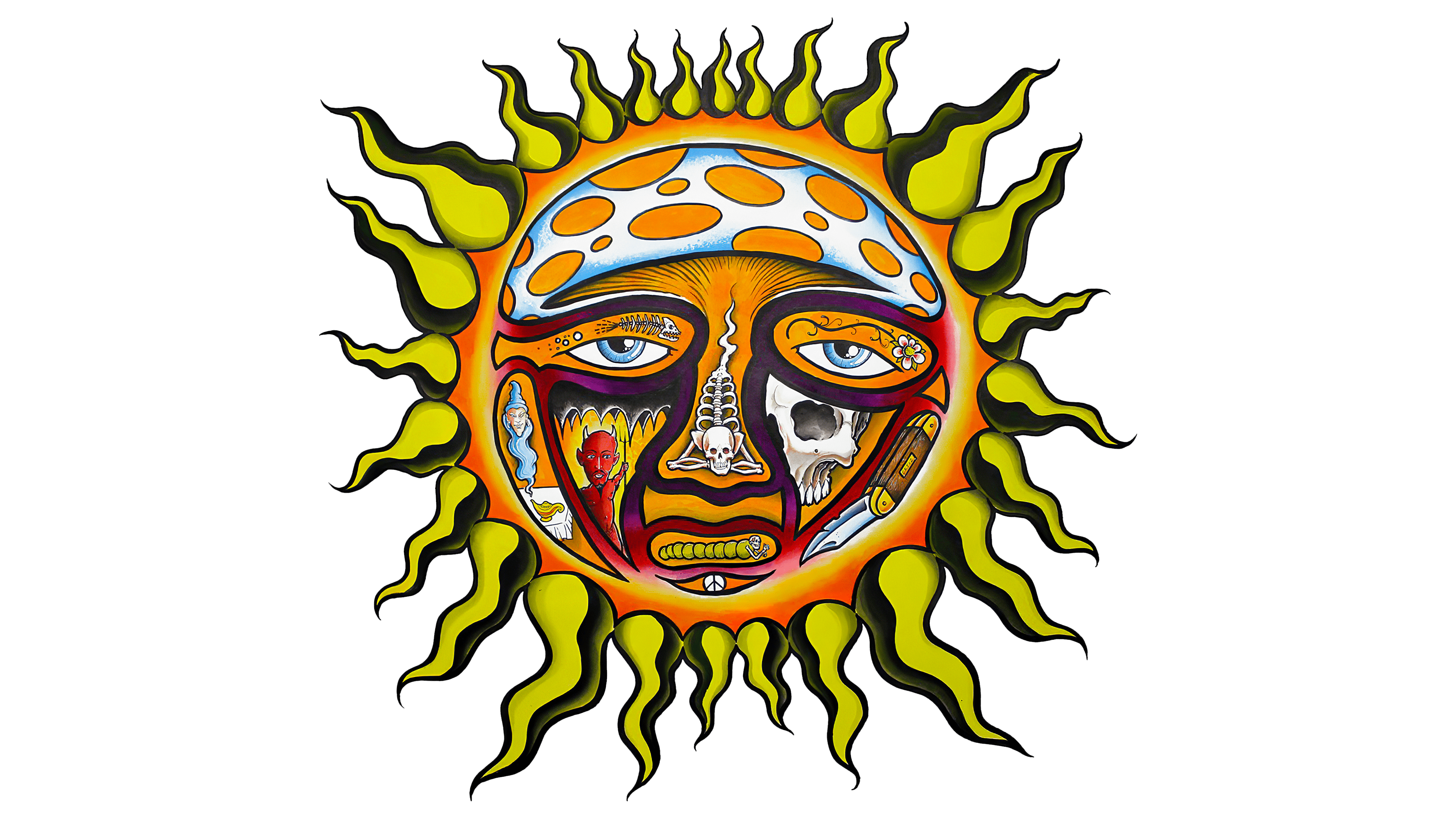
The first Sublime logo is associated with the debut compilation called 40oz. to Freedom. It features a black square with a sad sun in the center. Moreover, the luminary is depicted as non-standard: with chaotic spots and black stripes that form facial features. They surround the sun’s nose, mouth, and eyes with a human look. The mini-ellipses covering its surface resemble craters. Rays are placed along the edges of the circle. But they are not straight but sinuous, which testifies to the individuality of the work of rock musicians. The group’s name is written in the red rectangle at the top.
1994 – 1996
![]()
The second emblem is compact: it has only one word. A brief black inscription is located on a white background. It is in a classic serif typeface. This is the group’s name in lowercase. This logo adorned the 1994 music collection Robbin’ the Hood.
Font and Colors
Sublime’s visual identity style is not coherent. Each option has its own design, dramatically different from the previous one. This trend is associated with the peculiarities of the musical creativity of the group – fusion and a mixture of different genres. This explains the lack of a unified style in the album designs.

The rockers chose a bold, grotesque font for the first logo with flattened glyphs. For the second, they used a version similar to the traditional typewriter typeface, Times New Roman. However, it looks more like Urania Piccola II Medium, designed by Georg Sommeregger. The emblems’ color palette includes black, red, yellow, white, and blue.