


![]() Sonic Superstars Logo PNG
Sonic Superstars Logo PNG
Designers made the Sonic Superstars logo colorful and three-dimensional to reflect the game’s graphics. Bright colors highlight the characters’ energy and optimism, while elongated shapes convey speed and dynamism. Overall, the emblem matches the style of the fictional world in which the franchise’s events take place.
Meaning and History
![]()
When the platformer Sonic Superstars was in development, it was codenamed Sonic Orion, which is related to the eponymous constellation. There was no final version of the logo at that time: designers simply combined images of the four video game characters, complemented by a colorful inscription. Later, in 2023, the concept was refined. The emblem came to include four stars representing the game’s heroes:
- Blue – Sonic the Hedgehog;
- Orange – Miles Prower;
- Red – Knuckles the Echidna;
- Pink – Amy Rose.
However, the characters themselves were no longer present, only stars shooting out from behind the inscription. The trailing tails create an illusion of rapid movement. They convey the high speed that Sonic and his friends can achieve.
What is Sonic Superstars?
Sonic Superstars is part of the Sonic the Hedgehog media franchise. It’s a platformer game where the character must navigate uneven terrain, performing various tricks. It was developed by Sonic Team and Arzest and released by Sega in 2023. The player’s task is to complete a series of levels, defeat all bosses, collect Chaos Emeralds, and save the world from the villainous plans of Doctor Ivo “Eggman” Robotnik.
Before 2023 (pre-release)
![]()
At the center of the logo are four game characters that can be chosen for level progression:
- Sonic the Hedgehog, with blue spikes on his head, is the main hero of the franchise.
- Pink hedgehog Amy Rose is his friend.
- Red Knuckles, the Echidna, the antagonist;
- Orange two-tailed fox Miles Prower, Sonic’s best friend.
All of them are anthropomorphic animals and wear white gloves, reminiscent of Mickey Mouse. The creators of the emblem made the characters three-dimensional, using shadows and gradients, so they look just like in the game.
At the bottom, in the foreground, there’s a ribbon with three horizontal stripes: one white and two red. It bears the phrase “SONIC ORION,” the codename for Superstars. It’s styled similarly to the inscription in the Sonic Origins logo, meaning it’s divided into two lines. It uses a similar font with uneven “C” letters and diagonally slanted “O”s. Consistent with traditional design, the first word is colored yellow and outlined in blue, while “ORION” is in varying shades of green. Black shadows surround the glyphs, making them crisp.
Behind the characters, large stylized wings are visible, another nod to the Sonic Origins emblem. But in this case, they are composed of wide horizontal feathers resembling parallelograms with rounded corners. Their color gradually shifts from white to grey, with the left wing lighter than the right. The general background features a blue sky with white clouds and snow-capped mountain peaks.
2023
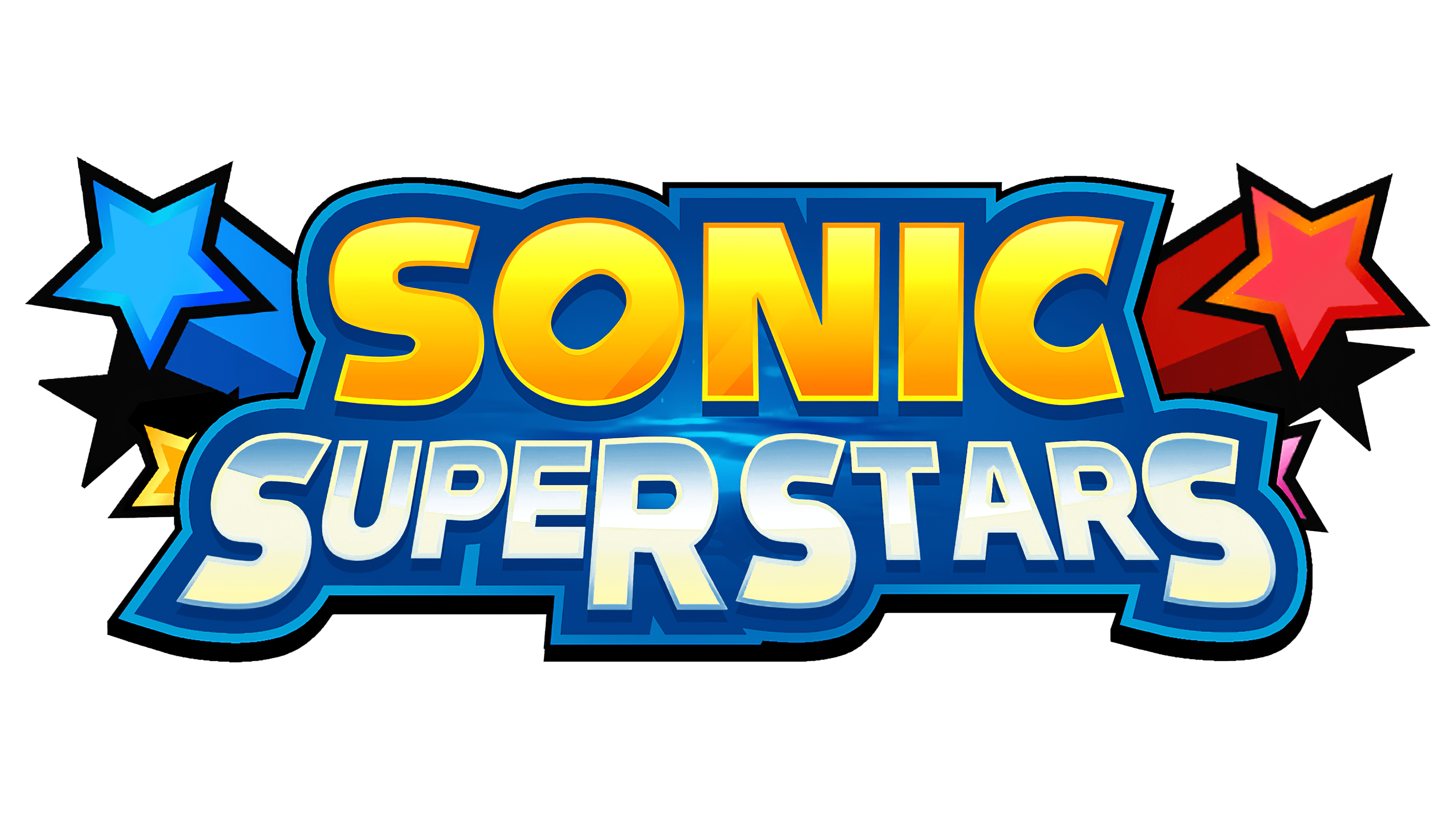
![]()
When the game Sonic Superstars was released, it became clear that its final logo differed significantly from the preliminary version. Gone were the franchise characters, the white-and-red ribbon, and the large stylized wings. Instead, new decorative elements appeared: four stars shooting out from behind the inscription, leaving long trails. They are positioned two on each side: blue and orange on the left and red and pink on the right.
The main space is occupied by the two-level inscription “SONIC SUPERSTARS.” The first word is colored in a yellow gradient, and the second in white and light blue. They stand out in contrast amid wide, dark-blue outlines. Designers retained the recognizable font style, characterized by bold, sans-serif letters, but altered it for “SUPERSTARS,” making the spaces inside the letters very narrow. At the bottom, the size of the glyphs changes from large (at the edges) to small (in the center). They are aligned in height, making the line curve and resemble an arch.
Font and Colors
The word “SONIC” is in bold, sans-serif font and is often used in the gaming franchise. Presumably, it’s a modified Syntax Ultra Black. For “SUPERSTARS,” designers chose the Latitude Sans typeface, created in 2019 by Brian J. Bonislawsky and Jim Lyles. Both variants match in style but differ in glyph shape and the size of spaces inside the letters.
The logo’s bright colors create an atmosphere of joy and fun, as their purpose is to attract children’s attention and convey the positive emotions experienced while playing the game. Additionally, red, blue, pink, and orange correspond to the colors of the main characters. Due to the gradient, the inscription and stars appear three-dimensional, resonating with the platformer’s 2.5D graphics.