


![]() Swat Logo PNG
Swat Logo PNG
Special Weapons And Tactics does not have a single officially approved emblem because each division uses a unique set of symbols that characterize its history, mission, and values. The SWAT logo may vary by region, yet these versions share many commonalities. They often include elements associated with bravery, strength, and determination, emphasizing teamwork, law enforcement, and the ability to act in extreme situations.
The history of SWAT (Special Weapons and Tactics) units began in the United States in the 1960s, driven by increased civil unrest, violent crimes, and high-profile incidents such as the mass shooting at the University of Texas, where a sniper killed 16 people. Initially formed within the Los Angeles Police Department, the specialized teams quickly expanded nationwide, utilizing military-inspired training tailored for civilian scenarios, including hostage rescue and urban combat. The FBI followed by creating its elite Hostage Rescue Team to handle terrorism and hostage crises. Over the subsequent decades, SWAT units became essential for high-risk warrants and counterterrorism operations, adopting advanced negotiation tactics and increasingly sophisticated technology. The acquisition of military-grade equipment, including armored vehicles, sparked public debate over its aggressive tactics, particularly following highly publicized incidents and protests. In response, many departments have adopted body cameras and emphasized transparency, de-escalation strategies, and accountability, continually adapting their approach to new threats and public expectations.
Meaning and History
![]()
There are no uniform rules that all SWAT groups in different U.S. cities follow. Each formation decides what weapons to use and what logo to adorn its uniform. Nonetheless, their systems of visual identification share many similarities. Since these police divisions have special training and perform complex tasks, their emblems typically symbolize the following values:
- team spirit;
- patriotism;
- safety;
- power and strength.
SWAT logos often feature an eagle, embodying the ideal qualities of a special forces soldier, such as honor and bravery. Moreover, this bird is a national symbol of the U.S. and appears on many coats of arms and flags.
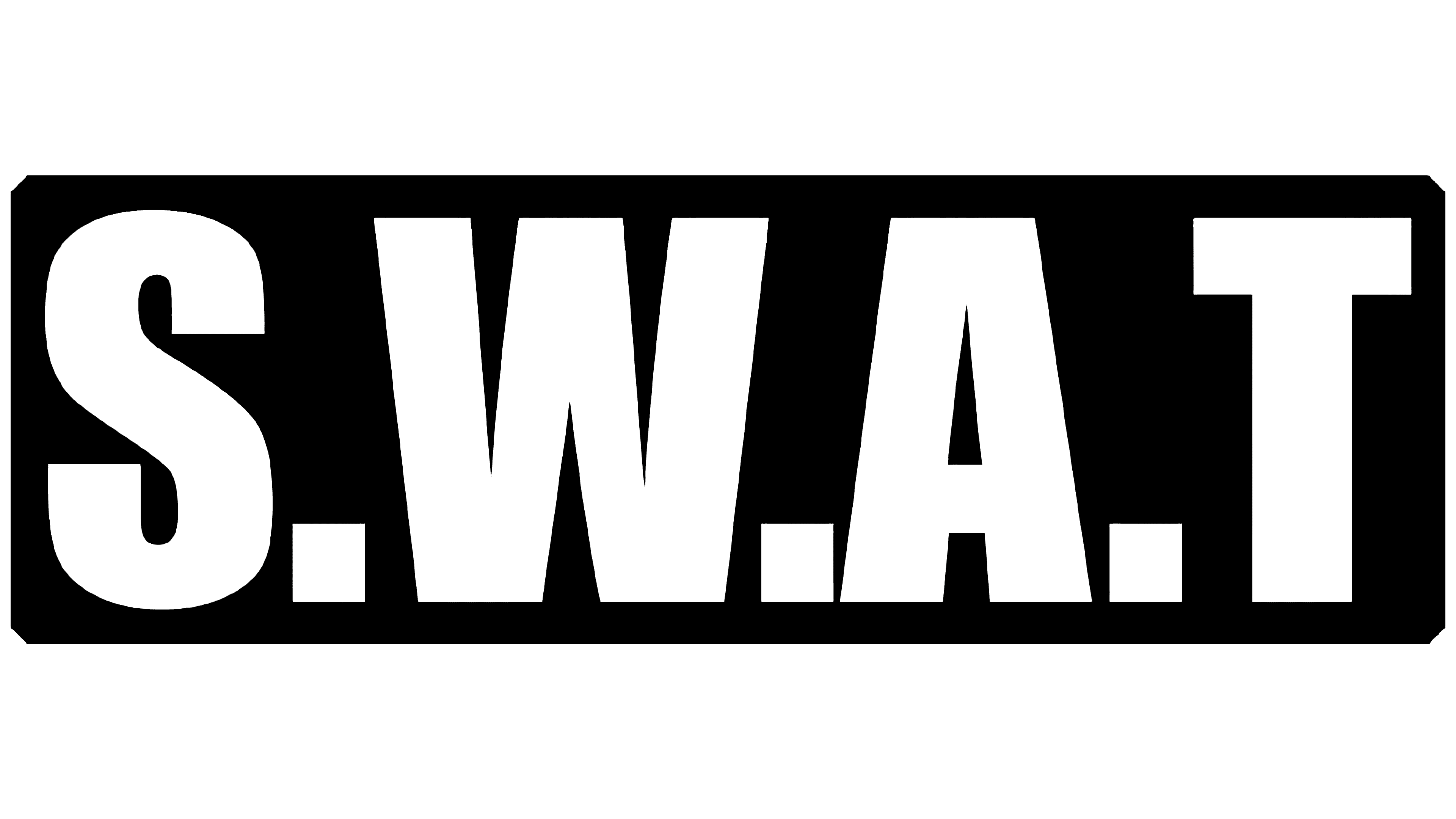
A broad light stripe outlines a verbal sign with the white inscription “S.W.A.T” on a black rectangle background. The distance between the letters is uneven. The bold, vertically elongated font is roughly similar to the Royal Rumble Regular from The Sports Fonts, but differs in that it lacks thin dividing lines. The inscription style is reminiscent of a military aesthetic, characterized by uppercase glyphs, conciseness, and minimal details.
What is SWAT?
SWAT is an elite police special unit that performs the most complex tasks, including the arrest of dangerous criminals, the neutralization of explosive devices, the prevention of terrorist acts, and the rescue of hostages. These are well-trained teams with the best equipment and modern weapons. The first such assault group appeared in Philadelphia and other U.S. cities. Different divisions do not have a common concept; they are united only by the special nature of their duties.
1964 – today
![]()
The logo is presented by D Platoon (SWAT), a special operations unit from Los Angeles. Its central figure is the bald eagle, the principal symbol of the United States. The soaring bird of prey carries a yellow lightning bolt in its talons, which signifies strength and speed. Below is a gray ribbon inscribed “41 SWAT 54”. This is enclosed in a ring of text, “LOS ANGELES POLICE DEPARTMENT SPECIAL WEAPONS AND TACTICS,” and is placed within a large black circle.
The number “4154” has its backstory. According to the LAPPL, this is the badge number of Special Forces Officer Steve Gomez, who retired in 2010. He was the only one allowed to receive a replica of his badge as a token of gratitude for his service, as Gomez participated in the most high-profile cases. The “4154” on the SWAT emblem reminds us of two significant incidents that showcased the unit’s courage and selflessness.
Font and Colors
Each Special Weapons and Tactics (SWAT) group has its own system of symbols, so it is impossible to single out a specific font that all units would use. But there are general trends. Preference is given to uppercase letters and a stern sans-serif typeface because the design of the inscription should match the serious nature of the SWAT’s activities.
The same applies to the color scheme: a universal combination of black and white is prioritized. Nevertheless, D Platoon from Los Angeles also incorporated gray and yellow elements into its logo.