Despite the highly responsible and complex field of work, the Sysco logo is uncomplicated and straightforward. The two-dimensional composition speaks to the wide range of services and their accessibility to anyone in any country around the world. Thus, the emblem is maximally understandable, simple, and universal.
Sysco: Brand overview
Meaning and History
Both the name and logo of Sysco convey that the company’s work is integrally linked to food and related product supply – from small food sets to large kitchen appliances. It is responsible, serious, and goal-oriented, as directly indicated by its name, “Sysco,” an abbreviation for “Systems and Services Company.” With over 600,000 clients, its minimalist emblem in calm tones is well-recognized, instilling confidence and demonstrating high professionalism. Overall, the organization covers four areas of work, unified by a common visual identity.
What is Sysco?
Sysco is a leading international supplier of food products, tableware, kitchen equipment, and dishes to medical and educational institutions, hotels, restaurants, and other similar establishments. It operates through its own distribution network, organized in over 90 countries, including more than 330 centers. Managed from its headquarters in Houston, Texas, the company was founded by Herbert Irving, Harry Rosenthal, and John F. Baugh in 1969.
1969 – 2008
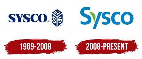
The textual emblem includes the shortened name of Systems and Services Company, compressed to the word “Sysco.” It’s set in an uppercase font with small serifs. The letter angles are rounded, so the text induces favorable impressions – feelings of safety, care, and trust. The glyphs are massive, with uneven thicknesses, suggesting it’s a bold typeface despite the presence of thin lines.
To the right of the text is the company’s individual sign, encoding its name. A geometric figure (presumably a vertically positioned parallelepiped) is turned on its edge, so only three planes are visible. At the top is the mark “Co,” with the “O” semi-encircled by the letter “C.” The right and left sides are occupied by two identical “S” – chopped, smoothly curved, and uppercase. They are separated by the glyph “Y,” which also acts as three edges.
2008 – today
The company moved away from allusions and dark colors: it chose a simple and light emblem consisting of a single word. The inscription is made in a highly rounded grotesque. All letters are smooth, soft, and streamlined except for “y,” which is composed of half a leaf and a diagonal stripe with even cuts. Through the plant element, the corporation shows that the products it supplies are healthy and environmentally safe.
Font and Colors
The typeface used in the Sysco logo resembles the humanistic sans-serif font Frutiger 75 Black. It was designed by Adrian Frutiger and first published by Linotype.
The color palette of the emblem is calm. If the early version predominated dark blue, the later one introduced light blue, close to sky blue. There is also a green element – a leaf, indicating the company’s concern for the ecological nature of its products and related goods.
