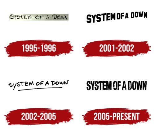
The System of a Down logo represents a desire to offer hope in a grim, dark world. The emblem represents a band that wasn’t afraid to address complex political topics and discuss environmental issues and crime.
System of a Down: Brand overview
| Founded: | 1994 – 2006, 2010 – present |
| Founder: | Serj Tankian, Daron Malakian, Shavo Odadjian, and John Dolmayan |
| Headquarters: | Glendale, California, U.S. |
| Website: | systemofadown.com |
Meaning and History
The band’s logo has always been their name. After their initial trial records, the group found its identity in the combination of black and white shades. Changing fonts for new albums slightly altered the primary essence of the emblem. This choice reflected a drive for the heaviest and most aggressive sound possible. The symbol played on the contrasts of evil and good, despair and hope, filth and light.
What is the System of a Down?
An American rock band with an Armenian lineup had a successful start in 1994. However, disagreements among the members prevented the group from continuing to create, and for over 15 years, the musicians haven’t released new albums. One of the latest albums – Mezmerize – won several awards as the best alternative album. The singles B.Y.O.B, Question!, and Lonely Day are particularly popular.
1995 – 1996
The band’s first emblem appeared on demo tapes. The logo consisted of the band’s name, seemingly written with a thin black marker, symbolizing a “first attempt.” It embodied the search for their unique path.
The band’s name is a modified title of a poem by Armenian rock musician Daron Malakian – Victims of the Down. Changing one word altered its meaning, hinting at the collapse of the American System. One reason for choosing the word “System” was the desire to have their records placed in stores next to Shavo Odadjian’s favorite band – Slayer.
2001 – 2002
The logo for the album Toxicity was reminiscent of Black Sabbath with their wavy letters for the 1971 album Master of Reality. The white inscription on a black background seemed to drift into the distance. The technique turned out to be very popular. Later on, a similar emblem was also adopted by Arctic Monkeys.
Upon examining the cover design, a clear parallel emerges between the large Hollywood letters on the hills of Los Angeles and the System of a Down inscription on the emblem. This analogy underscores the contrast between lavish life and societal issues. Wealth and fortune pale in comparison to systemic issues. The emblem carries the same political context as the songs of the album.
2002 – 2005
The “Steal This Album!” logo is handwritten, much like a signature on a disc from a personal library. The choice resonates with the compilation title, which was taken from the book by the anti-Vietnam war activist Abbie Hoffman, “Steal This Book.” The approach references bootleg recordings. It hints at the “bootleg” ideas in the songs, which differ from official governmental directives.
2005 – today
The emblem was used for the band’s duology, “Mezmerize” and “Hypnotize.” The album cover and logo were designed by Daron Malakian’s father, artist, and painter Vartan Malakian. The band engaged the designer because most songs were written and performed by Daron instead of the lead vocalist, Serj Tankian.
The large capital letters, slightly weathered over time, are elongated upwards and positioned fairly close together. The inscription seems scorched by flames, scarred by gunshots. The emblem reflects its connection to tragic, significant events. The albums touch upon themes of war, terrible losses, patriotism, and death. And the logo is like a majestic monument to those who have passed away.
The albums turned out to be the band’s last recordings; hence the logos haven’t changed since.
Font and Colors
A black background reflects the inclination towards a sharp and aggressive sound in most symbols. Starting with alternative metal in their self-titled debut album “System of a Down,” the band continued sticking with heavy guitar riffs, occasionally venturing into metal and nu-metal. The white letters of the name indicate the band’s objectivity, their desire to highlight serious issues and find solutions. The band’s songs act as a spotlight, highlighting the flaws of the System.
The font resembles Nidex and a worn-out film reel with footage of past events that play out in the songs like a movie.
System of a Down color codes
| Black | Hex color: | #000000 |
|---|---|---|
| RGB: | 0 0 0 | |
| CMYK: | 0 0 0 100 | |
| Pantone: | PMS Process Black C |

