The T-Mobile logo demonstrates a willingness to communicate. This shows that the company provides communication between two subscribers using its technologies. The friendly color scheme of the emblem hints at lengthy conversations and intimate messages.
T-Mobile (US): Brand overview
| Founded: | 1994 |
| Founder: | John W. Stanton |
| Headquarters: | Bellevue, Washington, U.S. |
| Website: | t-mobile.com |
Meaning and History
All brands owned by Deutsche Telekom are linked by a common symbol – a large purple “T” with square dots on the sides. But only T-Mobile (US) has a letter supplemented with a text mark, which indicates an attempt to distinguish between the parent company and its subsidiary brand visually. However, their goal is essentially the same: to create a holistic environment for digital life to flourish at work and home.
What is T-Mobile (US)?
T-Mobile (US) is a provider of telecommunication services: wireless broadband internet and mobile communications. It has been operating in the United States since 1994 but was known as VoiceStream Wireless for seven years. The brand received a new name in 2001 when it became the property of Deutsche Telekom. Since then, it has increased its influence to the point where it has been recognized as one of the largest cellular operators in the US.
1994 – 2001
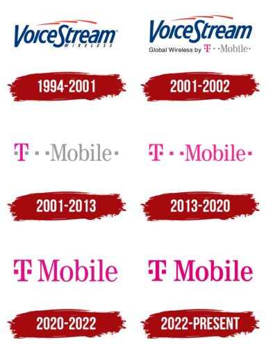
When T-Mobile was called VoiceStream Wireless, it had a logo with this caption. The phrase “VoiceStream” consisted of oblique blue letters, with the capital “V” and “S” going beyond the imaginary line, not only above but also below. To the right of the S, just below the “tream,” was a small black WIRELESS. It used an uppercase font.
To make the logo stand out, the designers drew three-pointed red lines above the text. They symbolized the connection that the telecommunications company supported.
2001 – 2002
The upper part of the logo remained unchanged. But at the bottom, there was a black inscription “Global Wireless by,” made in a sans-serif font, and a purple “T” with two gray squares on the sides. Further down the same line were two more squares, the gray word “Mobile” written in contrasting antiqua, and another square.
2001 – 2013
In 2001, the mobile operator was taken over by the German corporation Deutsche Telekom AG. The following year, it was named T-Mobile (US), and with it the corresponding logo. He inherited the purple T with a dashed line of five squares from its new owner. The overall picture looked like this: a square, “T,” three squares, the word “Mobile,” and another square.
It looks like the designers just took and unfurled the Deutsche Telekom emblem because, in the original, it was exactly the opposite: in front of the “T,” there were three quadrangles. But in any case, this is not a random set of geometric shapes but a stylized musical notation. The squares represent the heads of the notes, which usually appear as bold dots in writing. “T,” by the way, also replaces such a point: the top of the letter is located approximately where it should be.
The logo is based on an excerpt from the musical notation of the Deutsche Telekom corporate melody. Interbrand Zintzmeyer & Lux created the sound branding created by collaboration with musicians Chris McHale and Joe Barone.
2013 – 2020
After a redesign in 2013, the logo is now all purple. At the same time, the structure and arrangement of elements remained unchanged.
2020 – 2022
At the beginning of 2020, another redesign took place. Everything has changed, but little by little:
The letters have become a little bold.
- The color is slightly darker.
- The number of squares has been reduced to two.
Only those quadrangles that were located to the right and left of the “T” survived.
The current T-Mobile (US) logo was based on the old Deutsche Telekom badge. He illustrated the relationship between visual and auditory elements. More specifically, the original set of squares mimicked the melody that accompanied the company’s name in the advertisement. The dots were at the same level because they corresponded to a tone of the same pitch. The letter “T” stood for a higher tone.
2022 – today
In 2022, the T-Mobile logo has become slightly bolder, while it continues to use the familiar TeleAntiqua brand font. At the same time, a change in the color scheme followed: the designers made the purple hue more saturated so that the inscription was visible.
T-Mobile (US): Interesting Facts
T-Mobile US, originally known as VoiceStream Wireless, has been a key player in the U.S. telecommunications scene since its rebranding in 2001 after being bought by Deutsche Telekom.
- Rebranding: The transition from VoiceStream Wireless to T-Mobile marked a new direction and strategy after Deutsche Telekom acquired it.
- Technological Leadership: Entering the U.S. market in 1994, T-Mobile adopted GSM technology, laying the groundwork for later 4G LTE and 5G advancements.
- Nationwide 5G: T-Mobile was the first major U.S. carrier to offer nationwide 5G coverage, positioning itself as a leader in 5G technology.
- Un-carrier Strategy: Introduced in 2013, the Un-carrier approach changed the industry with policies like no contract lock-ins and taxes and fees included in prices.
- MetroPCS Merger: T-Mobile’s 2013 merger with MetroPCS significantly grew its customer base and spectrum holdings, boosting its presence in the prepaid market.
- Sprint Merger: The 2020 merger with Sprint greatly increased T-Mobile’s network and spectrum, making it a formidable competitor against Verizon and AT&T.
- Project 10Million: This initiative aims to provide internet access to millions of underserved students, showing T-Mobile’s dedication to closing the digital divide.
- Magenta Branding: T-Mobile’s distinctive magenta branding, a subject of legal protection, highlights the importance of branding in its business strategy.
- Retail Innovation: T-Mobile’s stores offer interactive and personalized experiences, underscoring the value of customer engagement and physical retail in a digital world.
- Environmental Goals: Committed to sustainability, T-Mobile aims for 100% renewable energy use and is working to reduce its carbon footprint as part of its broader corporate responsibility.
T-Mobile’s evolution from VoiceStream Wireless into a telecom giant showcases its innovative spirit and disruptive impact on the industry, from tech advancements to strategic mergers and a strong commitment to social and environmental issues.
Font and Colors
But the current T-Mobile (US) logo looks completely different: the company owners are transforming it to keep customers’ attention. From the original design, there are only two squares with a “T” in the middle.
The lettering font is similar to the serif TeleGrotesk used by Deutsche Telekom. The magenta color (a darker shade of Mexican Pink, # ED008C) was also taken from the new owner. It once represented only one brand, but now several brands are associated with T-Mobile (US).
T-Mobile (US) color codes
| Red Purple | Hex color: | #e20074 |
|---|---|---|
| RGB: | 226 0 116 | |
| CMYK: | 0 100 49 11 | |
| Pantone: | PMS 213 C |
