


![]() Tampa Bay Lightning Logo PNG
Tampa Bay Lightning Logo PNG
Lightning is a symbol of a direct threat. That’s why the team from Florida chose this emblem. The Tampa Bay Lightning emblem embodies tension, instills awe, and makes opponents nervous because lightning strikes are unpredictable in both timing and location.
The Tampa Bay Lightning entered the league in 1992, following the National Hockey League’s 1989 expansion plans. The initiative was driven by Phil Esposito, who promoted Tampa as a new market for the sport.
In September 1990, an exhibition game between the Los Angeles Kings and the Pittsburgh Penguins, featuring Wayne Gretzky and Mario Lemieux, drew 25,000 spectators at the Florida Suncoast Dome. The attendance influenced league inspectors, and within weeks, Tampa secured a franchise for the 1992–93 season.
After approval, Esposito struggled to cover the expansion fee as early sponsors withdrew. Financial backing came from Japanese investors connected to Kokusai Green, with negotiations held in Tokyo. Later, Takashi Okubo acquired the club, while Esposito stayed as general manager until 1998.
The name “Lightning” was proposed by Esposito, inspired by frequent storms over Tampa Bay. The primary logo featured a silver lightning bolt, reflecting that idea.
From 1992 to 2012, the team reached the playoffs only once and operated with heavy losses, despite investments estimated at $125 million. Attendance declined, and management cut costs. The club even signed Manon Rheaume to attract attention, while at one point, Tony Esposito served as the club’s only scout.
Before the 1998–99 season, ownership shifted to Art Williams, who replaced management and moved toward a younger roster. In 2009, the franchise was sold to Jeffrey Vinik.
The mascot ThunderBug was introduced later to engage fans.
Meaning and History
![]()
It is one of the youngest NHL franchises, founded in 1993. Four logos with a circle and lightning, that’s all the visual style heritage the team has accumulated to this point. The main authors are Phil Esposito (he suggested the lightning and inscription) and Lowell and Paul (they removed the Florida map from the background and replaced it with a clean circle). The modern version was adopted in 2011. Since then, it hasn’t left the hockey players’ gear, inspiring new achievements.
What is Tampa Bay Lightning?
It’s a professional hockey team from the USA. It’s based in Tampa, Florida, and plays at the Amalie Arena. The club, formed in 1992, is part of the Eastern Conference and plays in the NHL’s Atlantic Division.
1992 – 2001
![]()
The original logo, written by Phil Esposito himself, featured a white lightning bolt inside a gray circle. Thanks to dark shadows, the lightning had a three-dimensional effect. The circle was trimmed with a white-blue contour. Moreover, the words “Tampa Bay” and “Lightning” were placed above and below, respectively. Despite different fonts, both signs were blue letters with a thin black outline.
2001 – 2007
![]()
No significant changes were made to the 2002 badge design. In the new Tampa Bay Lightning logo, darker shades of blue and gray appeared without altering the elements’ shapes. Specifically, the bright blue shade was replaced with a dark one in the name and outline.
2007 – 2011
![]()
On August 25, 2007, designers presented the third logo of the Tampa Bay Lightning. Despite its similarity to previous logos, it had a more refined, modern, and professional look. The word “Lightning” disappeared, making the image clearer. In blue font, the “Tampa Bay” inscription now has a bolder white outline.
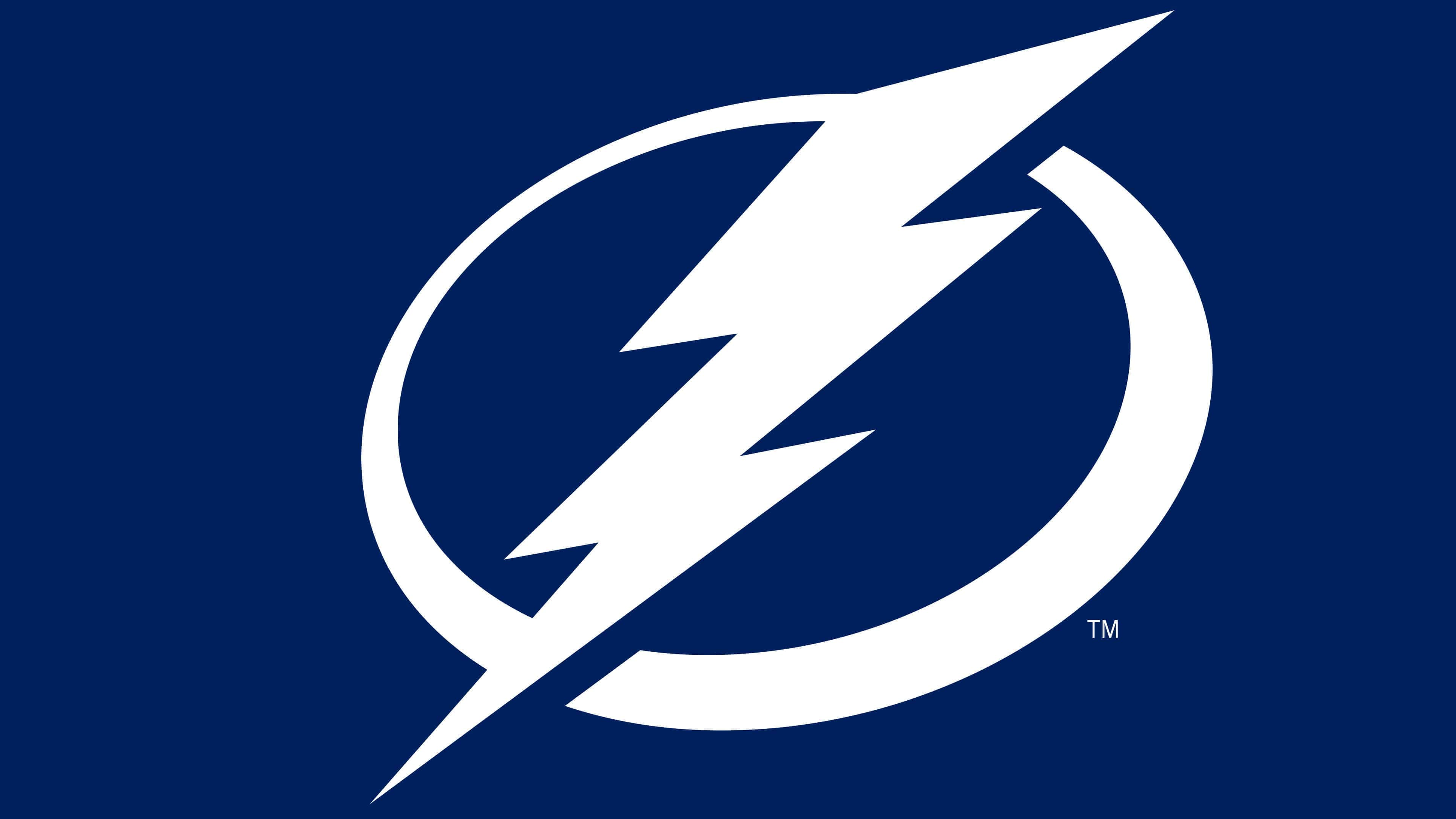
2011 – today
![]()
The new franchise owner, Jeff Vinik, initiated the logo update in 2012. He aimed to turn his club into a world-class hockey team, so he needed an ordinary hockey logo and a successful brand style. The logo depicts a zigzagging lightning flash striking from top to bottom, going beyond the usual circle. It consists of three elements: two sharp rectangles and one elongated triangle arranged to form zigzags.
Around the lightning, two semicircles form an open ring (it’s not connected at the top and bottom). Moreover, the lines in the circle have different thicknesses: the right fragment is thick, and the left is thin. This design technique gives the logo dynamism by demonstrating movement.
Font and Colors
The first three signs of the club’s visual style differ from the modern version in that they include a textual element. In the early logos, the inscription is double, as it includes the franchise’s full name, “Tampa Bay” (above) and “Lightning” (below). In the third version, developers removed part of the text, leaving only the locality name to indicate the location.
Also, previous emblems differ from the current one in that they have a shadow to the right of the lightning. They replicate its zigzags, making the image voluminous, which is no longer present in the current version. The transition to a 2D format involves adapting the emblem for printing on various media and for convenient placement on the uniform.
For the team’s name designation, designers used three font types: italic, resembling handwritten text, and two straight, close to print. Thus, the inscriptions intersect with several font types: Komu A, Industry Black Italic, Duke, and Nomad. In the early logos, letter contours are outlined with thin lines; in the third, they are outlined with a wide stripe.
The emblem’s color palette is unique and includes a specially developed blue shade called Tampa Bay Blue. It also includes white for contrast with the background. The club’s official color, black, was excluded from the emblem in 2011.
FAQ
Where Did the Name “Tampa Bay Lightning” Come From?
The Tampa Bay Lightning originated from Tampa City’s unofficial status as North America’s fastest capital. That is, storms often occur here. This character of the raging element was transferred to the hockey club’s identity.
When Did “Tampa Bay Lightning” Change Its Logo?
The Tampa Bay Lightning club changed its logo in 2011. That’s when the most radical changes occurred, as the franchise got a new owner who wanted to bring the team to the global level and began a complete identity update.
Who Designed the Tampa Bay Lightning Logo?
Phil Esposito, the hockey player who helped Tampa acquire the franchise, conceptualized the logo and created the team’s emblem and name.
What font is used for the Tampa Bay Lightning logo?
The franchise’s logo uses the NHL Tampa Bay Regular font. It’s based on three fonts: Industry Black Italic, Nomad, and Komu A.