The TAP Portugal logo conveys the image of a modern and dynamic airline ready to accompany passengers on their journeys around the world. It reflects the company’s commitment to innovation and development, while the emblem’s color palette evokes energy, strength, and safety associations.
TAP Portugal: Brand overview
Transportes Aéreos Portugueses, now known as TAP Portugal, began its journey on March 14, 1945, under the wing of the Secretaria de Estado da Aeronáutica Civil.
On September 1, 1946, the brand took off with its first commercial flight, using a Douglas DC-3 Dakota to connect Lisbon and Porto.
In 1947, the company’s horizons broadened with its inaugural international flight from Lisbon to Madrid. The same year, routes to Luanda in Angola and Lourenço Marques (present-day Maputo, Mozambique) were established.
The 1950s marked a period of growth, with the airline transitioning to a private company in 1953. The brand expanded its network to include Casablanca, Tangier, London, and Paris. In 1955, the fleet grew with the addition of Lockheed L-1049G Super Constellations.
Entering the jet age in 1962, the air operator introduced Caravelle VI-R jets to its fleet, enhancing route coverage and service quality. By 1967, flights reached New York, operated by Douglas DC-8s.
After the 1974 Carnation Revolution, the aviation firm was nationalized yet continued its expansion. 1972, the fleet welcomed Boeing 747-200, boosting long-haul flight efficiency.
During the 1980s, the aviation company modernized its fleet with Lockheed L-1011 TriStar and Boeing 737 aircraft, improving operational efficiency and expanding its routes.
In 1991, the airliner transitioned into a public limited company. A 1995 rebranding effort introduced the name TAP Air Portugal. This decade saw the fleet upgraded with Airbus A310s and A340s.
By 2005, the air operator joined the Star Alliance, significantly enhancing its global service capabilities. A year later, the airline adopted the name TAP Portugal.
In 2015, the Portuguese government partially privatized the brand, selling a 61% stake to the Atlantic Gateway consortium. This infusion of investment led to fleet renewals, including orders for Airbus A330neo and A321LR aircraft.
In the 2020s, the company continues to evolve as a major European airline, strengthening its connections between Europe, Africa, and the Americas. Its keen focus is on service quality and network expansion.
Meaning and History
What is TAP Portugal?
This is Portugal’s national carrier, based in Lisbon, and is known for its role as a connecting link between Europe, Africa, and the Americas. The company operates a diverse fleet, including various types of Airbus aircraft, allowing it to serve both short-European and long-haul routes efficiently. It is known for its Portugal Stopover program, which offers passengers a free stopover in Portugal on transit flights, promoting tourism in the country.
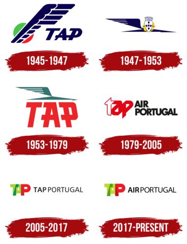
1945 – 1947
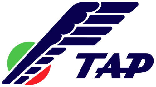
The original TAP Portugal logo was introduced in 1945 when the brand was called Transportes Aéreos Portugueses. Designers used the abbreviated version of the name in the emblem, as the newly established company needed a simple and memorable symbol.
The concise abbreviation “TAP” is rendered in semi-bold italics, creating a sense of lightness. The letters “A” and “P” are connected by a common horizontal stroke, adding dynamism to the inscription. The rectangular serif at the top of the “P” further emphasizes visual mobility by serving as a speed line. All these elements characterize Transportes Aéreos Portugueses as an active airline, ensuring the swift delivery of cargo and passengers to their destinations.
Two factors indicate a connection between the sky and flight:
- Dark blue color, which evokes associations with reliability and safety;
- A large bird wing composed of simple geometric shapes.
There are empty gaps between the design parts, making the emblem airy and weightless. This hints at the ease with which the company serves its customers.
Behind the wing is a circle—an abstract sun. It symbolizes life force, energy, and vitality and is one of the symbols of aviation. One side of the circle is green, while the other is red. This color combination corresponds to the flag of Portugal, hinting at the country of origin to attract as many local passengers as possible and showcase its authenticity.
1947 – 1953
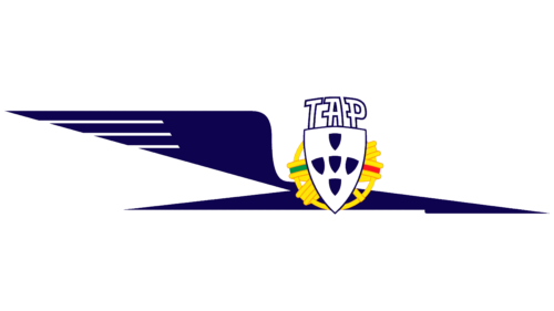
The 1947 redesign sharpened the logo, eliminating its visual softness. The result was a bold and slightly aggressive image, reflecting the company’s great ambitions. The wing is no longer just suspended in space; it is now part of an abstract bird swiftly flying toward a promising future.
The lower half of the emblem resembles a stylized arrow or lightning bolt – a symbol of ultra-fast speed. The bird image perfectly aligns with the sphere of activity of Transportes Aéreos Portugueses, as it evokes the concept of flight. The logo contains several elements that reflect the airline’s national pride and hold special significance in the cultural context.
- Foreground: The slightly modified heraldic shield from the Portuguese flag is prominent. Inside it are five small shields glorifying the victory of Christian knights over the Muslim army in 1139 when the Portuguese prince defeated five Moorish kings. This symbolizes patriotism and great achievements. The company showed its connection to its homeland by including it in the emblem.
- Background: Behind the large shield is an armillary sphere, an astronomical instrument once used by sailors. It is present on the country’s flag. In the TAP Portugal logo, the sphere symbolizes the origins of navigation, which is essential for precisely determining routes and making air transportation effective.
- Green and red stripes represent the Portuguese flag. These national colors symbolize hope and inspiration. The company uses them with the same meaning but prefers dark blue, which reminds one of the sky and best represents the aviation industry.
Above the shield is the abbreviation “TAP,” written in bold font with rectangular serifs. The letters lean towards the center, creating a sense of convexity. This visual volume makes the inscription dynamic, aligning it with the image of a flying bird. All these elements emphasize the activity of Transportes Aéreos Portugueses.
1953 – 1979
Shortly after the advent of the jet age, the company updated its logo to appear modern and align with technological progress. As a result, all references to Portugal were removed, including the symbolic shields, the armillary sphere, and the red-green stripes. The red color is used solely for the large “TAP” inscription, which occupies most of the space. Designers retained the massive font, large serifs, and original slant of the letters, as passengers had come to recognize the brand name in that style.
The large size of the inscription signifies the company’s importance both within the country and beyond, as Transportes Aéreos Portugueses was expanding its routes at the time. The red color conveys vibrant energy and dynamism – qualities that help the airline continue to improve.
The stylized bird is positioned at the top, evoking a sense of free flight. Its body still resembles a lightning bolt or arrow, imbuing the emblem with a sense of speed. The arrow-like shape symbolizes confident forward movement and the pursuit of goals. This symbolic image represents a swiftly flying airplane hurrying to deliver cargo and passengers. The turquoise color looks subdued but breathes novelty, as it had not been used in the brand’s identity before.
1979 – 2005
In 1979, the company was renamed TAP Air Portugal, which stands for Transportes Aéreos Portugueses Air Portugal. By then, it had reached an international level, necessitating a universal and recognizable corporate image. Along with the new name came a modernized logo, which only included the inscription.
The red color was retained for several reasons:
- It hints at the brand’s country of origin, as the Portuguese flag is half-red;
- It symbolically expresses speed, energy, and vibrant emotions, which are integral to air travel;
- Red reflects the company’s historical heritage, as elements of this color were present in its original logo.
This time, designers chose a muted shade of red to color the word “tap”: “a” and “p” completely and “t” partially. The first letter predominantly features white, creating visual balance and associating with purity. As for “a” and “p,” they merge into a single entity, forming an abstract shape. Its circular form might hint at aerobatic maneuvers, symbolizing the professionalism and skill of TAP Air Portugal pilots, ensuring flight safety.
The rest of the inscription is in uppercase bold grotesque, instilling confidence. The black color adds strictness and formality. The intervals between the letters are so narrow that they touch, emphasizing the company’s commitment to efficient and effective operation and enhancing the sense of dynamism.
2005 – 2017
The company celebrated its 60th anniversary with a new name and emblem as it prepared to join Star Alliance, necessitating a fitting corporate style. TAP Portugal was renamed to be simpler and more understandable to many customers (by 2005, the number had reached 6.5 million). Minimalism was evident at all levels of visual identity, including the logo, which now consists of two elements:
- A multicolored graphic symbol;
- A black wordmark.
These elements balance each other, presenting TAP Portugal as a serious yet creative airline that strictly adheres to standards while being open to new ideas.
The short word “TAP” merges into a single unit, but this does not affect the readability of the inscription, as designers made it semi-transparent. They achieved this effect by using different colors at the points where the letters connect: at the junction of “T” and “A,” a dark green, and between “A” and “P,” a maroon. The letters “T” and “A” themselves are in a calm light green color, which balances the expressive bright red “P.”
This color scheme conveys various emotions – from tranquility and safety to a passionate love for fast air travel. Culturally, the red-green palette corresponds to the colors of the Portuguese flag, emphasizing the brand’s historical roots. The red “P” draws attention to the country’s name.
In contrast, the adjacent “TAP Portugal” inscription looks restrained and formal, creating a business-like image for the company. Both words use the same thin sans-serif font, but the first three letters are bolder than the rest. This subtle detail adds dynamism to the logo. Notably, the lower ends of the “A” are cut diagonally, making the letter appear to rest on sharp angles. Its stability symbolizes the airline’s reliability and resilience, while the shape is associated with movement.
2017 – today
In 2017, the company changed its logo because it decided to return to its old name, which it had used before 2005. Upon entering the North American market, it realized that the locals knew nothing about it and did not even associate it with the aviation industry. To attract more customers, it had to reintroduce the word “Air” to its name – a direct reference to air transportation.
Although the rebranding affected the emblem, it remained recognizable because the company wanted to preserve its unique identity. The designers simply replaced the second word, “TAP,” with “Air,” keeping everything else the same.
The translucent emblem of red and green letters became the company’s main symbol. It creates a sense of depth, reflecting the complexity and multifaceted nature of the aviation industry. The stylish lettering is associated with innovation and technological progress, and using different colors adds visual interest to the logo. As is well known, the green and red were taken from the Portuguese flag, but they have additional meanings:
- Green represents safety and accessibility;
- Red conveys the dynamics of fast planes and the positive emotions of flight.
At the same time, the black wordmark reflects the company’s business image. The designers retained the original sans-serif font but used standard “A” letters this time to ensure the brand name did not appear frivolous.
