The TAROM logo complements the airline’s overall image, emphasizing its reliability and professionalism. The emblem showcases the brand’s connection to the aviation industry and symbolizes its national identity.
TAROM: Brand overview
TAROM, known officially as Transporturile Aeriene Române, is Romania’s national airline.
In the 1920s, Romanian civil aviation began with the establishment of CFRNA (Compagnie Franco-Roumaine de Navigation Aérienne), setting the stage for future developments.
The company was officially established on September 18, 1954, following the merger of several pre-existing Romanian airlines.
During the 1960s, the air operator expanded significantly, acquiring its first jet aircraft, the BAC 1-11, which opened new routes to Europe and the Middle East.
The 1970s marked further development as the fleet grew to include long-haul Boeing 707s, enabling flights to New York and other distant destinations.
Despite economic difficulties in the 1980s, the brand maintained stability and continued serving domestic and international routes.
Following the fall of the communist regime in 1989, the aviation firm faced new challenges and began restructuring and modernizing.
In 1993, the airliner acquired its first Airbus A310, enhancing service on long-haul routes.
2004, the airline joined the Association of European Airlines (AEA). By 2006, the aviation company started modernizing its medium-haul fleet by ordering new Boeing 737-700s.
On June 25, 2010, the company officially joined the global SkyTeam alliance, significantly expanding its service capabilities.
Financial difficulties and increased competition in the 2010s led the brand to begin a restructuring process to improve efficiency and reduce costs.
In 2018, the air operator introduced a new development strategy to return to profitability, including fleet renewal and route optimization.
2019, the aviation firm received the first of five Boeing 737 MAX 8 aircraft orders as part of its modernization plan.
As the 2020s began, the airliner focused on improving financial performance and service quality, emphasizing regional routes in Europe and connections with major European hubs.
Meaning and History
What is TAROM?
This is Romania’s national carrier, based in Bucharest. It is known for connecting Eastern Europe with the rest of the world. The carrier operates a mixed fleet, including Boeing and Airbus aircraft, allowing it to serve both regional and international routes. The company is known for its Flying Blue program, which, in partnership with Air France-KLM, provides passengers extensive opportunities to earn and redeem miles.
1954 – 1960
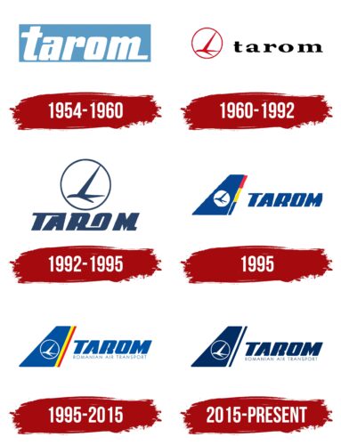
The old TAROM logo lacks originality. It contains only the brand name written in white letters within a light blue rectangle. Even in this simplicity, designers managed to encode a hidden message.
- The color scheme symbolizes the sky, evoking a sense of freedom and flight.
- The lowercase letters create a friendly and accessible company image, indicating its focus on a broad audience.
- The italic font conveys dynamics and speed, essential elements for an airline.
- The elongated horizontal lines on the “t” and “m” suggest forward movement, reminiscent of runway markings.
In this way, the emblem subtly shows TAROM’s connection to the aviation industry despite the absence of obvious symbols. It immerses passengers in an atmosphere of lightness, ease, and comfort.
1960 – 1992
By 1960, the company had become well-known throughout Europe, necessitating a new logo that was more fitting for the aviation industry. A small red airplane, encircled by an oval of the same color, symbolizes TAROM’s entry onto the international stage. The bright red shade conveys the dynamism that helped the brand gain fame far beyond its home country.
To prevent the emblem from appearing too aggressive due to the sharp lines and red color, designers complemented it with a restrained black inscription. The lowercase letters convey a sense of hospitality and friendliness. The contrasting thickness of the strokes adds energy to the inscription, reflecting the airline’s active operations.
1992 – 1995
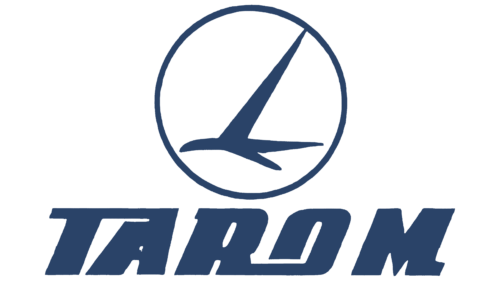
Designers moved the stylized airplane to the top, symbolizing flight and freedom. The ring encircling it does not restrict its space; instead, it highlights the importance of aviation and evokes a sense of safety. The red color has been replaced with dark blue, which is associated with professionalism and reliability and symbolizes the sky in the context of air travel.
The brand name is now in a bold, custom-designed font. To reduce the inscription’s visual weight, designers made it italic, added openings to some letters, and adorned them with short rectangular protrusions. All these elements create an illusion of movement, characterizing TAROM as a swift, serious, and responsible airline.
1995
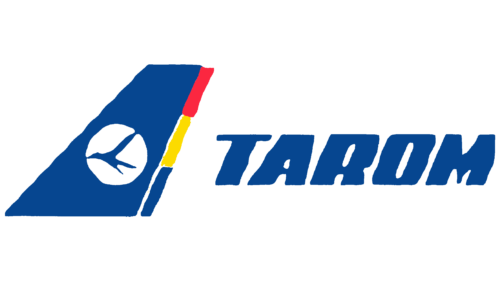
In 1995, the company’s main symbol was placed inside a tall, dark blue trapezoid, mimicking part of an airplane’s tail fin. The geometric figure is adorned with three colored stripes: blue, yellow, and red. These represent the Romanian flag, highlighting the brand’s national identity. The airline combined three ideas in its emblem: place of origin, service to the homeland, and dedication to the aviation industry.
The name TAROM is still in bold, grotesque font. The italic style adds lightness to the letters and infuses the wordmark with powerful energy, capable of moving even a heavy inscription. This reflects the company’s drive to constantly move forward, grow, and improve to offer customers the best travel conditions.
1995 – 2015
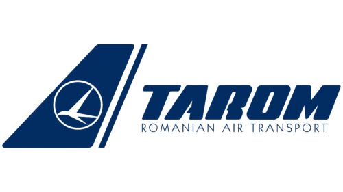
Designers refined the logo while staying within the framework of the old concept. Now, the mini-airplane is colored white and placed in a matching white ring. The area around it is entirely blue, as is the stylized image of the tail fin. Negative space indicates that TAROM aims to appear modern and innovative, especially since the company entered a loss-making period in the 1990s and had to regain passenger trust.
Two long diagonal yellow and red stripes are drawn next to it. These colors refer to the Romanian tricolor, although blue—symbolizing the sky, aviation, and reliability—still dominates the emblem. The elongated shape of the lines evokes associations with flight and swift movement.
To make the wordmark appear more friendly, designers rounded the edges of the letters. They created openings in the horizontal strokes of the “A” and “R.” These seemingly small changes completely transformed the brand name, giving it a stylish and welcoming appearance. At the bottom, another inscription appears: “ROMANIAN AIR TRANSPORT.” In contrast to the top line, it is rendered in a thin, even font, evoking a sense of stability and confidence.
2015 – today
The TAROM logo is blue and white, evoking the sky and conveying reliability. The logo features a circle with a stylized bird that resembles an airplane. This symbol is displayed on the vertical part of the airplane’s tail. To the right of this symbol is the brand name in a bold font, with “ROMANIAN AIR TRANSPORT” below it in thin capital letters.
Blue symbolizes the sky, reinforcing the airline’s connection to aviation and trust. The stylized bird adds a sense of flight and freedom. The logo’s placement on the tail section ensures high visibility and strengthens brand recognition. The brand name’s bold font highlights its importance, while the thin letters for “ROMANIAN AIR TRANSPORT” balance the design.
The blue and white colors create a clean, professional look that aligns with TAROM’s values. The bold, unique font for the brand name draws attention, while the thin letters add elegance and sophistication. The stylized bird and circle design symbolizes flight and adds a modern, dynamic element. This reflects the airline’s commitment to innovation and excellence in air travel. Combining bold and thin fonts creates a harmonious balance, making the logo visually appealing and easy to read.
