Speed and flawless work can be seen in the emblem. As the Tatra logo shows, thoughtful design makes the aerodynamics of the machines perfect. Driving a Tatra is a thrill, and at the same time, it is as safe as possible.
Tatra: Brand overview
| Founded: | 1850 |
| Founder: | Ignaz Schustala |
| Headquarters: | Kopřivnice, Moravian-Silesian Region, Czech Republic |
| Website: | tatratrucks.com |
Meaning and History
Their unusual construction and futuristic design always have distinguished Tatra cars. They began production in the early 1920s when the “Kopřivnická vozovka” company was named Tatra in honor of the highest mountain in Czechoslovakia. Even then, the technique was decorated with the famous round logo with an inscription inside, but its base was black.
Another rebranding took place in 1936. The automaker was bought and renamed Ringhoffer-Tatra. At that time, the badge on the cars changed: it acquired a red ring-frame with the word “RINGHOFFER” divided into letters. After 1938, the German invaders took over the company, and for several years it provided the enemy army with military vehicles. The cars were so bad that many German officers died while driving, losing control. The machines were jokingly called the secret weapons of the Czech Republic.
In 1945 the plant was nationalized. This did not stop the designers from continuing to experiment with the emblems. For example, in 1947, the Tatraplan model appeared, adorned with a round red badge that contained a white TATRA lettering with shortened T tops. But the Tatra T2-603 (until 1975) had a symbol inside a black rhombus with wings and was supplemented with the phrase “MADE IN CZECHOSLOVAKIA.” These machines were intended only for the leaders of the Communist Party.
The company changed logos very often but always adhered to the classic structure. She made sure to use her name and place it against the background of simple geometric shapes. An exception was the second half of the 20th century, when the inscription was without frames.
1897 – 1920
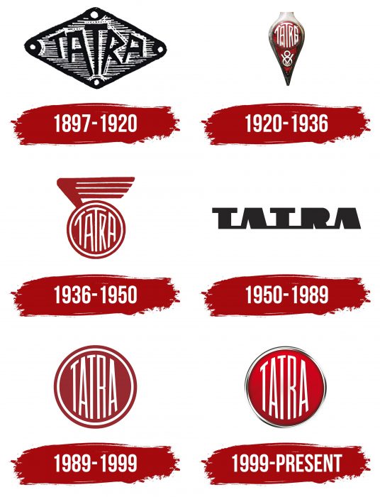
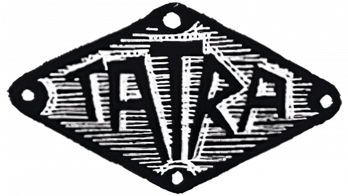
The emblem has a diamond shape with rounded corners. In the center is an elongated “T.” She stands upright, in contrast to the “TA” and “RA,” which tilt to the right and left of her. The font is uneven and sharp-angled. The base is lined with thin horizontal black and white stripes.
1920 – 1936
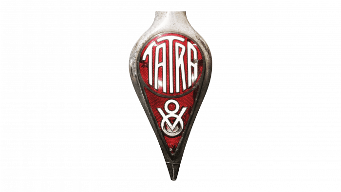
The radiator badge is covered with red enamel and looks like a droplet directed with a narrow side down. In the upper part, there is a circle with the word “TATRA.” The letters fill the space allotted for them. The horizontal strokes of both “T” s are curved in a circle.
1936 – 1950
The red circle with the traditional “TATRA” lettering has been added with a wing. The new element is attached to the logo on the upper left side and contains four “feathers” of different lengths. The brand name is placed in a red ring.
1950 – 1989
The word “TATRA” turned black and lost its circle. The letters are connected at the bottom by thin horizontal lines. The font is stylized, bold, with a very contrasting thickness of strokes. The “R” has no in-letter gap, and both “A” has no crossbars.
1989 – 1999
The classic design has returned: a red circle with white lettering in the same white ring. The word no longer takes up all the free space, so there is a lot of space around the edges. But above and below, the letters are curved in a circle. The horizontal “T” lines have been shortened.
1999 – today
To modernize the logo, the designers made it three-dimensional and placed it in a shiny silver ring. They achieved a 3D effect using a gradient that diverges from the lighter center to the darker edges.
Tatra: Interesting Facts
Tatra, one of the world’s oldest vehicle makers, spans a storied journey from the 19th century to today, rooted in the Czech Republic. Significant automotive and engineering milestones mark its trajectory.
- Foundation Era: Originating in 1850 in Kopřivnice, Moravia, within the Austro-Hungarian Empire, Tatra began crafting wagons and carriages, transitioning to automobiles. Initially named Nesselsdorfer Wagenbau-Fabriksgesellschaft, it laid the groundwork for future ventures.
- Aerodynamic Innovations: In 1934, Tatra set benchmarks in aerodynamic design with the Tatra 77. It is recognized as one of the earliest aerodynamically focused serial vehicles, influenced by Hans Ledwinka and Paul Jaray. This rear-engine, air-cooled layout set a precedent in automotive design.
- Volkswagen Beetle Connection: Tatra’s designs, notably the V570 and the Tatra 97, inspired the Volkswagen Beetle. Ferdinand Porsche acknowledged this influence, which led to legal actions resolved post-World War II.
- Military Contributions: Tatra’s portfolio includes durable military vehicles, with models like the Tatra 813 and Tatra 815 lauded for their performance in challenging terrains and for serving global military needs.
- Suspension System Development: The company introduced the “Tatra Concept” suspension, featuring a central tube chassis and swing axles. This suspension enhances vehicle stability and comfort and is applied across its civilian and military range.
- World War II Role: Tatra contributed to the German war effort during World War II, manufacturing trucks and cars. The Tatra 87, despite its popularity among Nazi officers, was notorious for its hazardous handling.
- Racing Achievements: Beyond engineering feats, Tatra proved its mettle in endurance racing, participating in events like the Monte Carlo Rally and the 24 Hours of Le Mans, underlining its vehicles’ resilience and performance.
- Post-Iron Curtain Evolution: Following European political shifts, Tatra continued its innovative streak, focusing on heavy-duty off-road trucks for construction and military uses. This demonstrated flexibility in meeting market demands.
- Cultural Stature: In the Czech Republic and Slovakia, Tatra embodies a legacy of creativity, perseverance, and engineering prowess deeply ingrained in the national consciousness.
- Overcoming Adversity: Despite financial hurdles and shifts in leadership, Tatra’s enduring spirit of innovation has allowed it to maintain its course, producing vehicles renowned globally for their specialized capabilities.
Tatra’s legacy, rich in innovation, design, and endurance, has left an indelible mark on the automotive landscape, showcasing a remarkable journey of growth, adaptation, and influence that resonates far beyond its origins.
Font and Colors
The current emblem is one of the main historical legacies of Tatra. Its foundation was laid back in the early 1920s when the company was renamed and produced the first cars with round badges on the radiator grilles. Realizing the value of the original design, the brand owners tried to preserve it, so it has survived to this day almost unchanged. The modern version differs only in stylish 3D design.
The letters have an unusual shape because they are adapted to the borders of the circle. All lines are of approximately the same thickness. Due to the deformation, the font is difficult to identify, although it is grotesque.
The latest redesign brings changes to the color scheme. The red base is preserved, but it has become brighter and has acquired a gradient. The inscription remains white as before. And the circle turned out to be inside a silver ring, which outwardly resembles a shiny chrome-plated metal.
Tatra color codes
| Lava | Hex color: | #cb071c |
|---|---|---|
| RGB: | 203 7 28 | |
| CMYK: | 0 97 86 20 | |
| Pantone: | PMS 485 C |
| Black | Hex color: | #000000 |
|---|---|---|
| RGB: | 0 0 0 | |
| CMYK: | 0 0 0 100 | |
| Pantone: | PMS Process Black C |
