


![]() Tekken Logo PNG
Tekken Logo PNG
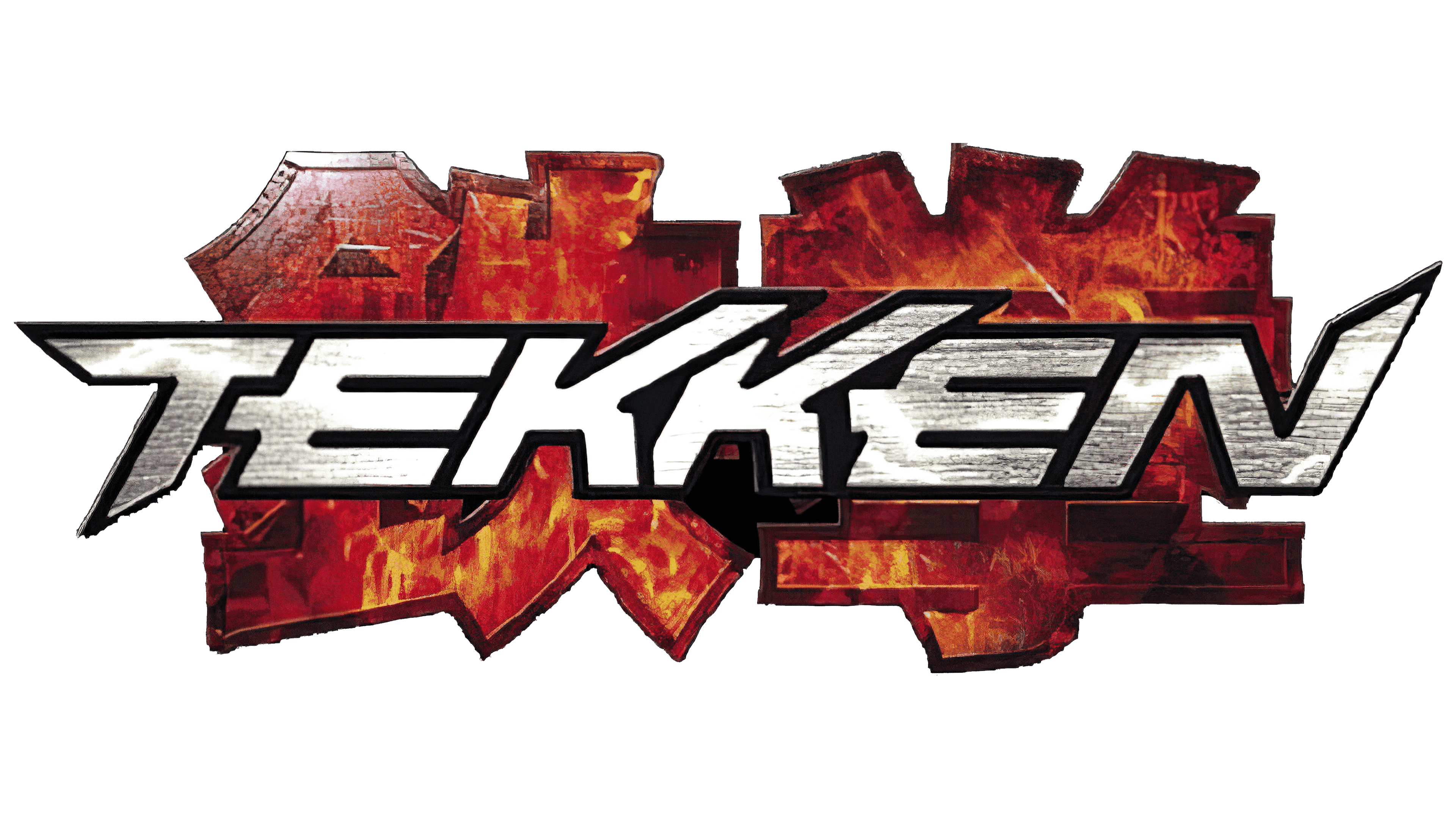
Find your way among mountains and labyrinths, the Tekken logo calls. The emblem symbols look combative and energetic. The road to victory will not be easy. You will have to show yourself as a skilled fighter and martial arts expert. Only the strongest and most dexterous will be able to reach the top.
Tekken began as Namco’s answer to Sega’s Virtua Fighter, which changed the fighting game landscape in 1993. In 1994, Namco hired several former Sega staff, including animators and programmers, and put Seiichi Ishii, who had worked on Virtua Fighter, in charge.
The game was built on Namco’s System 11 arcade board, based on early PlayStation hardware. That made the console port easier and cleaner than many arcade conversions. Namco’s US team proposed the title Rave War, but the Japanese name Tekken, meaning “iron fist,” stayed.
Tekken launched in Japanese arcades on December 9, 1994. It ran at 60 frames per second and featured eight fighters with styles inspired by real martial arts. The 1995 PlayStation version became the first PlayStation game to sell over 1 million copies.
Tekken 2 followed in arcades in 1995 and on PlayStation in 1996. Katsuhiro Harada joined the series, then directed Tekken 3, released in arcades in 1997 and on PlayStation in 1998. With sidesteps, lower jumps, and new characters such as Jin Kazama, it sold over 8 million copies.
Tekken Tag Tournament arrived in 2000 for PlayStation 2. Tekken 4 followed in 2001, Tekken 5 in 2004-2005, and Tekken 6 in 2007-2009 after Namco merged with Bandai. Tekken 7 debuted in arcades in 2015 and reached consoles and PC in 2017. Built on Unreal Engine, it featured guest appearances from Capcom, SNK, and Square Enix, and sold over 11 million copies.
Tekken 8 launched worldwide on January 26, 2024, without an arcade-first release. It sold 1 million copies in one day and over 2 million in its first month. By March 2025, series sales passed 61 million.
Meaning and History
![]()
The debut version of Tekken was released in December 1994, and the final version was released in the summer of 2017. At the moment, the collection has seven basic parts. Moreover, each has its own identity that resonates with the content. According to experts and users, the most significant editions are the first, second, and third.
Although the game started as a typical arcade adaptation, it later moved into the fighting category. Battles include a variety of throws, blocks, pursuits, and ground tournaments. The series now includes special moves and combos. Moreover, Tekken is a group of fighting games that debuted, in which 3D animation was first used. This made the franchise the best-selling franchise of all time, and its icon was widely recognized.
What is Tekken?
Tekken is a media franchise dedicated to a series of fighting games. Bandai Namco Entertainment created it. The first part of the series was released in 1994 for PlayStation. It has become an inspiration for subsequent games, spin-offs, books, anime, and feature films. The essence of Tekken is that gamers choose characters and fight in hand-to-hand combat one-on-one.
1994
![]()
The first emblem contains the name in Japanese. The red hieroglyphs are executed with broad strokes, imitating brushstrokes. This is evidenced by the torn train at the ends of some letters. Along the edges, they are outlined with thin black lines separated by a white stripe, which makes the inscription three-dimensional. Below is the English version, consisting of small characters in an individual design. The word “Tekken” is in uppercase and is colored black.
1995
![]()
The second issue came out under a radically different logo. His style was redesigned: he became more rigid, principled, unshakable. In the drawing, this is conveyed by the geometric shapes that compose the hieroglyphs. Squares, rectangles, and wide stripes form a formidable inscription in Japanese, rendered in brickwork with black splashes on a reddish-red background. At the bottom left is the English word “Tekken” and the number “2”. They are made with thin, elongated lines and decorated with a gradient transition from black to light gray.
1997
![]()
This year’s logo comprises three parts: a background featuring a hieroglyphic inscription, the game’s English name, and a serial number. The first element has no clear strokes: it looks more like two solid red spots with white lightning and a gradient from crimson to scarlet. The second part is the word “Tekken,” made in the original style with curly legs and long serifs. The third detail is the classic number “3”, decorated with a stencil inscription.
2001
![]()
In this version, the same elements are grouped in a completely different way. The number “4” occupies almost the entire front part of the logo. It is complemented by sharp corners and a very short stem. Next, the video game’s name is in Japanese. The gray hieroglyphs are so large that they almost merge into a single background. The smallest one is the inscription “Tekken.” It is made up of printed letters placed back-to-back. “KK” is on top of each other, both “E” rest against the next sign, and the right side of “T” is not visible at all.
2004
![]()
Background hieroglyphs have become more open, easy to read, and glossy. Now their flame is concentrated in the center, and darkening in the form of puffs of smoke are visible along the edges. Above the Japanese lettering are the video game’s English name in italics and its serial number. They have a metallic texture and roughness in the form of small horizontal stripes. The number “5” is large, oblique, and slightly compressed from above.
2007
![]()
The inscription in Japanese resembles fiery swirls: they are twisted like fists that protrude in different directions. In this version, hieroglyphs are poorly distinguishable and serve only as graphic elements. At the top is the word “Tekken,” indicating the game’s release. The text part is flat, smooth, with a pointed letter “T” and the number “6”. The dark symbols are surrounded by three stripes: red, gray, and black.
2015
![]()
In the latter version, the main style is retained: the letters are still uppercase, oblique, even, and slightly sharpened. The “N” has an extra stroke on the right leg at the top. The number “7” is highlighted in glossy gold, while the English lettering is completely white with black edging, very much like hieroglyphs, made in the form of brush strokes. Along the edges, they have charcoal stripes that resemble burnt lumps.
Font and Colors
All logos consist of three fragments: hieroglyphs, an English name, and a serial number. But in each version, they are decorated in a special way to emphasize the style of fighting battles.
For emblems, designers chose individual fonts each time, with no analogs. These typefaces are from the Sans Serif category, so the letters are smooth and sans serif. In some versions, they are oblique; in others, they are straight.
The logo’s color scheme includes fiery red, yellow, orange, brick, purple, gold, metallic, dark gray, light ash, black, and white.