Tele2 Logo

Tele2 LogoTele2 Logo PNG

Tele2: Brand overview

Tele2’s history began in Sweden in 1993 when businessman Jan Stenbeck founded the company as an alternative fixed-line provider. Known for his innovative business strategies, Stenbeck saw an opportunity to challenge the government-owned monopoly, Telia, in the Swedish telephone industry.

In 1994, the company started offering international phone services in Sweden at lower rates than its competitors, quickly attracting customers and enabling rapid growth.

A major milestone came in 1996 when it entered the Swedish mobile phone market. It became the first alternative operator in the country to offer mobile services, marking a significant boost to its presence.

In the late 1990s, the company began expanding internationally, entering the Baltic States, Denmark, Finland, Norway, and Central and Eastern Europe. This expansion helped diversify operations and reduced dependence on the Swedish market.

Tele2 entered the Russian market in 2000, acquiring regional operators in the Irkutsk Region and expanding into several other Russian regions. This marked the beginning of the company’s long and complex journey in Russia, which would grow to become one of its most important markets.

In 2003, it began rolling out its first 3G networks in Sweden and Norway, allowing the company to offer customers new services and faster mobile internet.

The company underwent major changes in 2005. Following the death of founder Jan Stenbeck in 2002, it began restructuring. In 2005, assets in Finland and Denmark were divested to focus on markets with greater potential.

The firm continued streamlining its operations in 2007 by selling its assets in Italy and Portugal, allowing it to concentrate on regions where it could take the lead.

Significant progress was made in Russia in 2009. By acquiring other regional operators, the company substantially expanded its presence, becoming the fourth-largest mobile operator in the country.

In 2011, the business began exiting several European markets by selling its operations in Croatia and Poland to focus on key markets where it could secure a larger share.

In 2013, the company faced a crucial turning point in Russia. It sold its Russian operations to VTB Group due to restrictions on 3G and 4G network development, which made it difficult to compete with larger carriers.

A major development occurred in 2014 when the firm merged with Rostelecom’s mobile assets, forming a new state-backed operator under the brand name. This significantly strengthened its position in the Russian market.

An important milestone in Russian expansion came in 2015 when the company launched its network in Moscow and the surrounding region. Its lower rates attracted a large customer base in Moscow.

In 2016, the operator continued aggressively deploying 3G and 4G networks in Russia, allowing it to compete with the largest players in the mobile internet market.

In 2017, the firm expanded its digital offerings, introducing several new services, such as lending extra gigabytes of internet to other customers.

In 2018, it became one of the first operators in Russia to offer eSIM technology, a groundbreaking service.

The company began testing its 5G networks in Russia in 2019, conducting trials in various locations nationwide.

Despite economic challenges in 2020, the company continued to expand its network and digital services, with new pricing plans and increased 4G coverage boosting mobile internet use.

In 2021, digital projects grew further. The mobile app was improved, and additional services, such as a virtual operator for gamers, were introduced.

Efforts continued in 2022 to expand network coverage and improve communication quality. The company strengthened its reputation with corporate clients by offering various new business solutions.

By 2023, the focus remained on innovation and customer satisfaction, solidifying its position as one of Russia’s top mobile providers. Dedicated efforts were made to expand digital services and develop 5G technology.

The company has grown from a small alternative operator in Sweden into a major global telecom provider and a leading player in the Russian mobile communications market. Its ability to adapt to changing market conditions, focus on customer needs, and innovative business approach have been key to its success.

Meaning and History

Tele2 Logo History

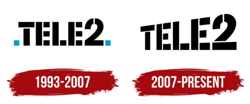
1993 – 2007

Tele2 Logo 1993

2007 – today

Tele2 Logo 2007

The Tele2 logo is bold and carries a rebellious edge. The number “2” appears to leap forward, taking a prominent position, while the rest of the name gradually fades into the background, creating a sense of motion. This effect plays with perspective as if the emblem is slightly angled toward us. The design is simple but unique, making it memorable.

The stencil-like font conveys a sense of accessibility and simplicity. There are no unnecessary details—each letter comprises clear, sharp shapes, emphasizing straightforwardness and transparency. At the time of the logo’s creation, the company was known for its pricing strategy aimed at the mass market, and the logo reflects that ethos: no frills, but dependable.

The monochrome palette of black and white speaks for itself. Black represents confidence and stability, while white suggests purity and simplicity. These colors declare, “There’s no need for excess—what matters is the essence.” This approach aligns perfectly with the company’s philosophy, which emphasizes the convenience and accessibility of its services.

Tele2 positioned itself as an alternative to traditional operators, and this spirit of rebellion is reflected in the design of the logo. It instantly communicates something fresh and uncomplicated.

2021 – today

Tele2 Logo

The updated Tele2 logo has become significantly more modern than its previous version. With the stencil-style letters removed, it now looks lighter and cleaner, making the logo smoother and easier to perceive. This change reflects the brand’s desire to become more approachable, eliminating distractions and unnecessary elements. The font is now straight, bold, and confident, conveying the core message of reliability and clarity.

The main focus remains on the number “2,” which stands out from the other letters. It is larger and draws attention to the end of the emblem, but there’s now a greater sense of harmony in the design. The letters no longer seem “scattered” across the logo as they did before. This shift reflects the company’s updated strategy: they maintain their strong market position but present themselves in a softer, more approachable manner for a wider audience.

A notable addition is the colorful dots below the logo. These multicolored circles symbolize diversity and freedom of choice, likely highlighting the variety of plans and options the company offers its customers. The yellow, green, blue, purple, and red dots resemble a palette of options, suggesting that clients can pick what suits them best.

The new fonts and style emphasize the brand’s simplified, customer-oriented approach. The excess has been removed, making the logo visually lighter while retaining its recognizability. This minimalist approach aligns with the current trends, as the company expanded into new markets and gained popularity through transparent pricing and attractive offers. The design highlights the brand’s focus on honesty and simplicity.

The black color of the font remains the primary choice, symbolizing stability and reliability. Meanwhile, the colorful dots add a playful and fresh element, signaling that the company is moving forward while staying true to its core values.