“We are spreading our signal” is the main message of the Telekom logo. The sign is like a repeater tower that helps to unite subscribers over long distances. The emblem contains the idea of communication, waves, and packets of information running through the air.
Telekom: Brand overview
| Founded: | 2 January 1995 |
| Headquarters: | Bonn, Germany |
| Website: | telekom.com |
Telekom (full name Deutsche Telekom or DT) is a telecommunications service in Germany. It appeared in January 1995 after the privatization of the German state postal service Deutsche Bundespost. The company has grown to become a leading fixed and mobile operator, broadband Internet, digital TV, and IT service provider. Today it is the largest specialized service provider in Europe, headquartered in Bonn.
To modernize the country’s telecommunications market and master the latest technologies in related areas, the government approved the privatization of the former state structure Deutsche Bundespost. At this time (summary for April 2020), the state owns 14.5 percent of the shares and 17.4 percent – the state-owned bank KfW.
From the moment of its appearance to the present day, this service has traveled a long way to leading positions in the world market. Her career is a history of mergers that happened regularly over a long period. She has gone far beyond the borders of the country and provides services in foreign countries. In the Czech Republic, the Netherlands, Poland, the USA, Macedonia, Slovakia, and Romania. She does this not directly but through her subsidiaries, of which she has several.
Meaning and History
The Telekom emblem has become a hallmark of quality service. There are many logos in the service’s history, although there was one more, which became the progenitor of the existing image. It followed the structure of the debut logo and was in use from 1989 to 1995. It was the personal symbol of the Deutsche Bundespost.
What is Telekom?
Telekom is the short name for Deutsche Telekom AG, also known as DT or DTAG. It is one of Europe’s largest and most influential telecommunications service providers. It appeared in 1995, but it had a predecessor: the postal organization Deutsche Bundespost, created in 1947.
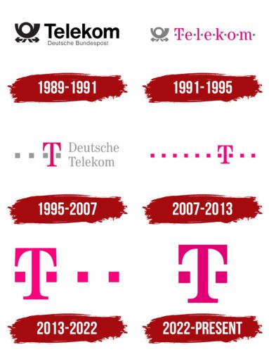
1989 – 1991
Having become an independent structure in the profile market, the company first used an emblem almost exactly repeated the previous one, inherited from the postal service. The logo depicts a horn with left and right arrows. They indicate the scale of the coverage of services and represent a complex man: instead of ahead, he has a coil of a musical instrument, instead of hands – arrows, and instead of legs – a tape of a horn. To the right of this symbol was the name of Deutsche Bundespost Telekom.
1991 – 1995
The brand symbol remains the same. On the right is the pink word “Telekom,” each letter separated by a gray square. It is a graphic interpretation of the musical notation of the horn melody, the postal communication symbol. The audio branding was created by Interbrand Zintzmeyer & Lux studio, which created it with musicians Chris McHale and Joe Barone’s support. Next comes the word “Mobilfunk” in a classic serif typeface.
1995 – 2007
Like the previous one, this logo was created by the consulting agency Interbrand using the TeleAntiqua brand font. Here, a large pink “T” is complemented by four gray squares arranged in one horizontal line. Three of them are on the left, and one is on the right. Also on the right is the gray phrase “Deutsche Telekom.” The words are split into two lines, left justified.
2007 – 2013
In 2007, another rebranding took place: the German service T-Mobile merged with T-Home, a subsidiary. As a result of the merger, the Telekom brand appeared. Today the word is used as an add-on to all local departments. For example, Hrvatski Telekom, Deutsche Telekom (parent company), Slovak Telekom and the like. The emblem has a single letter “T” in the classic spelling – elongated, thin, serif. To the right and the left of it, there is a horizontal row of ten miniature squares.
2013 – 2022
During the redesign, the developers removed several squares, reducing them to four: two under the “T” hat and two on the right at a distance. The color and style of the logo are preserved – pink fuchsia and classic font.
2022 – today
In 2022, the international consulting company MetaDesign created a new logo for Telekom. But there is nothing revolutionary about it because the most noticeable change was the disappearance of extra squares on the right side. Now “T” is completed with only two paired quadrilaterals. The shape of the letter remained the same, although the designers slightly corrected its geometry. They expanded the vertical and horizontal parts and flattened the edges of the “T” to be rectangular. This made it possible to achieve symmetry. The emblem traditionally has a pink shade of fuchsia.
Telekom: Interesting Facts
When discussing “Telekom,” we usually refer to Deutsche Telekom AG. This German company is one of the biggest telecom providers in the world.
- Beginnings: It started in 1995 after Germany privatized its national telecom company. This marked a new chapter for telecom in Germany and paved the way for Deutsche Telekom’s global growth.
- Worldwide Operations: While Deutsche Telekom is German at heart, it operates in over 50 countries. Its big move in the US was merging its subsidiary T-Mobile with Sprint in 2020, making it a major player in the American market.
- Tech Innovations: The company is leading the way in 5G technology in Germany and elsewhere, pushing forward the next wave of mobile internet.
- T-Mobile US Success: In the US, T-Mobile has shaken up the mobile industry with its “Un-carrier” approach, which includes ditching contracts, offering unlimited data plans, and focusing on customer needs.
- Going Green: Deutsche Telekom is serious about reducing its environmental impact. It aims to use 100% renewable energy by 2025 to achieve carbon neutrality.
- Beyond Telecom: The company has branched into IT and tech services, like cloud computing, cybersecurity, and the Internet of Things (IoT), serving businesses and government agencies.
- Magenta Everywhere: The brand’s logo and marketing heavily feature the color magenta, making it stand out.
- Top in Europe: Deutsche Telekom isn’t just big in Germany; it’s a leading telecom provider across Europe, offering a wide range of services, such as broadband and fixed-line internet.
- Innovation Hub: The company’s Telekom Innovation Laboratories (T-Labs) invest in research and development, partnering with universities and startups to explore new tech solutions.
- Giving Back: Deutsche Telekom is involved in social and cultural projects, like promoting digital education and internet safety, and supports sports teams and cultural events, showing its dedication to giving back to the community.
From its roots as a national service to becoming a global telecom and digital services powerhouse, Deutsche Telekom is all about embracing change, pushing technological boundaries, going green, and playing a positive role in society.
Font and Colors
The modernization of the visual identity of the German telecommunications company took place simultaneously with its development. The emblem discarded all unnecessary and grew into a laconic version starting with a heap of numerous elements. Now it is a graphically accurate logo that reflects both the concept and the name of the operator-provider. It also conveys a story since each square is a stylized note of a melody that mail carriers once trumpeted into a special horn. Moreover, “T” is the first character from the company’s name and the replacement of one of the notes.
The Telecommunications Service has retained the original typeface, so the emblems use the Century Modern FS Book Condensed font, including the single “T.” The corporate palette is also stable: the logos feature fuchsia (dark pink) and black.
Telekom color codes
| Red-Purple | Hex color: | #e10075 |
|---|---|---|
| RGB: | 225 0 117 | |
| CMYK: | 0 100 48 12 | |
| Pantone: | PMS 213 C |
