![]() Telemundo Logo PNG
Telemundo Logo PNG
The Telemundo logo is like a bubbling fire. Inside the image, tongues of flame merge in a wild dance, periodically unleashing a storm of energy on the viewers. The emblem represents very temperamental and vivid television for Spanish-speaking Americans.
In 1984, under the initial banner of “NetSpan,” Telemundo debuted as a new Spanish-language network in Miami, Florida, backed by Sony Pictures Entertainment. It was a period of ambitious beginnings, aiming to carve a niche within the Hispanic American viewing market, a domain where Univision had long been the dominant force.
Telemundo’s journey in the competitive arena of Spanish-language television was not without its challenges. Initially, the network found itself in the shadow of Univision’s established presence. Yet, undeterred, Telemundo embarked on a strategic expansion in 1987. It extended its reach by partnering with stations in key Latino markets, including Los Angeles, marking its first significant stride toward national coverage.
The tide began to turn for Telemundo in the decades that followed. The 1990s and early 2000s saw the network bolster its position through strategic acquisitions and increased investment. This period was characterized by the network absorbing smaller Spanish-language channels, broadening its footprint, and expanding its offerings to include news, dramas, and entertainment shows. This expansion strategy proved fruitful, enabling Telemundo to broadcast to over 90% of Hispanic households in the United States.
Entering the new millennium, Telemundo pivoted to innovate its content slate, focusing on producing original series like “La Reina del Sur,” a move that further distinguished the network in a competitive market. Comcast’s 2009 acquisition, as part of its NBCUniversal purchase, marked another milestone, providing Telemundo with additional resources to refine and expand its programming.
Today, Telemundo stands as a leading Spanish-language broadcaster in the United States, alongside Univision, serving the diverse and growing Latino-American community. Despite Univision’s lead in certain ratings, Telemundo has successfully established itself as an essential player in Hispanic American media, demonstrating the enduring appeal of its culturally resonant and engaging content.
Meaning and History
![]()
Although modern Telemundo is the result of the merger of 4 companies – WKAQ-TV, WSCV, WNJU, and KSTS, WKAQ-TV had the most influence on its visual identity. The sign exhibits sufficient strength and energy to broadcast around the world, and the company eventually achieved this. The symbol reflects the channel’s main audience’s unique mindset and, at the same time, captures all viewers with its vivid content.
What is Telemundo?
An American television network, originally broadcasting in Spanish and now in 34 languages. They are owned by Comcast through NBCUniversal. The broadcast is shown in the USA and in 100 countries.
1984 – 1987
![]()
The beginning of Telemundo was the NetSpan network, created by WNJU and KSTS in 1984. The name served as the emblem. The name indicated that the network provided content in Spanish.
The sign was divided into two capital letters: Net and Span. The elongated lower glyph of S emphasizes the first part of the name, connecting with N and highlighting the word Net. Each station had an extensive broadcasting network. WNJU operated in New York, while KSTS operated in the South Bay. Both companies were private. They laid the foundation for uniting a series of channels into a nationwide network. The first on the list was KVEA, whose owners later formed Telemundo.
1987
![]()
The owners of KVEA acquired John Blair & Co., which owned the Telemundo brand, WKAQ-TV, and WSCV. Then WNJU was added to the list of purchases. In 1987, the businessmen realized that a wise decision would be to combine all the acquired networks under the purchased Telemundo brand. This led to the creation of Telemundo Group.
The union’s new logo consisted of a circle with the name written in two levels. The words extended beyond the figure. The sphere symbolizes the Earth. It foreshadowed the worldwide spread of broadcasting.
The image of the emblem matched the company name. Telemundo, translated from Portuguese, means “television world” or “worldwide television.” Over time, the brand indeed established itself worldwide, in more than 100 countries.
The name Telemundo is associated with Ángel Ramos. He owned media under the Mundo brand: the newspaper El Mundo and the radio station Radio El Mundo. Therefore, when he started the WKAQ-TV television project, he named it Telemundo. The name stuck.
Ramos’s projects were well-known within the American Spanish-speaking community. The new owners decided that viewers would favorably receive a project with a popular name. And so, the television network became Telemundo Group.
1987 – 1992
![]()
In 1987, the owners made Telemundo Group a public company, renamed NetSpan to Telemundo, and added two more networks to the composition.
The new conglomerate’s logo consisted of a red circle, representing the Sun. Inside, a part of the red earth’s surface with parallel lines was visible. The composition indicated the expanses of Earth, warmed and illuminated by the Sun.
The earth’s surface seemed to strive toward the horizon as if constantly rotating. The theme of movement emphasized the passage of time. The company’s studios covered events happening on Earth. Day by day. Year by year. Telemundo lives as long as the planet lives and rotates.
The large name was placed under the circular emblem. The letters, as if continuing the movement, are touched by the Earth’s kinetic energy. They leaned backward, ready to follow into the circle, just as the broadcasts of the shows followed the events happening in the world.
1992 – 1997
![]()
In 1992, the network underwent a major rebranding, which forever changed the structure of the company’s logo. The image, developed by designers Chermayeff & Geismar and the renowned American branding master Steff Geissbuhler, laid the foundation for all subsequent rebrandings.
On the emblem, the capital letter T serves as a window to the world. Looking inside, one can see the blue sky and part of the green sphere, symbolizing the Earth. The composition demonstrated the network’s global role to serve as a conduit. To be the main source of news. The network not only covers events but also interprets them. Therefore, the color scheme of the objects within the logo is not natural, but rather as the company perceives it.
By connecting to the network, users will be aware of all events happening on the planet and can expand their information field. The logo emphasized the beginning of work with international distributors who received the rights to broadcast the company’s programs abroad.
Below the image, the network’s full name is indicated in capital letters.
1997 – 2000
![]()
In 1997, the company was acquired by Liberty Media and Sony Pictures Entertainment. The purchase of a controlling stake was followed by rebranding.
The T was placed on a brown background, enhancing the sensation of a window, a T-shaped cut into the world. Meanwhile, the image behind the window acquired more realistic natural features.
Although the brown square added weight to the logo, the contrast intensified the desire to enter the world of Telemundo, where everything is light, free, and understandable.
The new owners completely revised the channel’s schedule to regain the audience, which had halved. Therefore, in the logo, the brown square symbolizing rocks conveyed stability and strength.
2000 – 2012
![]()
In 2000, the management team changed, and Telemundo prepared for a sale, which occurred in 2001. The channels’ sign was changed to a more schematic design in shades of blue: a blue letter T, inside which the outline of the globe is marked with a white line. The monochromatic scheme corresponds to the aspiration for unity with the world and the conciseness characteristic of logos from the early 2000s. The color emphasizes the company’s professionalism.
2012 – 2018
![]()
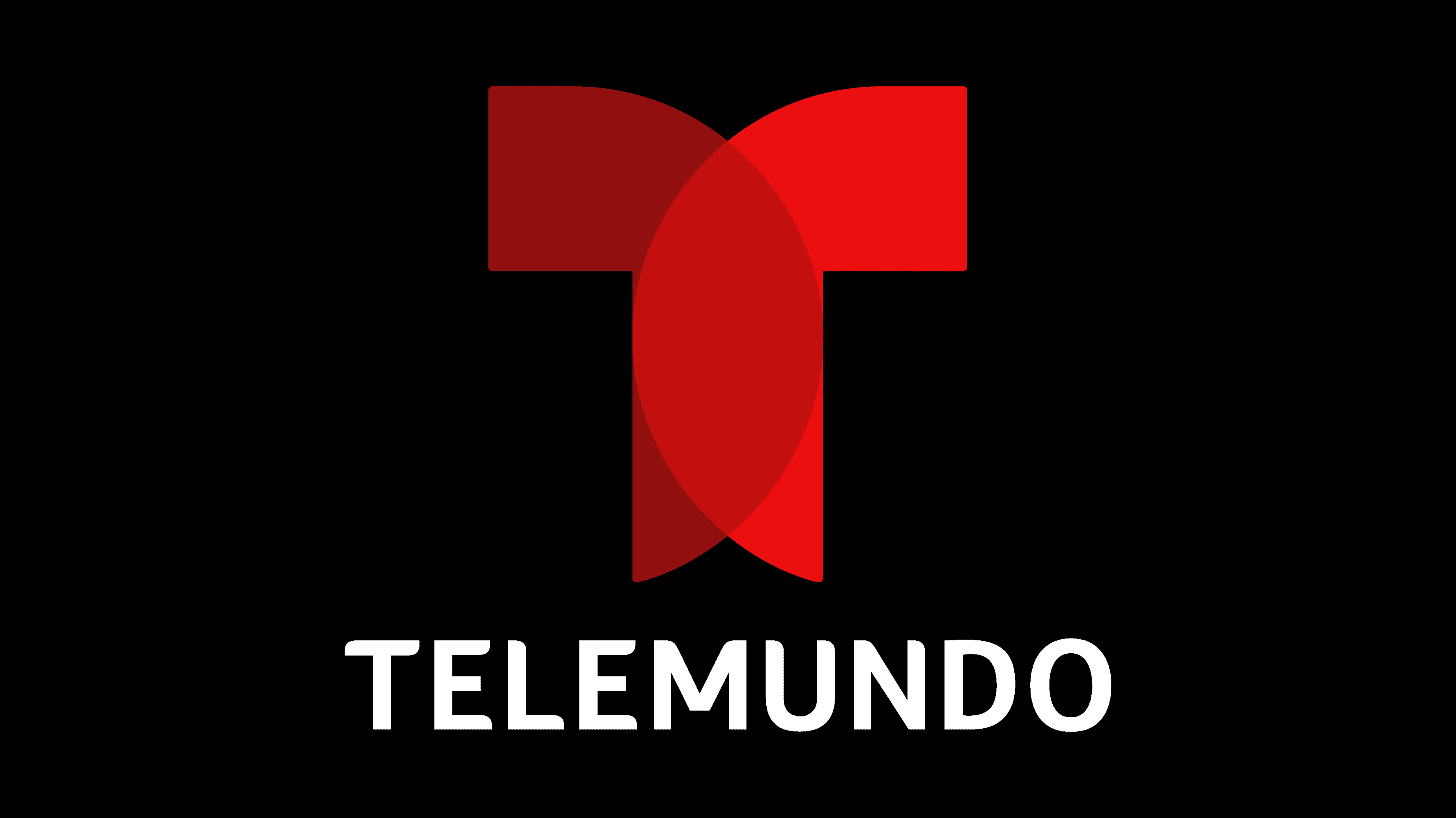
Comcast purchased a controlling stake in NBC’s shares. The channel’s identity underwent a significant rebrand, culminating in the theme “a window to the world.” Two intersecting red halves form the letter T of the new emblem. The color emphasizes the temperament of Latino viewers. The two parts indicate a dual mentality. On the one hand, the channel’s audience in the USA has Latin roots, and on the other hand, it has American thinking. Telemundo understands this feature well and can provide content that appeals to such viewers.
The logo’s concept was presented by the design agency Loyalkaspar.
2018 – today
![]()
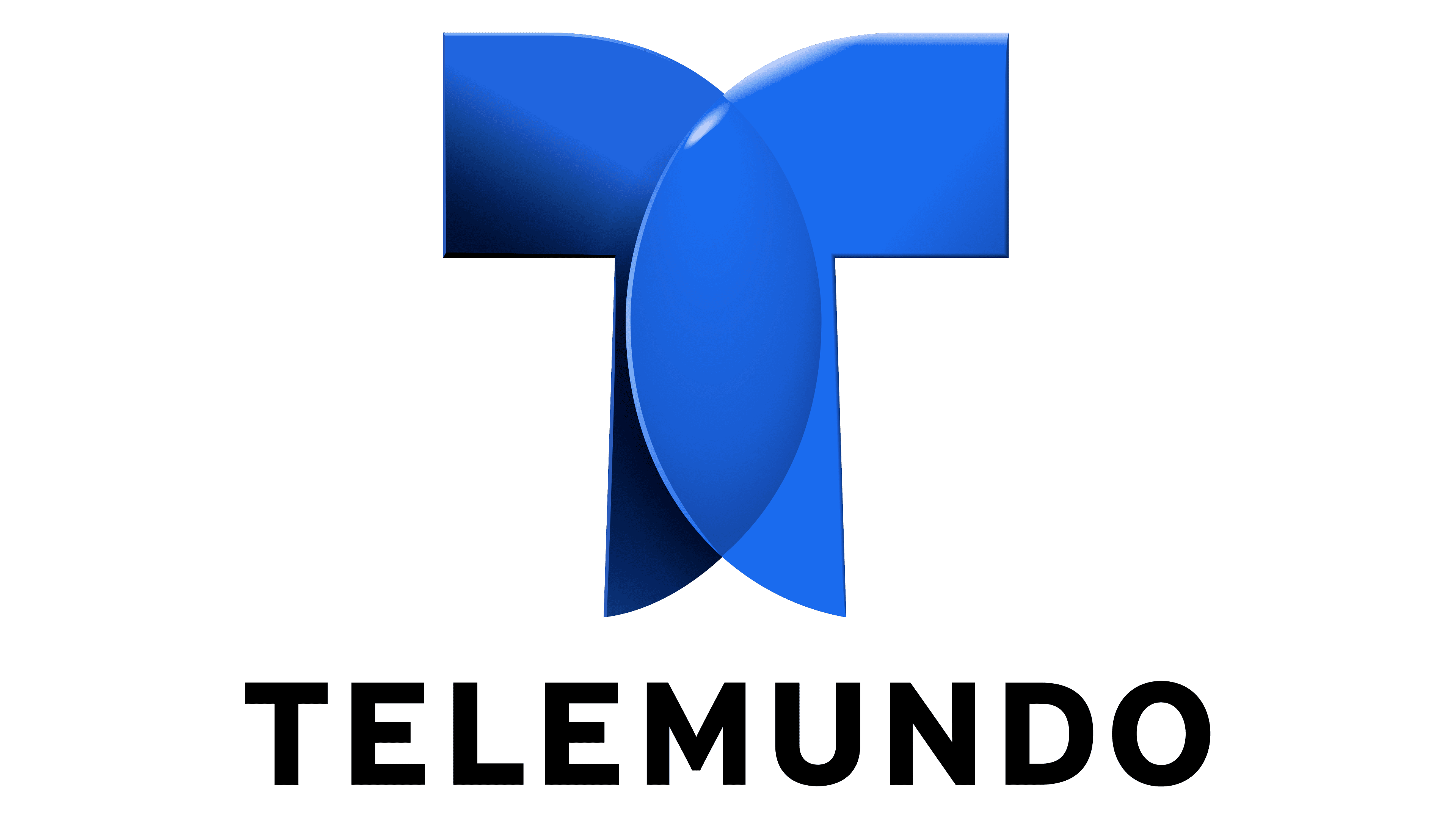
In 2018, the agency Red Bee Media slightly adjusted the company’s emblem, changing the color scheme and adding sleekness to the corporate sign and the font of the name. The logo gained style and lightness, hinting at the blossoming of new themes and an interesting broadcasting schedule.
Interestingly, each network in the alliance has its own emblem, which is added to the common T. For KSTS, it’s the number 48; for WKAQ-TV, it’s the victory symbol, two raised fingers, as a hint to channel 2, and so on.
Font and Colors
Red dominates the color palette of the latest Telemundo logos. The shade indicates the fiery temperament of viewers, as well as interesting, bright, and engaging shows and hot news.
The font resembles Plantago Extended Bold, with slightly modified glyphs, giving the inscription a unique look. It seems that the letters are not stationary, and the inscription is just a fleeting image captured from a dance.