Telkomsel: Brand overview
Emerging in 1995 as a joint venture between Telkom Indonesia, with a 65% stake, and Singapore Telecommunications Limited, with a 35% stake, Telkomsel quickly established its place in Indonesia’s telecommunications landscape. That same year, the company launched the country’s first GSM mobile network, setting the stage for its future endeavors.
Two years later, in 1997, Telkomsel broke new ground by being one of the first companies in Asia to offer prepaid SIM cards. This innovation played a crucial role in democratizing the use of cell phones. In the 2000s, Telkomsel began expanding its network to cover Indonesia’s diverse geographical landscapes.
Another milestone was reached in 2006 when the company led the rollout of 3G services, ahead of all other providers in Indonesia. Moving forward to 2020, Telkomsel boasts a huge subscriber base of over 169 million, making it the largest mobile operator in the country.
The company is at the forefront of technological advancement, with a focus on enhancing its digital capabilities. It is deploying next-generation 4G/LTE and 5G networks and developing digital services such as mobile banking.
Telkomsel has been a technological pioneer in Indonesia’s mobile sector since its inception. Today, it remains the dominant mobile service provider in Indonesia, backed by its major shareholders, Telkom Indonesia and Singapore Telecommunications Limited.
Meaning and History
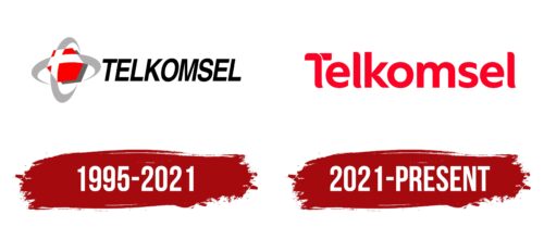
1995 – 2021
2021 – today
The semicircular ends of the letters make the Telkomsel logo very pleasing, and the red color adds a twist to it. Overall, the combination of sharp edges and smooth transitions does not create a feeling of aggressiveness; on the contrary, the mark looks positive and attractive. In addition, it adds to its authenticity. Thailand is a sunny, southern country, so the red color matches the concept of the telecommunication network. The name is mostly made up of lowercase letters, except for the letter “T” at the beginning. A white wavy stripe divides the crossbar into two parts.
The red color of the logo is not just ostentatious; it is as if it borrows the warmth of the Thai sun. The wavy white stripe on the letter “T” is reminiscent of a cool breeze cutting through the heat. The logo is reminiscent of a little story about Thailand – warm but cool.
Telkomsel color codes
| Ruddy | Hex color: | #ff0025 |
|---|---|---|
| RGB: | 255 0 37 | |
| CMYK: | 0 100 85 0 | |
| Pantone: | PMS Bright Red C |


